
← Compose Multiplatform Component in Material 3 Compose
ExposedDropdownMenuBox
Android
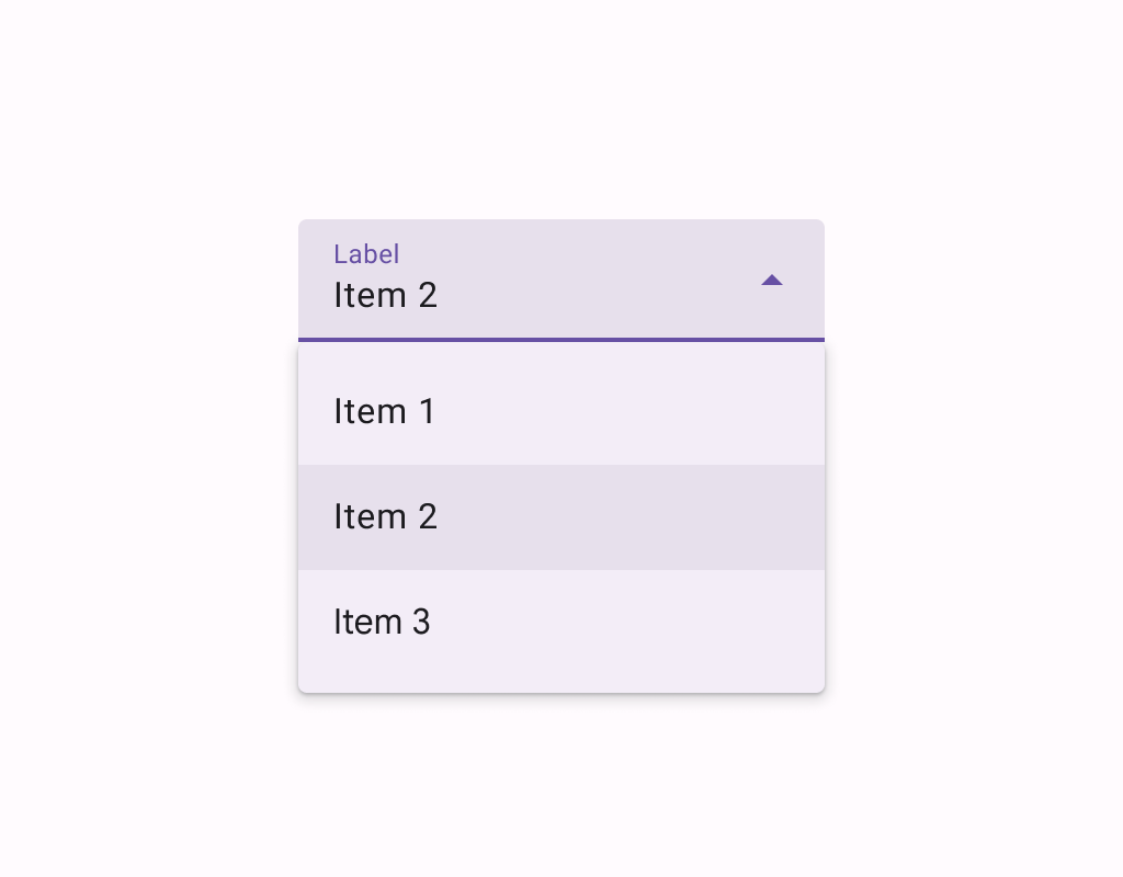
Menus display a list of choices on a temporary surface. They appear when users interact with a button, action, or other control.
Exposed dropdown menus, sometimes also called "spinners" or "combo boxes", display the currently selected item in a text field to which the menu is anchored. In some cases, it can accept and display user input (whether or not it’s listed as a menu choice), in which case it may be used to implement autocomplete.
Last updated:
Installation
dependencies {
   implementation("androidx.compose.material3:material3:1.3.0-beta04")
}
Overloads
@Composable
@ExperimentalMaterial3Api
fun ExposedDropdownMenuBox(
    expanded: Boolean,
    onExpandedChange: (Boolean) -> Unit,
    modifier: Modifier = Modifier,
    content: @Composable ExposedDropdownMenuBoxScope.() -> Unit,
)
Parameters
| name | description |
|---|---|
expanded | whether the menu is expanded or not |
onExpandedChange | called when the exposed dropdown menu is clicked and the expansion state changes. |
modifier | the [Modifier] to be applied to this ExposedDropdownMenuBox |
content | the content of this ExposedDropdownMenuBox, typically a [TextField] and an [ExposedDropdownMenu][ExposedDropdownMenuBoxScope.ExposedDropdownMenu]. |
Code Examples
ExposedDropdownMenuSample
@Composable
@Sampled
@Preview
@OptIn(ExperimentalMaterial3Api::class
fun ExposedDropdownMenuSample() {
    val options = listOf("Cupcake", "Donut", "Eclair", "Froyo", "Gingerbread")
    var expanded by remember { mutableStateOf(false) }
    var text by remember { mutableStateOf(options[0]) }

    ExposedDropdownMenuBox(
        expanded = expanded,
        onExpandedChange = { expanded = it },
    ) {
        TextField(
            // The `menuAnchor` modifier must be passed to the text field to handle
            // expanding/collapsing the menu on click. A read-only text field has
            // the anchor type `PrimaryNotEditable`.
            modifier = Modifier.menuAnchor(MenuAnchorType.PrimaryNotEditable),
            value = text,
            onValueChange = {},
            readOnly = true,
            singleLine = true,
            label = { Text("Label") },
            trailingIcon = { ExposedDropdownMenuDefaults.TrailingIcon(expanded = expanded) },
            colors = ExposedDropdownMenuDefaults.textFieldColors(),
        )
        ExposedDropdownMenu(
            expanded = expanded,
            onDismissRequest = { expanded = false },
        ) {
            options.forEach { option ->
                DropdownMenuItem(
                    text = { Text(option, style = MaterialTheme.typography.bodyLarge) },
                    onClick = {
                        text = option
                        expanded = false
                    },
                    contentPadding = ExposedDropdownMenuDefaults.ItemContentPadding,
                )
            }
        }
    }
}
EditableExposedDropdownMenuSample
@Composable
@Sampled
@Preview
@OptIn(ExperimentalMaterial3Api::class
fun EditableExposedDropdownMenuSample() {
    val options = listOf("Cupcake", "Donut", "Eclair", "Froyo", "Gingerbread")
    var text by remember { mutableStateOf(TextFieldValue()) }

    // The text that the user inputs into the text field can be used to filter the options.
    // This sample uses string subsequence matching.
    val filteredOptions = options.filteredBy(text.text)

    val (allowExpanded, setExpanded) = remember { mutableStateOf(false) }
    val expanded = allowExpanded && filteredOptions.isNotEmpty()

    ExposedDropdownMenuBox(
        expanded = expanded,
        onExpandedChange = setExpanded,
    ) {
        TextField(
            // The `menuAnchor` modifier must be passed to the text field to handle
            // expanding/collapsing the menu on click. An editable text field has
            // the anchor type `PrimaryEditable`.
            modifier = Modifier.menuAnchor(MenuAnchorType.PrimaryEditable),
            value = text,
            onValueChange = { text = it },
            singleLine = true,
            label = { Text("Label") },
            trailingIcon = {
                ExposedDropdownMenuDefaults.TrailingIcon(
                    expanded = expanded,
                    // If the text field is editable, it is recommended to make the
                    // trailing icon a `menuAnchor` of type `SecondaryEditable`. This
                    // provides a better experience for certain accessibility services
                    // to choose a menu option without typing.
                    modifier = Modifier.menuAnchor(MenuAnchorType.SecondaryEditable),
                )
            },
            colors = ExposedDropdownMenuDefaults.textFieldColors(),
        )
        ExposedDropdownMenu(
            expanded = expanded,
            onDismissRequest = { setExpanded(false) },
        ) {
            filteredOptions.forEach { option ->
                DropdownMenuItem(
                    text = { Text(option, style = MaterialTheme.typography.bodyLarge) },
                    onClick = {
                        text =
                            TextFieldValue(
                                text = option.text,
                                selection = TextRange(option.text.length),
                            )
                        setExpanded(false)
                    },
                    contentPadding = ExposedDropdownMenuDefaults.ItemContentPadding,
                )
            }
        }
    }
}
