---
title: "AlertDialog"
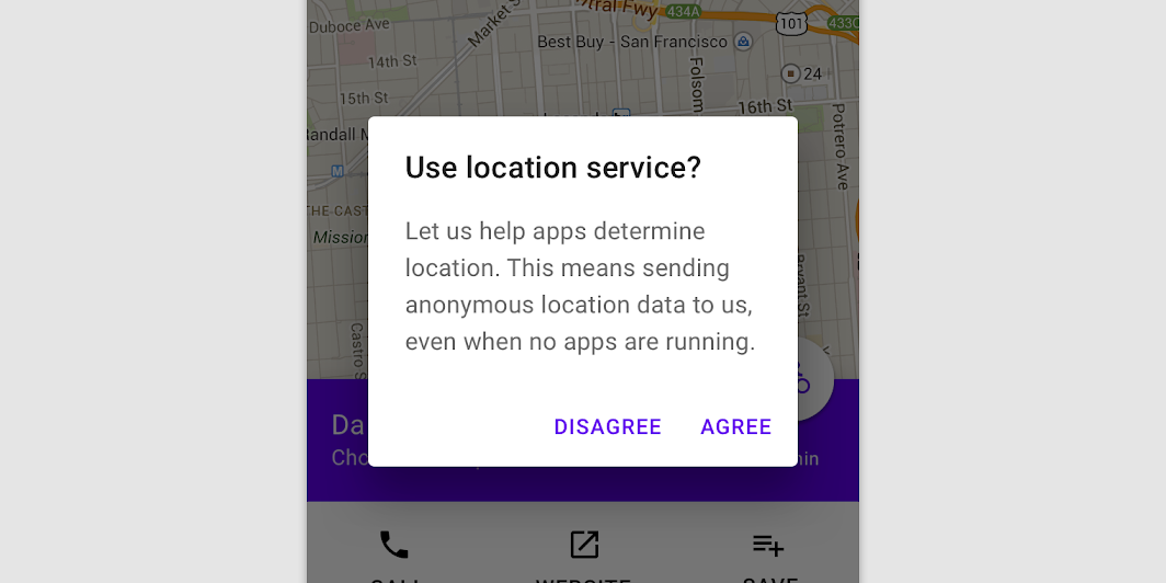
description: "Alert dialogs interrupt users with urgent information, details, or actions."
type: "component"
social_image: "/static/images/material/dialogs.png"
---
Composable Component
Alert dialogs interrupt users with urgent information, details, or actions.
Common
```kotlin
@Composable
expect fun AlertDialog(
onDismissRequest: () -> Unit,
confirmButton: @Composable () -> Unit,
modifier: Modifier = Modifier,
dismissButton: @Composable (() -> Unit)? = null,
title: @Composable (() -> Unit)? = null,
text: @Composable (() -> Unit)? = null,
shape: Shape = MaterialTheme.shapes.medium,
backgroundColor: Color = MaterialTheme.colors.surface,
contentColor: Color = contentColorFor(backgroundColor),
properties: DialogProperties = DialogProperties(),
)
```
#### Parameters
| | |
| --- | --- |
| onDismissRequest | Executes when the user tries to dismiss the Dialog by clicking outside or pressing the back button. This is not called when the dismiss button is clicked. |
| confirmButton | A button which is meant to confirm a proposed action, thus resolving what triggered the dialog. The dialog does not set up any events for this button so they need to be set up by the caller. |
| modifier | Modifier to be applied to the layout of the dialog. |
| dismissButton | A button which is meant to dismiss the dialog. The dialog does not set up any events for this button so they need to be set up by the caller. |
| title | The title of the Dialog which should specify the purpose of the Dialog. The title is not mandatory, because there may be sufficient information inside the `text`. Provided text style will be `Typography.subtitle1`. |
| text | The text which presents the details regarding the Dialog's purpose. Provided text style will be `Typography.body2`. |
| shape | Defines the Dialog's shape |
| backgroundColor | The background color of the dialog. |
| contentColor | The preferred content color provided by this dialog to its children. |
| properties | Typically platform specific properties to further configure the dialog. |
Common
```kotlin
@Composable
expect fun AlertDialog(
onDismissRequest: () -> Unit,
buttons: @Composable () -> Unit,
modifier: Modifier = Modifier,
title: (@Composable () -> Unit)? = null,
text: @Composable (() -> Unit)? = null,
shape: Shape = MaterialTheme.shapes.medium,
backgroundColor: Color = MaterialTheme.colors.surface,
contentColor: Color = contentColorFor(backgroundColor),
properties: DialogProperties = DialogProperties(),
)
```
#### Parameters
| | |
| --- | --- |
| onDismissRequest | Executes when the user tries to dismiss the Dialog by clicking outside or pressing the back button. This is not called when the dismiss button is clicked. |
| buttons | Function that emits the layout with the buttons. |
| modifier | Modifier to be applied to the layout of the dialog. |
| title | The title of the Dialog which should specify the purpose of the Dialog. The title is not mandatory, because there may be sufficient information inside the `text`. Provided text style will be `Typography.subtitle1`. |
| text | The text which presents the details regarding the Dialog's purpose. Provided text style will be `Typography.body2`. |
| shape | Defines the Dialog's shape. |
| backgroundColor | The background color of the dialog. |
| contentColor | The preferred content color provided by this dialog to its children. |
| properties | Typically platform specific properties to further configure the dialog. |
Android
```kotlin
@Composable
actual fun AlertDialog(
onDismissRequest: () -> Unit,
confirmButton: @Composable () -> Unit,
modifier: Modifier,
dismissButton: @Composable (() -> Unit)?,
title: @Composable (() -> Unit)?,
text: @Composable (() -> Unit)?,
shape: Shape,
backgroundColor: Color,
contentColor: Color,
properties: DialogProperties,
): Unit
```
Android
```kotlin
@Composable
actual fun AlertDialog(
onDismissRequest: () -> Unit,
buttons: @Composable () -> Unit,
modifier: Modifier,
title: (@Composable () -> Unit)?,
text: @Composable (() -> Unit)?,
shape: Shape,
backgroundColor: Color,
contentColor: Color,
properties: DialogProperties,
): Unit
```
## Code Examples
### AlertDialogSample
```kotlin
@Composable
fun AlertDialogSample() {
val openDialog = remember { mutableStateOf(true) }
if (openDialog.value) {
AlertDialog(
onDismissRequest = {
// Dismiss the dialog when the user clicks outside the dialog or on the back
// button. If you want to disable that functionality, simply use an empty
// onCloseRequest.
openDialog.value = false
},
title = { Text(text = "Title") },
text = {
Text(
"This area typically contains the supportive text " +
"which presents the details regarding the Dialog's purpose."
)
},
confirmButton = {
TextButton(onClick = { openDialog.value = false }) { Text("Confirm") }
},
dismissButton = {
TextButton(onClick = { openDialog.value = false }) { Text("Dismiss") }
},
)
}
}
```
### CustomAlertDialogSample
```kotlin
@Composable
fun CustomAlertDialogSample() {
val openDialog = remember { mutableStateOf(true) }
if (openDialog.value) {
AlertDialog(
onDismissRequest = { openDialog.value = false },
title = { Text(text = "Title") },
text = {
Text(
"This area typically contains the supportive text " +
"which presents the details regarding the Dialog's purpose."
)
},
buttons = {
Row(
modifier = Modifier.padding(all = 8.dp),
horizontalArrangement = Arrangement.Center,
) {
Button(
modifier = Modifier.fillMaxWidth(),
onClick = { openDialog.value = false },
) {
Text("Dismiss")
}
}
},
)
}
}
```