Composable Component
A bottom app bar displays navigation and key actions at the bottom of screens.
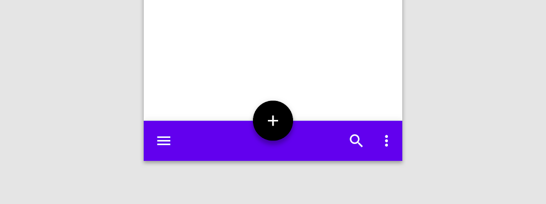
BottomAppBar
Common
```kotlin
@Composable
fun BottomAppBar(
windowInsets: WindowInsets,
modifier: Modifier = Modifier,
backgroundColor: Color = MaterialTheme.colors.primarySurface,
contentColor: Color = contentColorFor(backgroundColor),
cutoutShape: Shape? = null,
elevation: Dp = AppBarDefaults.BottomAppBarElevation,
contentPadding: PaddingValues = AppBarDefaults.ContentPadding,
content: @Composable RowScope.() -> Unit,
)
```
#### Parameters
| | |
| --- | --- |
| windowInsets | a window insets that app bar will respect. |
| modifier | The `Modifier` to be applied to this BottomAppBar |
| backgroundColor | The background color for the BottomAppBar. Use `Color.Transparent` to have no color. |
| contentColor | The preferred content color provided by this BottomAppBar to its children. Defaults to either the matching content color for `backgroundColor`, or if `backgroundColor` is not a color from the theme, this will keep the same value set above this BottomAppBar. |
| cutoutShape | the shape of the cutout that will be added to the BottomAppBar - this should typically be the same shape used inside the `FloatingActionButton`, when `BottomAppBar` and `FloatingActionButton` are being used together in `Scaffold`. This shape will be drawn with an offset around all sides. If null, where will be no cutout. |
| elevation | the elevation of this BottomAppBar. |
| contentPadding | the padding applied to the content of this BottomAppBar |
| content | the content of this BottomAppBar. The default layout here is a `Row`, so content inside will be placed horizontally. |
BottomAppBar
Common
```kotlin
@Composable
fun BottomAppBar(
modifier: Modifier = Modifier,
backgroundColor: Color = MaterialTheme.colors.primarySurface,
contentColor: Color = contentColorFor(backgroundColor),
cutoutShape: Shape? = null,
elevation: Dp = AppBarDefaults.BottomAppBarElevation,
contentPadding: PaddingValues = AppBarDefaults.ContentPadding,
content: @Composable RowScope.() -> Unit,
)
```
#### Parameters
| | |
| --- | --- |
| modifier | The `Modifier` to be applied to this BottomAppBar |
| backgroundColor | The background color for the BottomAppBar. Use `Color.Transparent` to have no color. |
| contentColor | The preferred content color provided by this BottomAppBar to its children. Defaults to either the matching content color for `backgroundColor`, or if `backgroundColor` is not a color from the theme, this will keep the same value set above this BottomAppBar. |
| cutoutShape | the shape of the cutout that will be added to the BottomAppBar - this should typically be the same shape used inside the `FloatingActionButton`, when `BottomAppBar` and `FloatingActionButton` are being used together in `Scaffold`. This shape will be drawn with an offset around all sides. If null, where will be no cutout. |
| elevation | the elevation of this BottomAppBar. |
| contentPadding | the padding applied to the content of this BottomAppBar |
| content | the content of this BottomAppBar. The default layout here is a `Row`, so content inside will be placed horizontally. |