---
title: "Button"
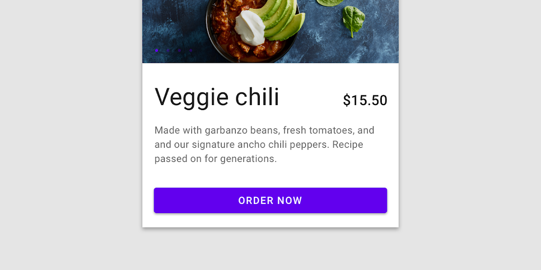
description: "Contained buttons are high-emphasis, distinguished by their use of elevation and fill. They
contain actions that are primary to your app."
type: "component"
social_image: "/static/images/material/contained-button.png"
---
Composable Component
Contained buttons are high-emphasis, distinguished by their use of elevation and fill. They
contain actions that are primary to your app.
Common
```kotlin
@Composable
fun Button(
onClick: () -> Unit,
modifier: Modifier = Modifier,
enabled: Boolean = true,
interactionSource: MutableInteractionSource? = null,
elevation: ButtonElevation? = ButtonDefaults.elevation(),
shape: Shape = MaterialTheme.shapes.small,
border: BorderStroke? = null,
colors: ButtonColors = ButtonDefaults.buttonColors(),
contentPadding: PaddingValues = ButtonDefaults.ContentPadding,
content: @Composable RowScope.() -> Unit,
)
```
#### Parameters
| | |
| --- | --- |
| onClick | Will be called when the user clicks the button |
| modifier | Modifier to be applied to the button |
| enabled | Controls the enabled state of the button. When `false`, this button will not be clickable |
| interactionSource | an optional hoisted `MutableInteractionSource` for observing and emitting `Interaction`s for this button. You can use this to change the button's appearance or preview the button in different states. Note that if `null` is provided, interactions will still happen internally. |
| elevation | `ButtonElevation` used to resolve the elevation for this button in different states. This controls the size of the shadow below the button. Pass `null` here to disable elevation for this button. See `ButtonDefaults.elevation`. |
| shape | Defines the button's shape as well as its shadow |
| border | Border to draw around the button |
| colors | `ButtonColors` that will be used to resolve the background and content color for this button in different states. See `ButtonDefaults.buttonColors`. |
| contentPadding | The spacing values to apply internally between the container and the content |
| content | The content displayed on the button, expected to be text, icon or image. |
## Code Examples
### ButtonSample
```kotlin
@Composable
fun ButtonSample() {
Button(onClick = { /* Do something! */ }) { Text("Button") }
}
```
### ButtonWithIconSample
```kotlin
@Composable
fun ButtonWithIconSample() {
Button(onClick = { /* Do something! */ }) {
Icon(
Icons.Filled.Favorite,
contentDescription = null,
modifier = Modifier.size(ButtonDefaults.IconSize),
)
Spacer(Modifier.size(ButtonDefaults.IconSpacing))
Text("Like")
}
}
```