Composable Component
Cards contain content and actions about a single subject.
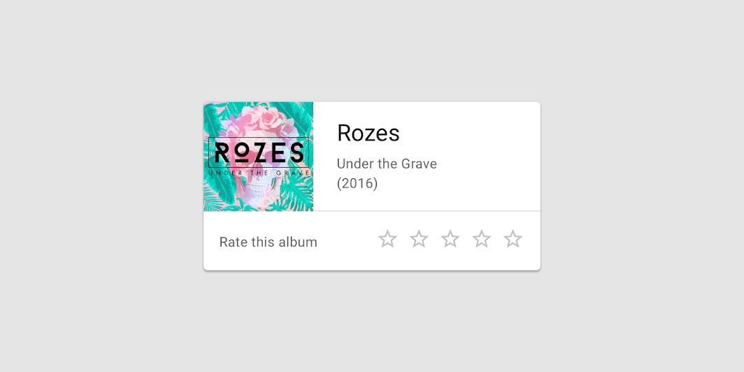
Card
Common
```kotlin
@Composable
fun Card(
modifier: Modifier = Modifier,
shape: Shape = MaterialTheme.shapes.medium,
backgroundColor: Color = MaterialTheme.colors.surface,
contentColor: Color = contentColorFor(backgroundColor),
border: BorderStroke? = null,
elevation: Dp = 1.dp,
content: @Composable () -> Unit,
)
```
#### Parameters
| | |
| --- | --- |
| modifier | Modifier to be applied to the layout of the card. |
| shape | Defines the card's shape as well its shadow. A shadow is only displayed if the `elevation` is greater than zero. |
| backgroundColor | The background color. |
| contentColor | The preferred content color provided by this card to its children. Defaults to either the matching content color for `backgroundColor`, or if `backgroundColor` is not a color from the theme, this will keep the same value set above this card. |
| border | Optional border to draw on top of the card |
| elevation | The z-coordinate at which to place this card. This controls the size of the shadow below the card. |
| content | The content displayed on the card. |
Card
Common
```kotlin
@ExperimentalMaterialApi
@Composable
fun Card(
onClick: () -> Unit,
modifier: Modifier = Modifier,
enabled: Boolean = true,
shape: Shape = MaterialTheme.shapes.medium,
backgroundColor: Color = MaterialTheme.colors.surface,
contentColor: Color = contentColorFor(backgroundColor),
border: BorderStroke? = null,
elevation: Dp = 1.dp,
interactionSource: MutableInteractionSource? = null,
content: @Composable () -> Unit,
)
```
#### Parameters
| | |
| --- | --- |
| onClick | callback to be called when the card is clicked |
| modifier | Modifier to be applied to the layout of the card. |
| enabled | Controls the enabled state of the card. When `false`, this card will not be clickable |
| shape | Defines the card's shape as well its shadow. A shadow is only displayed if the `elevation` is greater than zero. |
| backgroundColor | The background color. |
| contentColor | The preferred content color provided by this card to its children. Defaults to either the matching content color for `backgroundColor`, or if `backgroundColor` is not a color from the theme, this will keep the same value set above this card. |
| border | Optional border to draw on top of the card |
| elevation | The z-coordinate at which to place this card. This controls the size of the shadow below the card. |
| interactionSource | an optional hoisted `MutableInteractionSource` for observing and emitting `Interaction`s for this card. You can use this to change the card's appearance or preview the card in different states. Note that if `null` is provided, interactions will still happen internally. |
| content | The content displayed on the card. |