---
title: "Checkbox"
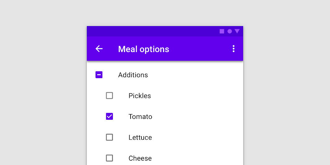
description: "Checkboxes allow users to select one or more items from a set. Checkboxes can turn an option on
or off."
type: "component"
social_image: "/static/images/material/checkboxes.png"
---
Composable Component
Checkboxes allow users to select one or more items from a set. Checkboxes can turn an option on
or off.
Common
```kotlin
@Composable
fun Checkbox(
checked: Boolean,
onCheckedChange: ((Boolean) -> Unit)?,
modifier: Modifier = Modifier,
enabled: Boolean = true,
interactionSource: MutableInteractionSource? = null,
colors: CheckboxColors = CheckboxDefaults.colors(),
)
```
#### Parameters
| | |
| --- | --- |
| checked | whether Checkbox is checked or unchecked |
| onCheckedChange | callback to be invoked when checkbox is being clicked, therefore the change of checked state in requested. If null, then this is passive and relies entirely on a higher-level component to control the "checked" state. |
| modifier | Modifier to be applied to the layout of the checkbox |
| enabled | whether the component is enabled or grayed out |
| interactionSource | an optional hoisted `MutableInteractionSource` for observing and emitting `Interaction`s for this checkbox. You can use this to change the checkbox's appearance or preview the checkbox in different states. Note that if `null` is provided, interactions will still happen internally. |
| colors | `CheckboxColors` that will be used to determine the color of the checkmark / box / border in different states. See `CheckboxDefaults.colors`. |
## Code Examples
### CheckboxSample
```kotlin
@Composable
fun CheckboxSample() {
val checkedState = remember { mutableStateOf(true) }
Checkbox(checked = checkedState.value, onCheckedChange = { checkedState.value = it })
}
```