---
title: "Divider"
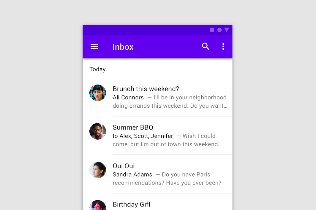
description: "A divider is a thin line that groups content in lists and layouts."
type: "component"
social_image: "/static/images/material/dividers.png"
---
Composable Component
A divider is a thin line that groups content in lists and layouts.
Common
```kotlin
@Composable
fun Divider(
modifier: Modifier = Modifier,
color: Color = MaterialTheme.colors.onSurface.copy(alpha = DividerAlpha),
thickness: Dp = 1.dp,
startIndent: Dp = 0.dp,
)
```
#### Parameters
| | |
| --- | --- |
| modifier | Modifier to be applied to the divider line |
| color | color of the divider line |
| thickness | thickness of the divider line, 1 dp is used by default. Using `Dp.Hairline` will produce a single pixel divider regardless of screen density. |
| startIndent | start offset of this line, no offset by default |