---
title: "ModalDrawer"
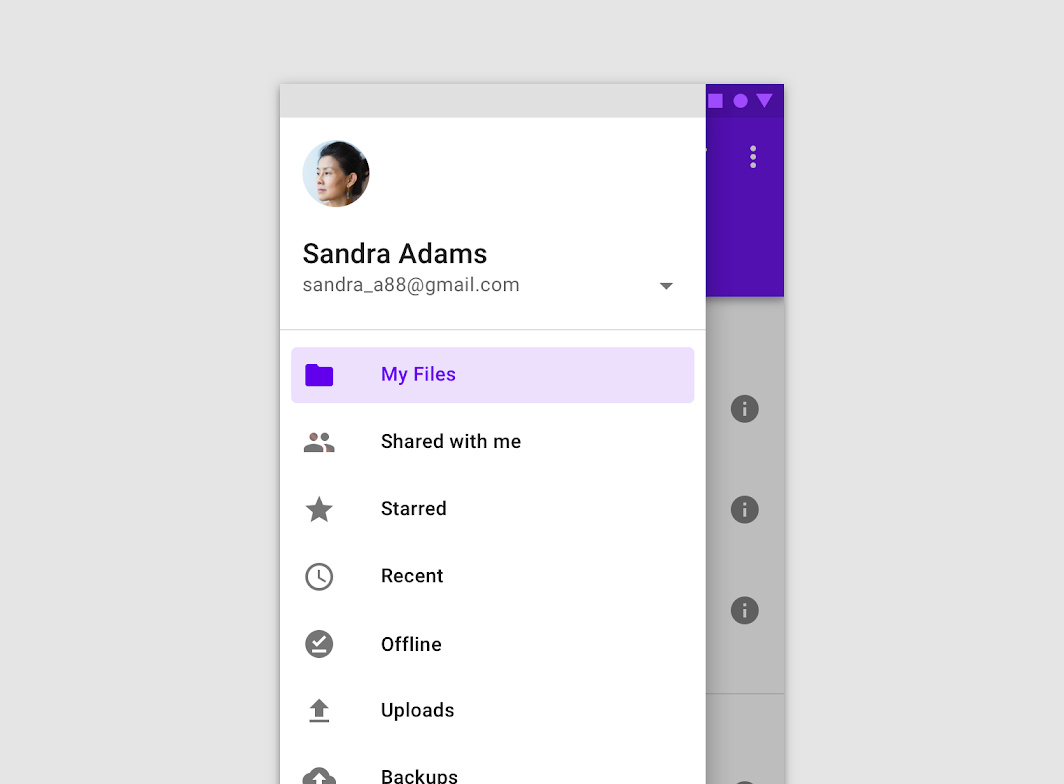
description: "Modal navigation drawers block interaction with the rest of an app’s content with a scrim. They
are elevated above most of the app’s UI and don’t affect the screen’s layout grid."
type: "component"
social_image: "/static/images/material/modal-drawer.png"
---
Composable Component
Modal navigation drawers block interaction with the rest of an app’s content with a scrim. They
are elevated above most of the app’s UI and don’t affect the screen’s layout grid.
Common
```kotlin
@Composable
fun ModalDrawer(
drawerContent: @Composable ColumnScope.() -> Unit,
modifier: Modifier = Modifier,
drawerState: DrawerState = rememberDrawerState(DrawerValue.Closed),
gesturesEnabled: Boolean = true,
drawerShape: Shape = DrawerDefaults.shape,
drawerElevation: Dp = DrawerDefaults.Elevation,
drawerBackgroundColor: Color = DrawerDefaults.backgroundColor,
drawerContentColor: Color = contentColorFor(drawerBackgroundColor),
scrimColor: Color = DrawerDefaults.scrimColor,
content: @Composable () -> Unit,
)
```
#### Parameters
| | |
| --- | --- |
| drawerContent | composable that represents content inside the drawer |
| modifier | optional modifier for the drawer |
| drawerState | state of the drawer |
| gesturesEnabled | whether or not drawer can be interacted by gestures |
| drawerShape | shape of the drawer sheet |
| drawerElevation | drawer sheet elevation. This controls the size of the shadow below the drawer sheet |
| drawerBackgroundColor | background color to be used for the drawer sheet |
| drawerContentColor | color of the content to use inside the drawer sheet. Defaults to either the matching content color for `drawerBackgroundColor`, or, if it is not a color from the theme, this will keep the same value set above this Surface. |
| scrimColor | color of the scrim that obscures content when the drawer is open |
| content | content of the rest of the UI |
## Code Examples
### ModalDrawerSample
```kotlin
@Composable
fun ModalDrawerSample() {
val drawerState = rememberDrawerState(DrawerValue.Closed)
val scope = rememberCoroutineScope()
ModalDrawer(
drawerState = drawerState,
drawerContent = {
Button(
modifier = Modifier.align(Alignment.CenterHorizontally).padding(top = 16.dp),
onClick = { scope.launch { drawerState.close() } },
content = { Text("Close Drawer") },
)
},
content = {
Column(
modifier = Modifier.fillMaxSize().padding(16.dp),
horizontalAlignment = Alignment.CenterHorizontally,
) {
Text(text = if (drawerState.isClosed) ">>> Swipe >>>" else "<<< Swipe <<<")
Spacer(Modifier.height(20.dp))
Button(onClick = { scope.launch { drawerState.open() } }) { Text("Click to open") }
}
},
)
}
```