---
title: "RadioButton"
description: "Radio buttons allow users to select one option from a set."
type: "component"
social_image: "/static/images/material/radio-buttons.png"
---
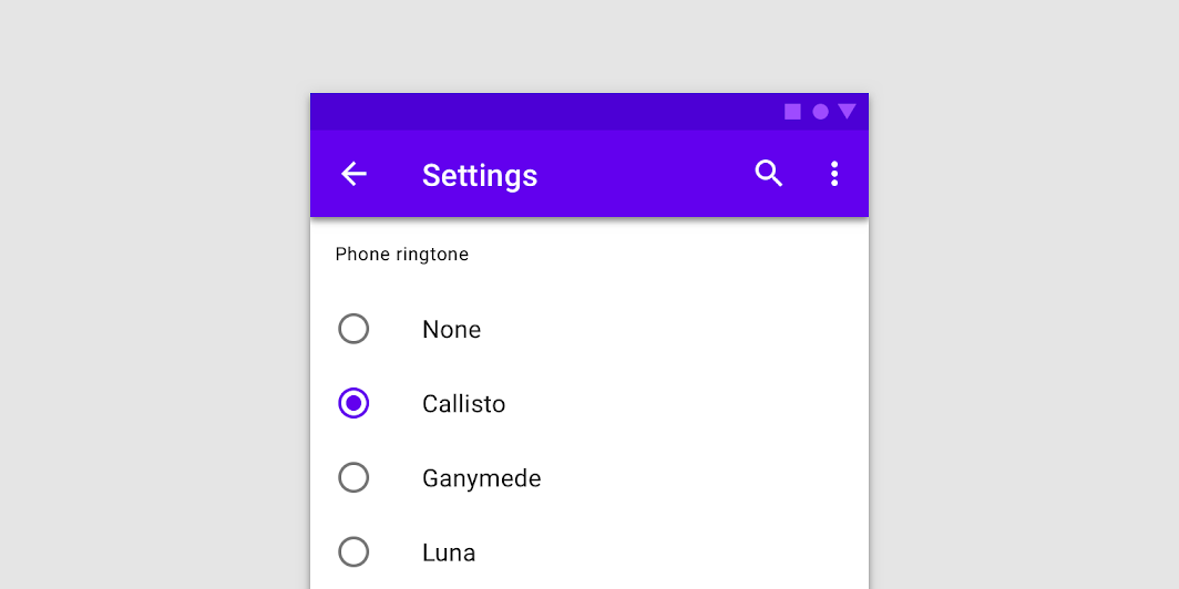
Composable Component
Radio buttons allow users to select one option from a set.
Common
```kotlin
@Composable
fun RadioButton(
selected: Boolean,
onClick: (() -> Unit)?,
modifier: Modifier = Modifier,
enabled: Boolean = true,
interactionSource: MutableInteractionSource? = null,
colors: RadioButtonColors = RadioButtonDefaults.colors(),
)
```
#### Parameters
| | |
| --- | --- |
| selected | whether this radio button is selected or not |
| onClick | callback to be invoked when the RadioButton is clicked. If null, then this RadioButton will not handle input events, and only act as a visual indicator of `selected` state |
| modifier | Modifier to be applied to the radio button |
| enabled | Controls the enabled state of the `RadioButton`. When `false`, this button will not be selectable and appears disabled |
| interactionSource | an optional hoisted `MutableInteractionSource` for observing and emitting `Interaction`s for this radio button. You can use this to change the radio button's appearance or preview the radio button in different states. Note that if `null` is provided, interactions will still happen internally. |
| colors | `RadioButtonColors` that will be used to resolve the color used for this RadioButton in different states. See `RadioButtonDefaults.colors`. |
## Code Examples
### RadioButtonSample
```kotlin
@Composable
fun RadioButtonSample() {
// We have two radio buttons and only one can be selected
var state by remember { mutableStateOf(true) }
// Note that Modifier.selectableGroup() is essential to ensure correct accessibility behavior
Row(Modifier.selectableGroup()) {
RadioButton(selected = state, onClick = { state = true })
RadioButton(selected = !state, onClick = { state = false })
}
}
```
### RadioGroupSample
```kotlin
@Composable
fun RadioGroupSample() {
val radioOptions = listOf("Calls", "Missed", "Friends")
val (selectedOption, onOptionSelected) = remember { mutableStateOf(radioOptions[0]) }
// Note that Modifier.selectableGroup() is essential to ensure correct accessibility behavior
Column(Modifier.selectableGroup()) {
radioOptions.forEach { text ->
Row(
Modifier.fillMaxWidth()
.height(56.dp)
.selectable(
selected = (text == selectedOption),
onClick = { onOptionSelected(text) },
role = Role.RadioButton,
)
.padding(horizontal = 16.dp),
verticalAlignment = Alignment.CenterVertically,
) {
RadioButton(
selected = (text == selectedOption),
onClick = null, // null recommended for accessibility with screenreaders
)
Text(
text = text,
style = MaterialTheme.typography.body1.merge(),
modifier = Modifier.padding(start = 16.dp),
)
}
}
}
}
```