Composable Component
Sliders allow users to make selections from a range of values.
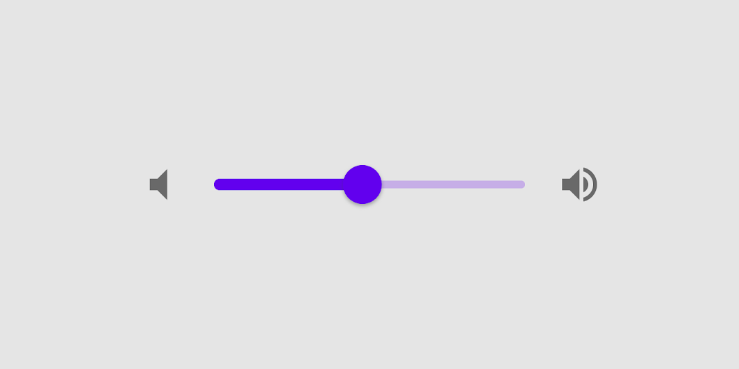
Slider
Common
```kotlin
@Composable
fun Slider(
value: Float,
onValueChange: (Float) -> Unit,
modifier: Modifier = Modifier,
enabled: Boolean = true,
valueRange: ClosedFloatingPointRange = 0f..1f,
@IntRange(from = 0) steps: Int = 0,
onValueChangeFinished: (() -> Unit)? = null,
interactionSource: MutableInteractionSource? = null,
colors: SliderColors = SliderDefaults.colors(),
)
```
#### Parameters
| | |
| --- | --- |
| value | current value of the Slider. If outside of `valueRange` provided, value will be coerced to this range. |
| onValueChange | lambda in which value should be updated |
| modifier | modifiers for the Slider layout |
| enabled | whether or not component is enabled and can be interacted with or not |
| valueRange | range of values that Slider value can take. Passed `value` will be coerced to this range |
| steps | if positive, specifies the amount of discrete allowable values between the endpoints of `valueRange`. For example, a range from 0 to 10 with 4 `steps` allows 4 values evenly distributed between 0 and 10 (i.e., 2, 4, 6, 8). If `steps` is 0, the slider will behave continuously and allow any value from the range. Must not be negative. |
| onValueChangeFinished | lambda to be invoked when value change has ended. This callback shouldn't be used to update the slider value (use `onValueChange` for that), but rather to know when the user has completed selecting a new value by ending a drag or a click. |
| interactionSource | an optional hoisted `MutableInteractionSource` for observing and emitting `Interaction`s for this slider. You can use this to change the slider's appearance or preview the slider in different states. Note that if `null` is provided, interactions will still happen internally. |
| colors | `SliderColors` that will be used to determine the color of the Slider parts in different state. See `SliderDefaults.colors` to customize. |