Composable Component
Switches toggle the state of a single item on or off.
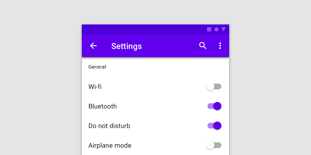
Switch
Common
```kotlin
@Composable
fun Switch(
checked: Boolean,
onCheckedChange: ((Boolean) -> Unit)?,
modifier: Modifier = Modifier,
enabled: Boolean = true,
interactionSource: MutableInteractionSource? = null,
colors: SwitchColors = SwitchDefaults.colors(),
)
```
#### Parameters
| | |
| --- | --- |
| checked | whether or not this component is checked |
| onCheckedChange | callback to be invoked when Switch is being clicked, therefore the change of checked state is requested. If null, then this is passive and relies entirely on a higher-level component to control the "checked" state. |
| modifier | Modifier to be applied to the switch layout |
| enabled | whether the component is enabled or grayed out |
| interactionSource | an optional hoisted `MutableInteractionSource` for observing and emitting `Interaction`s for this switch. You can use this to change the switch's appearance or preview the switch in different states. Note that if `null` is provided, interactions will still happen internally. |
| colors | `SwitchColors` that will be used to determine the color of the thumb and track in different states. See `SwitchDefaults.colors`. |