Composable Component
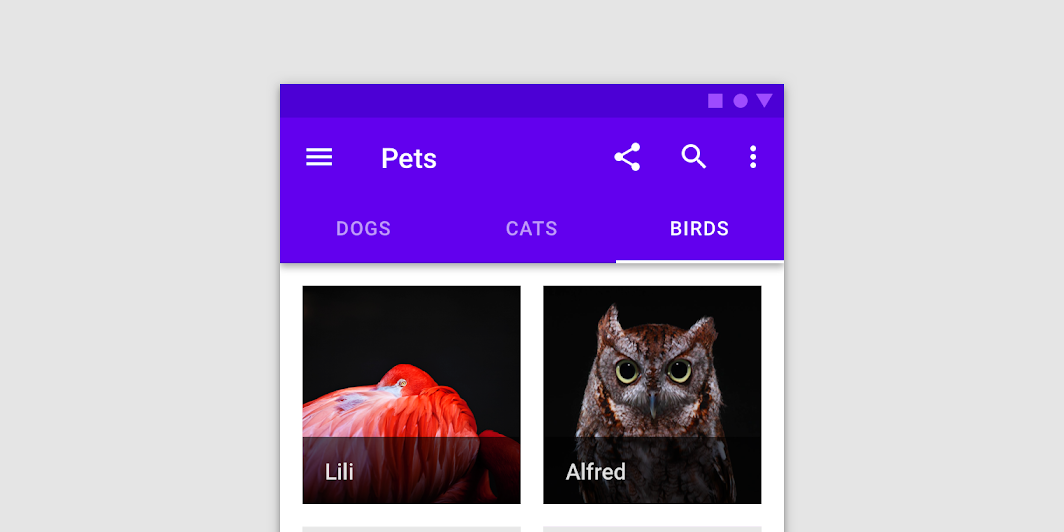
Fixed tabs display all tabs in a set simultaneously. They are best for switching between related
content quickly, such as between transportation methods in a map. To navigate between fixed tabs,
tap an individual tab, or swipe left or right in the content area.
TabRow
Common
```kotlin
@Composable
fun TabRow(
selectedTabIndex: Int,
modifier: Modifier = Modifier,
backgroundColor: Color = MaterialTheme.colors.primarySurface,
contentColor: Color = contentColorFor(backgroundColor),
indicator: @Composable @UiComposable (tabPositions: List) -> Unit =
@Composable { tabPositions ->
TabRowDefaults.Indicator(Modifier.tabIndicatorOffset(tabPositions[selectedTabIndex]))
},
divider: @Composable @UiComposable () -> Unit = @Composable { TabRowDefaults.Divider() },
tabs: @Composable @UiComposable () -> Unit,
)
```
#### Parameters
| | |
| --- | --- |
| selectedTabIndex | the index of the currently selected tab |
| modifier | optional `Modifier` for this TabRow |
| backgroundColor | The background color for the TabRow. Use `Color.Transparent` to have no color. |
| contentColor | The preferred content color provided by this TabRow to its children. Defaults to either the matching content color for `backgroundColor`, or if `backgroundColor` is not a color from the theme, this will keep the same value set above this TabRow. |
| indicator | the indicator that represents which tab is currently selected. By default this will be a `TabRowDefaults.Indicator`, using a `TabRowDefaults.tabIndicatorOffset` modifier to animate its position. Note that this indicator will be forced to fill up the entire TabRow, so you should use `TabRowDefaults.tabIndicatorOffset` or similar to animate the actual drawn indicator inside this space, and provide an offset from the start. |
| divider | the divider displayed at the bottom of the TabRow. This provides a layer of separation between the TabRow and the content displayed underneath. |
| tabs | the tabs inside this TabRow. Typically this will be multiple `Tab`s. Each element inside this lambda will be measured and placed evenly across the TabRow, each taking up equal space. |