Composable Component
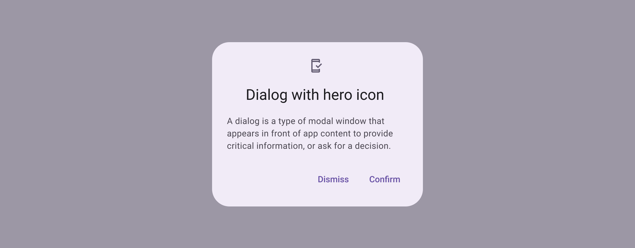
Dialogs provide important prompts in a user flow. They can require an action, communicate
information, or help users accomplish a task.
AlertDialog
Common
```kotlin
@Composable
expect fun AlertDialog(
onDismissRequest: () -> Unit,
confirmButton: @Composable () -> Unit,
modifier: Modifier = Modifier,
dismissButton: @Composable (() -> Unit)? = null,
icon: @Composable (() -> Unit)? = null,
title: @Composable (() -> Unit)? = null,
text: @Composable (() -> Unit)? = null,
shape: Shape = AlertDialogDefaults.shape,
containerColor: Color = AlertDialogDefaults.containerColor,
iconContentColor: Color = AlertDialogDefaults.iconContentColor,
titleContentColor: Color = AlertDialogDefaults.titleContentColor,
textContentColor: Color = AlertDialogDefaults.textContentColor,
tonalElevation: Dp = AlertDialogDefaults.TonalElevation,
properties: DialogProperties = DialogProperties(),
)
```
#### Parameters
| | |
| --- | --- |
| onDismissRequest | called when the user tries to dismiss the Dialog by clicking outside or pressing the back button. This is not called when the dismiss button is clicked. |
| confirmButton | button which is meant to confirm a proposed action, thus resolving what triggered the dialog. The dialog does not set up any events for this button so they need to be set up by the caller. |
| modifier | the `Modifier` to be applied to this dialog |
| dismissButton | button which is meant to dismiss the dialog. The dialog does not set up any events for this button so they need to be set up by the caller. |
| icon | optional icon that will appear above the `title` or above the `text`, in case a title was not provided. |
| title | title which should specify the purpose of the dialog. The title is not mandatory, because there may be sufficient information inside the `text`. |
| text | text which presents the details regarding the dialog's purpose. |
| shape | defines the shape of this dialog's container |
| containerColor | the color used for the background of this dialog. Use `Color.Transparent` to have no color. |
| iconContentColor | the content color used for the icon. |
| titleContentColor | the content color used for the title. |
| textContentColor | the content color used for the text. |
| tonalElevation | when `containerColor` is `ColorScheme.surface`, a translucent primary color overlay is applied on top of the container. A higher tonal elevation value will result in a darker color in light theme and lighter color in dark theme. See also: `Surface`. |
| properties | typically platform specific properties to further configure the dialog. |
Common
> **Deprecated** Use BasicAlertDialog instead
AlertDialog
```kotlin
@ExperimentalMaterial3Api
@Composable
fun AlertDialog(
onDismissRequest: () -> Unit,
modifier: Modifier = Modifier,
properties: DialogProperties = DialogProperties(),
content: @Composable () -> Unit,
) = BasicAlertDialog(onDismissRequest, modifier, properties, content)
```
#### Parameters
| | |
| --- | --- |
| onDismissRequest | called when the user tries to dismiss the Dialog by clicking outside or pressing the back button. This is not called when the dismiss button is clicked. |
| modifier | the `Modifier` to be applied to this dialog's content. |
| properties | typically platform specific properties to further configure the dialog. |
| content | the content of the dialog |
AlertDialog
Android
```kotlin
@Composable
actual fun AlertDialog(
onDismissRequest: () -> Unit,
confirmButton: @Composable () -> Unit,
modifier: Modifier,
dismissButton: @Composable (() -> Unit)?,
icon: @Composable (() -> Unit)?,
title: @Composable (() -> Unit)?,
text: @Composable (() -> Unit)?,
shape: Shape,
containerColor: Color,
iconContentColor: Color,
titleContentColor: Color,
textContentColor: Color,
tonalElevation: Dp,
properties: DialogProperties,
): Unit
```