---
title: "BottomAppBar"
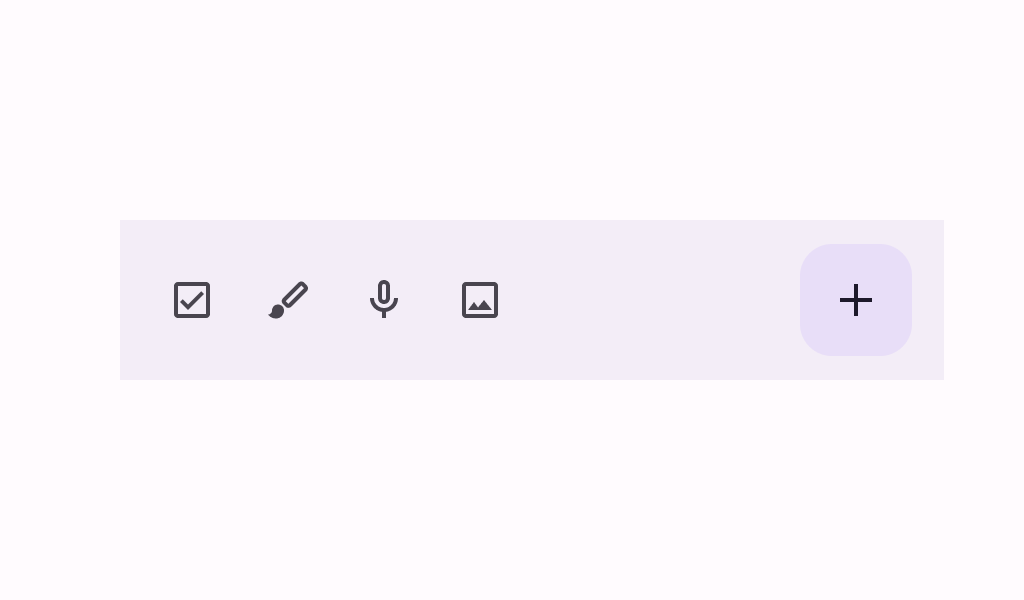
description: "A bottom app bar displays navigation and key actions at the bottom of small screens."
type: "component"
social_image: "/static/images/material3/bottom-app-bar.png"
---
Composable Component
A bottom app bar displays navigation and key actions at the bottom of small screens.
Common
```kotlin
@Composable
fun BottomAppBar(
actions: @Composable RowScope.() -> Unit,
modifier: Modifier = Modifier,
floatingActionButton: @Composable (() -> Unit)? = null,
containerColor: Color = BottomAppBarDefaults.containerColor,
contentColor: Color = contentColorFor(containerColor),
tonalElevation: Dp = BottomAppBarDefaults.ContainerElevation,
contentPadding: PaddingValues = BottomAppBarDefaults.ContentPadding,
windowInsets: WindowInsets = BottomAppBarDefaults.windowInsets,
) =
BottomAppBar(
actions = actions,
modifier = modifier,
floatingActionButton = floatingActionButton,
containerColor = containerColor,
contentColor = contentColor,
tonalElevation = tonalElevation,
contentPadding = contentPadding,
windowInsets = windowInsets,
scrollBehavior = null,
)
```
#### Parameters
| | |
| --- | --- |
| actions | the icon content of this BottomAppBar. The default layout here is a `Row`, so content inside will be placed horizontally. |
| modifier | the `Modifier` to be applied to this BottomAppBar |
| floatingActionButton | optional floating action button at the end of this BottomAppBar |
| containerColor | the color used for the background of this BottomAppBar. Use `Color.Transparent` to have no color. |
| contentColor | the preferred color for content inside this BottomAppBar. Defaults to either the matching content color for `containerColor`, or to the current `LocalContentColor` if `containerColor` is not a color from the theme. |
| tonalElevation | when `containerColor` is `ColorScheme.surface`, a translucent primary color overlay is applied on top of the container. A higher tonal elevation value will result in a darker color in light theme and lighter color in dark theme. See also: `Surface`. |
| contentPadding | the padding applied to the content of this BottomAppBar |
| windowInsets | a window insets that app bar will respect. |
Common
```kotlin
@ExperimentalMaterial3Api
@Composable
fun BottomAppBar(
actions: @Composable RowScope.() -> Unit,
modifier: Modifier = Modifier,
floatingActionButton: @Composable (() -> Unit)? = null,
containerColor: Color = BottomAppBarDefaults.containerColor,
contentColor: Color = contentColorFor(containerColor),
tonalElevation: Dp = BottomAppBarDefaults.ContainerElevation,
contentPadding: PaddingValues = BottomAppBarDefaults.ContentPadding,
windowInsets: WindowInsets = BottomAppBarDefaults.windowInsets,
scrollBehavior: BottomAppBarScrollBehavior? = null,
) =
BottomAppBar(
modifier = modifier,
containerColor = containerColor,
contentColor = contentColor,
tonalElevation = tonalElevation,
windowInsets = windowInsets,
contentPadding = contentPadding,
scrollBehavior = scrollBehavior,
) {
Row(
modifier = Modifier.weight(1f),
horizontalArrangement = Arrangement.Start,
verticalAlignment = Alignment.CenterVertically,
content = actions,
)
if (floatingActionButton != null) {
Box(
Modifier.fillMaxHeight()
.padding(top = FABVerticalPadding, end = FABHorizontalPadding),
contentAlignment = Alignment.TopStart,
) {
floatingActionButton()
}
}
}
```
#### Parameters
| | |
| --- | --- |
| actions | the icon content of this BottomAppBar. The default layout here is a `Row`, so content inside will be placed horizontally. |
| modifier | the `Modifier` to be applied to this BottomAppBar |
| floatingActionButton | optional floating action button at the end of this BottomAppBar |
| containerColor | the color used for the background of this BottomAppBar. Use `Color.Transparent` to have no color. |
| contentColor | the preferred color for content inside this BottomAppBar. Defaults to either the matching content color for `containerColor`, or to the current `LocalContentColor` if `containerColor` is not a color from the theme. |
| tonalElevation | when `containerColor` is `ColorScheme.surface`, a translucent primary color overlay is applied on top of the container. A higher tonal elevation value will result in a darker color in light theme and lighter color in dark theme. See also: `Surface`. |
| contentPadding | the padding applied to the content of this BottomAppBar |
| windowInsets | a window insets that app bar will respect. |
| scrollBehavior | a `BottomAppBarScrollBehavior` which holds various offset values that will be applied by this bottom app bar to set up its height. A scroll behavior is designed to work in conjunction with a scrolled content to change the bottom app bar appearance as the content scrolls. Note that the bottom app bar will not react to scrolling in case a touch exploration service (e.g., TalkBack) is active. See `BottomAppBarScrollBehavior.nestedScrollConnection`. |
Common
```kotlin
@Composable
fun BottomAppBar(
modifier: Modifier = Modifier,
containerColor: Color = BottomAppBarDefaults.containerColor,
contentColor: Color = contentColorFor(containerColor),
tonalElevation: Dp = BottomAppBarDefaults.ContainerElevation,
contentPadding: PaddingValues = BottomAppBarDefaults.ContentPadding,
windowInsets: WindowInsets = BottomAppBarDefaults.windowInsets,
content: @Composable RowScope.() -> Unit,
) =
BottomAppBar(
modifier = modifier,
containerColor = containerColor,
contentColor = contentColor,
tonalElevation = tonalElevation,
contentPadding = contentPadding,
windowInsets = windowInsets,
scrollBehavior = null,
content = content,
)
```
#### Parameters
| | |
| --- | --- |
| modifier | the `Modifier` to be applied to this BottomAppBar |
| containerColor | the color used for the background of this BottomAppBar. Use `Color.Transparent` to have no color. |
| contentColor | the preferred color for content inside this BottomAppBar. Defaults to either the matching content color for `containerColor`, or to the current `LocalContentColor` if `containerColor` is not a color from the theme. |
| tonalElevation | when `containerColor` is `ColorScheme.surface`, a translucent primary color overlay is applied on top of the container. A higher tonal elevation value will result in a darker color in light theme and lighter color in dark theme. See also: `Surface`. |
| contentPadding | the padding applied to the content of this BottomAppBar |
| windowInsets | a window insets that app bar will respect. |
| content | the content of this BottomAppBar. The default layout here is a `Row`, so content inside will be placed horizontally. |
Common
```kotlin
@ExperimentalMaterial3Api
@Composable
fun BottomAppBar(
modifier: Modifier = Modifier,
containerColor: Color = BottomAppBarDefaults.containerColor,
contentColor: Color = contentColorFor(containerColor),
tonalElevation: Dp = BottomAppBarDefaults.ContainerElevation,
contentPadding: PaddingValues = BottomAppBarDefaults.ContentPadding,
windowInsets: WindowInsets = BottomAppBarDefaults.windowInsets,
scrollBehavior: BottomAppBarScrollBehavior? = null,
content: @Composable RowScope.() -> Unit,
)
```
#### Parameters
| | |
| --- | --- |
| modifier | the `Modifier` to be applied to this BottomAppBar |
| containerColor | the color used for the background of this BottomAppBar. Use `Color.Transparent` to have no color. |
| contentColor | the preferred color for content inside this BottomAppBar. Defaults to either the matching content color for `containerColor`, or to the current `LocalContentColor` if `containerColor` is not a color from the theme. |
| tonalElevation | when `containerColor` is `ColorScheme.surface`, a translucent primary color overlay is applied on top of the container. A higher tonal elevation value will result in a darker color in light theme and lighter color in dark theme. See also: `Surface`. |
| contentPadding | the padding applied to the content of this BottomAppBar |
| windowInsets | a window insets that app bar will respect. |
| scrollBehavior | a `BottomAppBarScrollBehavior` which holds various offset values that will be applied by this bottom app bar to set up its height. A scroll behavior is designed to work in conjunction with a scrolled content to change the bottom app bar appearance as the content scrolls. Note that the bottom app bar will not react to scrolling in case a touch exploration service (e.g., TalkBack) is active. See `BottomAppBarScrollBehavior.nestedScrollConnection`. |
| content | the content of this BottomAppBar. The default layout here is a `Row`, so content inside will be placed horizontally. |
## Code Examples
### BottomAppBarWithFAB
```kotlin
@OptIn(ExperimentalMaterial3Api::class)
@Preview
@Composable
fun BottomAppBarWithFAB() {
BottomAppBar(
actions = {
TooltipBox(
positionProvider =
TooltipDefaults.rememberTooltipPositionProvider(TooltipAnchorPosition.Above),
tooltip = { PlainTooltip { Text("Check") } },
state = rememberTooltipState(),
) {
IconButton(onClick = { /* doSomething() */ }) {
Icon(Icons.Filled.Check, contentDescription = "Check")
}
}
TooltipBox(
positionProvider =
TooltipDefaults.rememberTooltipPositionProvider(TooltipAnchorPosition.Above),
tooltip = { PlainTooltip { Text("Edit") } },
state = rememberTooltipState(),
) {
IconButton(onClick = { /* doSomething() */ }) {
Icon(Icons.Filled.Edit, contentDescription = "Edit")
}
}
},
floatingActionButton = {
TooltipBox(
positionProvider =
TooltipDefaults.rememberTooltipPositionProvider(TooltipAnchorPosition.Above),
tooltip = { PlainTooltip { Text("Add") } },
state = rememberTooltipState(),
) {
FloatingActionButton(
onClick = { /* do something */ },
containerColor = BottomAppBarDefaults.bottomAppBarFabColor,
elevation = FloatingActionButtonDefaults.bottomAppBarFabElevation(),
) {
Icon(Icons.Filled.Add, "Add")
}
}
},
)
}
```
### ExitAlwaysBottomAppBar
```kotlin
/**
* A sample for a [BottomAppBar] that collapses when the content is scrolled up, and appears when
* the content scrolled down.
*/
@OptIn(ExperimentalMaterial3Api::class)
@Preview
@Composable
fun ExitAlwaysBottomAppBar() {
val scrollBehavior = BottomAppBarDefaults.exitAlwaysScrollBehavior()
Scaffold(
modifier = Modifier.nestedScroll(scrollBehavior.nestedScrollConnection),
bottomBar = {
BottomAppBar(
actions = {
TooltipBox(
positionProvider =
TooltipDefaults.rememberTooltipPositionProvider(
TooltipAnchorPosition.Above
),
tooltip = { PlainTooltip { Text("Check") } },
state = rememberTooltipState(),
) {
IconButton(onClick = { /* doSomething() */ }) {
Icon(Icons.Filled.Check, contentDescription = "Check")
}
}
TooltipBox(
positionProvider =
TooltipDefaults.rememberTooltipPositionProvider(
TooltipAnchorPosition.Above
),
tooltip = { PlainTooltip { Text("Edit") } },
state = rememberTooltipState(),
) {
IconButton(onClick = { /* doSomething() */ }) {
Icon(Icons.Filled.Edit, contentDescription = "Edit")
}
}
},
scrollBehavior = scrollBehavior,
)
},
floatingActionButton = {
TooltipBox(
positionProvider =
TooltipDefaults.rememberTooltipPositionProvider(TooltipAnchorPosition.Above),
tooltip = { PlainTooltip { Text("Add") } },
state = rememberTooltipState(),
) {
FloatingActionButton(
modifier = Modifier.offset(y = 4.dp),
onClick = { /* do something */ },
containerColor = BottomAppBarDefaults.bottomAppBarFabColor,
elevation = FloatingActionButtonDefaults.bottomAppBarFabElevation(),
) {
Icon(Icons.Filled.Add, "Add")
}
}
},
floatingActionButtonPosition = FabPosition.EndOverlay,
content = { innerPadding ->
LazyColumn(
contentPadding = innerPadding,
verticalArrangement = Arrangement.spacedBy(8.dp),
) {
val list = (0..75).map { it.toString() }
items(count = list.size) {
Text(
text = list[it],
style = MaterialTheme.typography.bodyLarge,
modifier = Modifier.fillMaxWidth().padding(horizontal = 16.dp),
)
}
}
},
)
}
```
### SimpleBottomAppBar
```kotlin
@OptIn(ExperimentalMaterial3Api::class)
@Preview
@Composable
fun SimpleBottomAppBar() {
BottomAppBar(
actions = {
TooltipBox(
positionProvider =
TooltipDefaults.rememberTooltipPositionProvider(TooltipAnchorPosition.Above),
tooltip = { PlainTooltip { Text("Menu") } },
state = rememberTooltipState(),
) {
IconButton(onClick = { /* doSomething() */ }) {
Icon(Icons.Filled.Menu, contentDescription = "Menu button")
}
}
}
)
}
```