---
title: "Button"
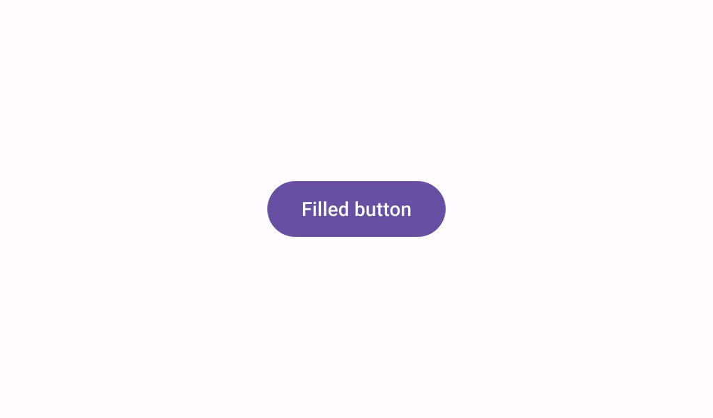
description: "Buttons help people initiate actions, from sending an email, to sharing a document, to liking a
post."
type: "component"
social_image: "/static/images/material3/filled-button.png"
---
Composable Component
Buttons help people initiate actions, from sending an email, to sharing a document, to liking a
post.
Common
```kotlin
@Composable
fun Button(
onClick: () -> Unit,
modifier: Modifier = Modifier,
enabled: Boolean = true,
shape: Shape = ButtonDefaults.shape,
colors: ButtonColors = ButtonDefaults.buttonColors(),
elevation: ButtonElevation? = ButtonDefaults.buttonElevation(),
border: BorderStroke? = null,
contentPadding: PaddingValues = ButtonDefaults.ContentPadding,
interactionSource: MutableInteractionSource? = null,
content: @Composable RowScope.() -> Unit,
)
```
#### Parameters
| | |
| --- | --- |
| onClick | called when this button is clicked |
| modifier | the `Modifier` to be applied to this button |
| enabled | controls the enabled state of this button. When `false`, this component will not respond to user input, and it will appear visually disabled and disabled to accessibility services. |
| shape | defines the shape of this button's container, border (when `border` is not null), and shadow (when using `elevation`) |
| colors | `ButtonColors` that will be used to resolve the colors for this button in different states. See `ButtonDefaults.buttonColors`. |
| elevation | `ButtonElevation` used to resolve the elevation for this button in different states. This controls the size of the shadow below the button. See `ButtonElevation.shadowElevation`. |
| border | the border to draw around the container of this button |
| contentPadding | the spacing values to apply internally between the container and the content |
| interactionSource | an optional hoisted `MutableInteractionSource` for observing and emitting `Interaction`s for this button. You can use this to change the button's appearance or preview the button in different states. Note that if `null` is provided, interactions will still happen internally. |
| content | The content displayed on the button, expected to be text, icon or image. |
Common
```kotlin
@Composable
@ExperimentalMaterial3ExpressiveApi
fun Button(
onClick: () -> Unit,
shapes: ButtonShapes,
modifier: Modifier = Modifier,
enabled: Boolean = true,
colors: ButtonColors = ButtonDefaults.buttonColors(),
elevation: ButtonElevation? = ButtonDefaults.buttonElevation(),
border: BorderStroke? = null,
contentPadding: PaddingValues = ButtonDefaults.contentPaddingFor(ButtonDefaults.MinHeight),
interactionSource: MutableInteractionSource? = null,
content: @Composable RowScope.() -> Unit,
)
```
#### Parameters
| | |
| --- | --- |
| onClick | called when this button is clicked |
| shapes | the `ButtonShapes` that this button with morph between depending on the user's interaction with the button. |
| modifier | the `Modifier` to be applied to this button |
| enabled | controls the enabled state of this button. When `false`, this component will not respond to user input, and it will appear visually disabled and disabled to accessibility services. |
| colors | `ButtonColors` that will be used to resolve the colors for this button in different states. See `ButtonDefaults.buttonColors`. |
| elevation | `ButtonElevation` used to resolve the elevation for this button in different states. This controls the size of the shadow below the button. See `ButtonElevation.shadowElevation`. |
| border | the border to draw around the container of this button |
| contentPadding | the spacing values to apply internally between the container and the content |
| interactionSource | an optional hoisted `MutableInteractionSource` for observing and emitting `Interaction`s for this button. You can use this to change the button's appearance or preview the button in different states. Note that if `null` is provided, interactions will still happen internally. |
| content | The content displayed on the button, expected to be text, icon or image. |
## Code Examples
### ButtonSample
```kotlin
@Preview
@Composable
fun ButtonSample() {
Button(onClick = {}) { Text("Button") }
}
```
### ButtonWithAnimatedShapeSample
```kotlin
@OptIn(ExperimentalMaterial3ExpressiveApi::class)
@Preview
@Composable
fun ButtonWithAnimatedShapeSample() {
Button(onClick = {}, shapes = ButtonDefaults.shapes()) { Text("Button") }
}
```
### ButtonWithIconSample
```kotlin
@OptIn(ExperimentalMaterial3ExpressiveApi::class)
@Preview
@Composable
fun ButtonWithIconSample() {
Button(
onClick = { /* Do something! */ },
contentPadding =
ButtonDefaults.contentPaddingFor(ButtonDefaults.MinHeight, hasStartIcon = true),
) {
Icon(
Icons.Filled.Favorite,
contentDescription = "Localized description",
modifier = Modifier.size(ButtonDefaults.iconSizeFor(ButtonDefaults.MinHeight)),
)
Spacer(Modifier.size(ButtonDefaults.iconSpacingFor(ButtonDefaults.MinHeight)))
Text("Like")
}
}
```
### LargeButtonWithIconSample
```kotlin
@OptIn(ExperimentalMaterial3ExpressiveApi::class)
@Preview
@Composable
fun LargeButtonWithIconSample() {
val size = ButtonDefaults.LargeContainerHeight
Button(
onClick = { /* Do something! */ },
modifier = Modifier.heightIn(size),
contentPadding = ButtonDefaults.contentPaddingFor(size, hasStartIcon = true),
) {
Icon(
Icons.Filled.Edit,
contentDescription = "Localized description",
modifier = Modifier.size(ButtonDefaults.iconSizeFor(size)),
)
Spacer(Modifier.size(ButtonDefaults.iconSpacingFor(size)))
Text("Label", style = ButtonDefaults.textStyleFor(size))
}
}
```
### MediumButtonWithIconSample
```kotlin
@OptIn(ExperimentalMaterial3ExpressiveApi::class)
@Preview
@Composable
fun MediumButtonWithIconSample() {
val size = ButtonDefaults.MediumContainerHeight
Button(
onClick = { /* Do something! */ },
modifier = Modifier.heightIn(size),
contentPadding = ButtonDefaults.contentPaddingFor(size, hasStartIcon = true),
) {
Icon(
Icons.Filled.Edit,
contentDescription = "Localized description",
modifier = Modifier.size(ButtonDefaults.iconSizeFor(size)),
)
Spacer(Modifier.size(ButtonDefaults.iconSpacingFor(size)))
Text("Label", style = ButtonDefaults.textStyleFor(size))
}
}
```
### SmallButtonSample
```kotlin
@OptIn(ExperimentalMaterial3ExpressiveApi::class)
@Preview
@Composable
fun SmallButtonSample() {
Button(onClick = { /* Do something! */ }, contentPadding = ButtonDefaults.SmallContentPadding) {
Text("Button")
}
}
```
### SquareButtonSample
```kotlin
@OptIn(ExperimentalMaterial3ExpressiveApi::class)
@Preview
@Composable
fun SquareButtonSample() {
Button(onClick = { /* Do something! */ }, shape = ButtonDefaults.squareShape) { Text("Button") }
}
```
### XLargeButtonWithIconSample
```kotlin
@OptIn(ExperimentalMaterial3ExpressiveApi::class)
@Preview
@Composable
fun XLargeButtonWithIconSample() {
val size = ButtonDefaults.ExtraLargeContainerHeight
Button(
onClick = { /* Do something! */ },
modifier = Modifier.heightIn(size),
contentPadding = ButtonDefaults.contentPaddingFor(size, hasStartIcon = true),
) {
Icon(
Icons.Filled.Edit,
contentDescription = "Localized description",
modifier = Modifier.size(ButtonDefaults.iconSizeFor(size)),
)
Spacer(Modifier.size(ButtonDefaults.iconSpacingFor(size)))
Text("Label", style = ButtonDefaults.textStyleFor(size))
}
}
```
### XSmallButtonWithIconSample
```kotlin
@OptIn(ExperimentalMaterial3ExpressiveApi::class)
@Preview
@Composable
fun XSmallButtonWithIconSample() {
val size = ButtonDefaults.ExtraSmallContainerHeight
Button(
onClick = { /* Do something! */ },
modifier = Modifier.heightIn(size),
contentPadding = ButtonDefaults.contentPaddingFor(size, hasStartIcon = true),
) {
Icon(
Icons.Filled.Edit,
contentDescription = "Localized description",
modifier = Modifier.size(ButtonDefaults.iconSizeFor(size)),
)
Spacer(Modifier.size(ButtonDefaults.iconSpacingFor(size)))
Text("Label")
}
}
```