---
title: "Card"
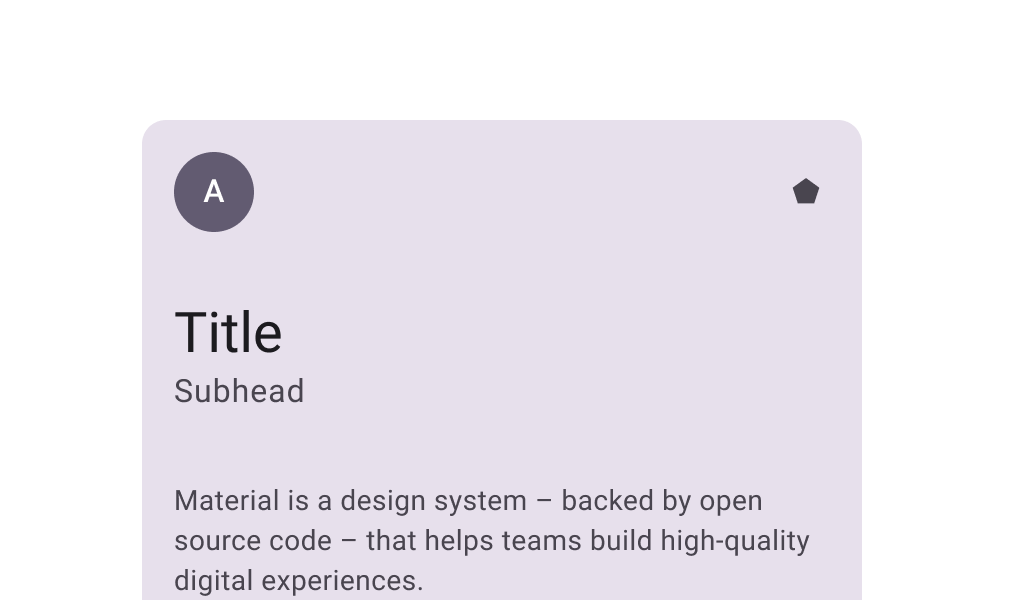
description: "Cards contain contain content and actions that relate information about a subject. Filled cards
provide subtle separation from the background. This has less emphasis than elevated or outlined
cards."
type: "component"
social_image: "/static/images/material3/filled-card.png"
---
Composable Component
Cards contain contain content and actions that relate information about a subject. Filled cards
provide subtle separation from the background. This has less emphasis than elevated or outlined
cards.
Common
```kotlin
@Composable
fun Card(
modifier: Modifier = Modifier,
shape: Shape = CardDefaults.shape,
colors: CardColors = CardDefaults.cardColors(),
elevation: CardElevation = CardDefaults.cardElevation(),
border: BorderStroke? = null,
content: @Composable ColumnScope.() -> Unit,
)
```
#### Parameters
| | |
| --- | --- |
| modifier | the `Modifier` to be applied to this card |
| shape | defines the shape of this card's container, border (when `border` is not null), and shadow (when using `elevation`) |
| colors | `CardColors` that will be used to resolve the colors used for this card in different states. See `CardDefaults.cardColors`. |
| elevation | `CardElevation` used to resolve the elevation for this card in different states. This controls the size of the shadow below the card. Additionally, when the container color is `ColorScheme.surface`, this controls the amount of primary color applied as an overlay. See also: `Surface`. |
| border | the border to draw around the container of this card |
| content | The content displayed on the card |
Common
```kotlin
@Composable
fun Card(
onClick: () -> Unit,
modifier: Modifier = Modifier,
enabled: Boolean = true,
shape: Shape = CardDefaults.shape,
colors: CardColors = CardDefaults.cardColors(),
elevation: CardElevation = CardDefaults.cardElevation(),
border: BorderStroke? = null,
interactionSource: MutableInteractionSource? = null,
content: @Composable ColumnScope.() -> Unit,
)
```
#### Parameters
| | |
| --- | --- |
| onClick | called when this card is clicked |
| modifier | the `Modifier` to be applied to this card |
| enabled | controls the enabled state of this card. When `false`, this component will not respond to user input, and it will appear visually disabled and disabled to accessibility services. |
| shape | defines the shape of this card's container, border (when `border` is not null), and shadow (when using `elevation`) |
| colors | `CardColors` that will be used to resolve the color(s) used for this card in different states. See `CardDefaults.cardColors`. |
| elevation | `CardElevation` used to resolve the elevation for this card in different states. This controls the size of the shadow below the card. Additionally, when the container color is `ColorScheme.surface`, this controls the amount of primary color applied as an overlay. See also: `Surface`. |
| border | the border to draw around the container of this card |
| interactionSource | an optional hoisted `MutableInteractionSource` for observing and emitting `Interaction`s for this card. You can use this to change the card's appearance or preview the card in different states. Note that if `null` is provided, interactions will still happen internally. |
| content | The content displayed on the card |
## Code Examples
### CardSample
```kotlin
@Preview
@Composable
fun CardSample() {
Card(Modifier.size(width = 180.dp, height = 100.dp)) {
Box(Modifier.fillMaxSize()) { Text("Card content", Modifier.align(Alignment.Center)) }
}
}
```
### ClickableCardSample
```kotlin
@Preview
@Composable
fun ClickableCardSample() {
Card(
onClick = { /* Do something */ },
modifier = Modifier.size(width = 180.dp, height = 100.dp),
) {
Box(Modifier.fillMaxSize()) { Text("Clickable", Modifier.align(Alignment.Center)) }
}
}
```