---
title: "Checkbox"
description: "Checkboxes allow users to select one or more items from a set. Checkboxes can turn an option on
or off."
type: "component"
social_image: "/static/images/material3/checkbox.png"
---
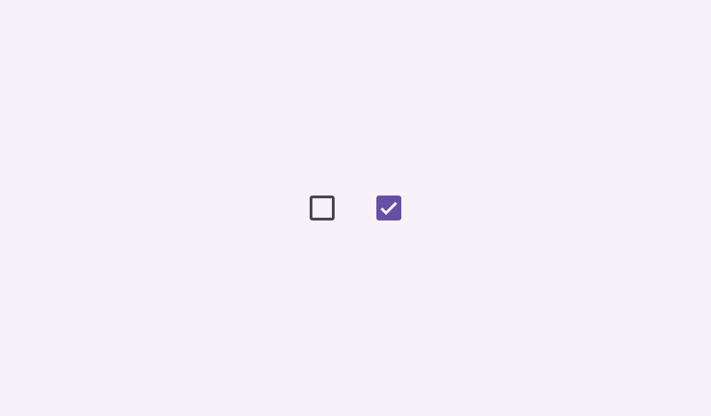
Composable Component
Checkboxes allow users to select one or more items from a set. Checkboxes can turn an option on
or off.
Common
```kotlin
@Composable
fun Checkbox(
checked: Boolean,
onCheckedChange: ((Boolean) -> Unit)?,
modifier: Modifier = Modifier,
enabled: Boolean = true,
colors: CheckboxColors = CheckboxDefaults.colors(),
interactionSource: MutableInteractionSource? = null,
)
```
#### Parameters
| | |
| --- | --- |
| checked | whether this checkbox is checked or unchecked |
| onCheckedChange | called when this checkbox is clicked. If `null`, then this checkbox will not be interactable, unless something else handles its input events and updates its state. |
| modifier | the `Modifier` to be applied to this checkbox |
| enabled | controls the enabled state of this checkbox. When `false`, this component will not respond to user input, and it will appear visually disabled and disabled to accessibility services. |
| colors | `CheckboxColors` that will be used to resolve the colors used for this checkbox in different states. See `CheckboxDefaults.colors`. |
| interactionSource | an optional hoisted `MutableInteractionSource` for observing and emitting `Interaction`s for this checkbox. You can use this to change the checkbox's appearance or preview the checkbox in different states. Note that if `null` is provided, interactions will still happen internally. |
Common
```kotlin
@Composable
fun Checkbox(
checked: Boolean,
onCheckedChange: ((Boolean) -> Unit)?,
checkmarkStroke: Stroke,
outlineStroke: Stroke,
modifier: Modifier = Modifier,
enabled: Boolean = true,
colors: CheckboxColors = CheckboxDefaults.colors(),
interactionSource: MutableInteractionSource? = null,
)
```
#### Parameters
| | |
| --- | --- |
| checked | whether this checkbox is checked or unchecked |
| onCheckedChange | called when this checkbox is clicked. If `null`, then this checkbox will not be interactable, unless something else handles its input events and updates its state. |
| checkmarkStroke | stroke for the checkmark. |
| outlineStroke | stroke for the checkmark's box outline. Note that this stroke is applied when drawing the outline's rounded rectangle, so attributions such as `androidx.compose.ui.graphics.StrokeJoin` will be ignored. |
| modifier | the `Modifier` to be applied to this checkbox |
| enabled | controls the enabled state of this checkbox. When `false`, this component will not respond to user input, and it will appear visually disabled and disabled to accessibility services. |
| colors | `CheckboxColors` that will be used to resolve the colors used for this checkbox in different states. See `CheckboxDefaults.colors`. |
| interactionSource | an optional hoisted `MutableInteractionSource` for observing and emitting `Interaction`s for this checkbox. You can use this to change the checkbox's appearance or preview the checkbox in different states. Note that if `null` is provided, interactions will still happen internally. |
## Code Examples
### CheckboxRoundedStrokesSample
```kotlin
@Preview
@Composable
fun CheckboxRoundedStrokesSample() {
val strokeWidthPx = with(LocalDensity.current) { floor(CheckboxDefaults.StrokeWidth.toPx()) }
val checkmarkStroke =
remember(strokeWidthPx) {
Stroke(width = strokeWidthPx, cap = StrokeCap.Round, join = StrokeJoin.Round)
}
val outlineStroke = remember(strokeWidthPx) { Stroke(width = strokeWidthPx) }
val checkedState = remember { mutableStateOf(true) }
Checkbox(
checked = checkedState.value,
onCheckedChange = { checkedState.value = it },
checkmarkStroke = checkmarkStroke,
outlineStroke = outlineStroke,
)
}
```
### CheckboxSample
```kotlin
@Preview
@Composable
fun CheckboxSample() {
val checkedState = remember { mutableStateOf(true) }
Checkbox(checked = checkedState.value, onCheckedChange = { checkedState.value = it })
}
```
### CheckboxWithTextSample
```kotlin
@Preview
@Composable
fun CheckboxWithTextSample() {
val (checkedState, onStateChange) = remember { mutableStateOf(true) }
val interactionSource = remember { MutableInteractionSource() }
Row(
Modifier.fillMaxWidth()
.height(56.dp)
.toggleable(
value = checkedState,
onValueChange = { onStateChange(!checkedState) },
role = Role.Checkbox,
indication = null,
interactionSource = interactionSource,
)
.padding(horizontal = 16.dp),
verticalAlignment = Alignment.CenterVertically,
) {
Checkbox(
checked = checkedState,
interactionSource = interactionSource,
onCheckedChange = onStateChange,
)
Text(
text = "Option selection",
style = MaterialTheme.typography.bodyLarge,
modifier = Modifier.padding(start = 16.dp),
)
}
}
```