Composable Component
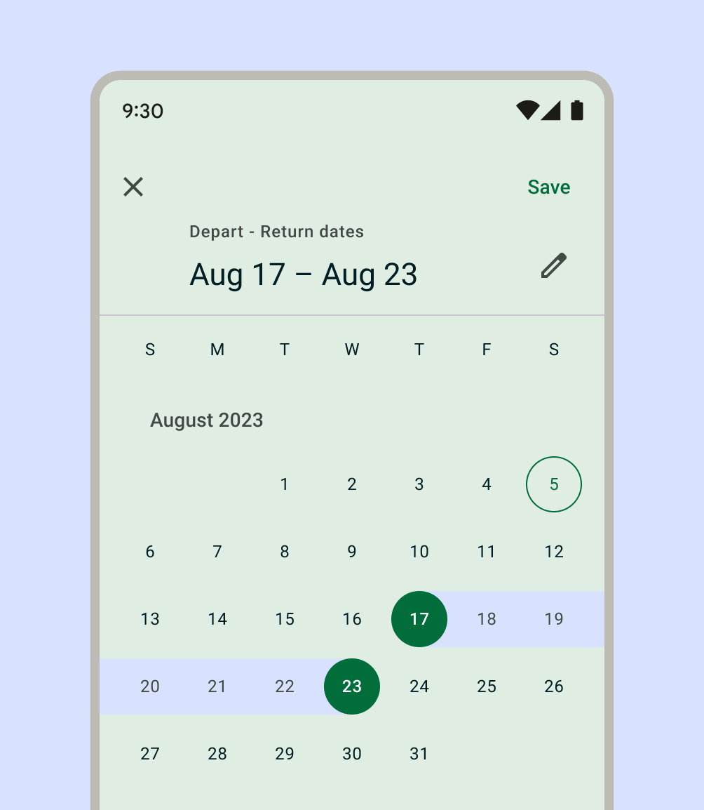
Date range pickers let people select a range of dates and can be embedded into Dialogs.
Common
```kotlin
@Composable
fun DateRangePicker(
state: DateRangePickerState,
modifier: Modifier = Modifier,
dateFormatter: DatePickerFormatter = remember { DatePickerDefaults.dateFormatter() },
colors: DatePickerColors = DatePickerDefaults.colors(),
title: (@Composable () -> Unit)? = {
DateRangePickerDefaults.DateRangePickerTitle(
displayMode = state.displayMode,
modifier = Modifier.padding(DateRangePickerTitlePadding),
contentColor = colors.titleContentColor,
)
},
headline: (@Composable () -> Unit)? = {
DateRangePickerDefaults.DateRangePickerHeadline(
selectedStartDateMillis = state.selectedStartDateMillis,
selectedEndDateMillis = state.selectedEndDateMillis,
displayMode = state.displayMode,
dateFormatter,
modifier = Modifier.padding(DateRangePickerHeadlinePadding),
contentColor = colors.headlineContentColor,
)
},
showModeToggle: Boolean = true,
focusRequester: FocusRequester? = remember { FocusRequester() },
)
```
#### Parameters
| | |
| --- | --- |
| state | state of the date range picker. See `rememberDateRangePickerState`. |
| modifier | the `Modifier` to be applied to this date range picker |
| dateFormatter | a `DatePickerFormatter` that provides formatting skeletons for dates display |
| colors | `DatePickerColors` that will be used to resolve the colors used for this date range picker in different states. See `DatePickerDefaults.colors`. |
| title | the title to be displayed in the date range picker |
| headline | the headline to be displayed in the date range picker |
| showModeToggle | indicates if this DateRangePicker should show a mode toggle action that transforms it into a date range input |
| focusRequester | a focus requester that will be used to focus the text field when the date picker is in an input mode. Pass `null` to not focus the text field if that's the desired behavior. |