---
title: "DropdownMenuGroup"
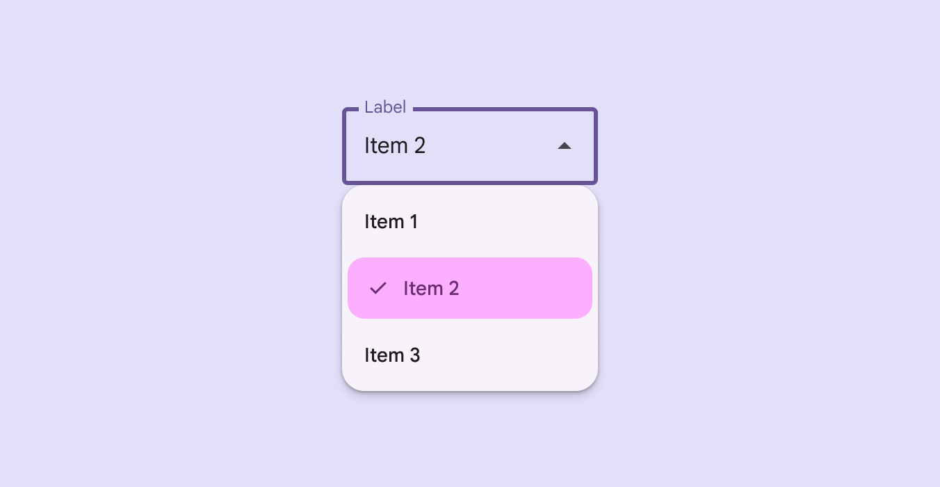
description: "A composable for creating a visually distinct group within a `DropdownMenuPopup`."
type: "component"
social_image: "/static/images/material3/exposed-dropdown-menu-selectable-items.png"
---
Composable Component
A composable for creating a visually distinct group within a `DropdownMenuPopup`.
Common
```kotlin
@ExperimentalMaterial3ExpressiveApi
@Composable
fun DropdownMenuGroup(
shapes: MenuGroupShapes,
modifier: Modifier = Modifier,
containerColor: Color = MenuDefaults.groupStandardContainerColor,
tonalElevation: Dp = MenuDefaults.TonalElevation,
shadowElevation: Dp = MenuDefaults.ShadowElevation,
border: BorderStroke? = null,
contentPadding: PaddingValues = MenuDefaults.DropdownMenuGroupContentPadding,
interactionSource: MutableInteractionSource? = null,
content: @Composable ColumnScope.() -> Unit,
)
```
#### Parameters
| | |
| --- | --- |
| shapes | the `MenuGroupShapes` of the menu group. The shapes provided should be determined by the number of groups in the menu as well as the group's position in the menu. There is a convenience function that can be used to easily determine the shape to be used at `MenuDefaults.groupShape` |
| modifier | `Modifier` to be applied to this menu group. |
| containerColor | the container color of the menu group. There are two predefined container colors at `MenuDefaults.groupStandardContainerColor` and `MenuDefaults.groupVibrantContainerColor` which you can use. |
| tonalElevation | when `containerColor` is `ColorScheme.surface`, a translucent primary color overlay is applied on top of the container. A higher tonal elevation value will result in a darker color in light theme and lighter color in dark theme. See also: `Surface`. |
| shadowElevation | the elevation for the shadow below the menu group. |
| border | the border to draw around the container of the menu group. |
| contentPadding | the padding applied to the content of this menu group. |
| interactionSource | an optional hoisted `MutableInteractionSource` for observing and emitting `Interaction`s for this menu group. |
| content | the content of this menu group, typically `DropdownMenuItem`s. |
## Code Examples
### GroupedMenuSample
```kotlin
@OptIn(ExperimentalMaterial3Api::class, ExperimentalMaterial3ExpressiveApi::class)
@Preview
@Composable
fun GroupedMenuSample() {
val groupInteractionSource = remember { MutableInteractionSource() }
var expanded by remember { mutableStateOf(false) }
var homeChecked by remember { mutableStateOf(false) }
val groupLabels = listOf("Modification", "Navigation")
val groupItemLabels = listOf(listOf("Edit", "Settings"), listOf("Home", "More Options"))
val groupItemLeadingIcons =
listOf(
listOf(Icons.Outlined.Edit, Icons.Outlined.Settings),
listOf(null, Icons.Outlined.Info),
)
val groupItemCheckedLeadingIcons =
listOf(
listOf(Icons.Filled.Edit, Icons.Filled.Settings),
listOf(Icons.Filled.Check, Icons.Filled.Info),
)
val groupItemTrailingIcons: List> =
listOf(listOf(null, null), listOf(Icons.Outlined.Home, Icons.Outlined.MoreVert))
val groupItemCheckedTrailingIcons: List> =
listOf(listOf(null, null), listOf(Icons.Filled.Home, Icons.Filled.MoreVert))
val groupItemSupportingText: List> =
listOf(listOf("Edit mode", null), listOf(null, "Opens menu"))
val checked = remember {
listOf(mutableStateListOf(false, false), mutableStateListOf(false, false))
}
Box(modifier = Modifier.fillMaxSize().wrapContentSize(Alignment.TopStart)) {
// Icon button should have a tooltip associated with it for a11y.
TooltipBox(
positionProvider =
TooltipDefaults.rememberTooltipPositionProvider(TooltipAnchorPosition.Above),
tooltip = { PlainTooltip { Text("Localized description") } },
state = rememberTooltipState(),
) {
IconButton(onClick = { expanded = true }) {
Icon(Icons.Default.MoreVert, contentDescription = "Localized description")
}
}
DropdownMenuPopup(expanded = expanded, onDismissRequest = { expanded = false }) {
val groupCount = groupLabels.size
groupLabels.fastForEachIndexed { groupIndex, label ->
DropdownMenuGroup(
shapes = MenuDefaults.groupShape(groupIndex, groupCount),
interactionSource = groupInteractionSource,
) {
MenuDefaults.Label { Text(label) }
HorizontalDivider(
modifier = Modifier.padding(MenuDefaults.HorizontalDividerPadding)
)
val groupItemCount = groupItemLabels[groupIndex].size
groupItemLabels[groupIndex].fastForEachIndexed { itemIndex, itemLabel ->
DropdownMenuItem(
text = { Text(itemLabel) },
supportingText =
groupItemSupportingText[groupIndex][itemIndex]?.let { supportingText
->
{ Text(supportingText) }
},
shapes = MenuDefaults.itemShape(itemIndex, groupItemCount),
leadingIcon =
groupItemLeadingIcons[groupIndex][itemIndex]?.let { iconData ->
{
Icon(
iconData,
modifier = Modifier.size(MenuDefaults.LeadingIconSize),
contentDescription = null,
)
}
},
checkedLeadingIcon = {
Icon(
groupItemCheckedLeadingIcons[groupIndex][itemIndex],
modifier = Modifier.size(MenuDefaults.LeadingIconSize),
contentDescription = null,
)
},
trailingIcon =
if (checked[groupIndex][itemIndex]) {
groupItemCheckedTrailingIcons[groupIndex][itemIndex]?.let {
iconData ->
{
Icon(
iconData,
modifier =
Modifier.size(MenuDefaults.TrailingIconSize),
contentDescription = null,
)
}
}
} else {
groupItemTrailingIcons[groupIndex][itemIndex]?.let { iconData ->
{
Icon(
iconData,
modifier =
Modifier.size(MenuDefaults.TrailingIconSize),
contentDescription = null,
)
}
}
},
checked = checked[groupIndex][itemIndex],
onCheckedChange = { checked[groupIndex][itemIndex] = it },
)
}
}
if (groupIndex != groupCount - 1) {
Spacer(Modifier.height(MenuDefaults.GroupSpacing))
}
}
if (checked.last().last()) {
DropdownMenuButtonGroup()
}
}
}
}
```