Composable Component
A composable for creating a visually distinct group within a `DropdownMenuPopup`.
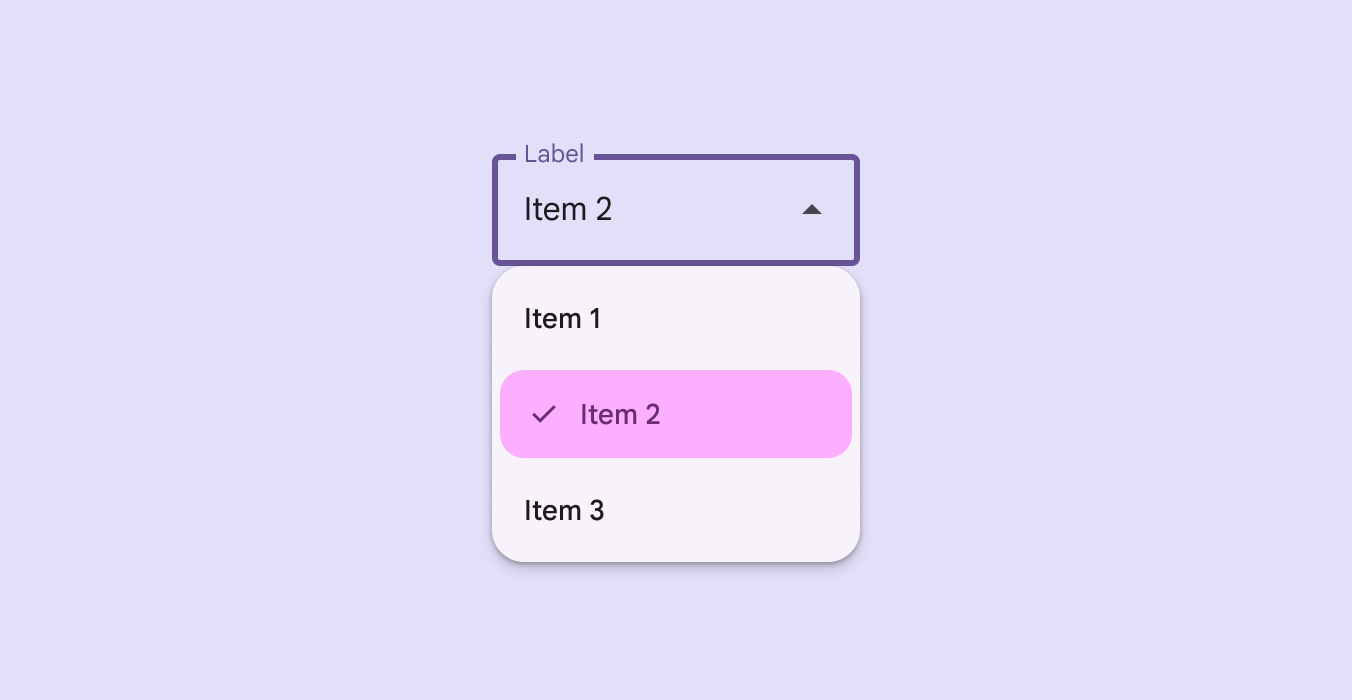
DropdownMenuGroup
Common
```kotlin
@ExperimentalMaterial3ExpressiveApi
@Composable
fun DropdownMenuGroup(
shapes: MenuGroupShapes,
modifier: Modifier = Modifier,
containerColor: Color = MenuDefaults.groupStandardContainerColor,
tonalElevation: Dp = MenuDefaults.TonalElevation,
shadowElevation: Dp = MenuDefaults.ShadowElevation,
border: BorderStroke? = null,
contentPadding: PaddingValues = MenuDefaults.DropdownMenuGroupContentPadding,
interactionSource: MutableInteractionSource? = null,
content: @Composable ColumnScope.() -> Unit,
)
```
#### Parameters
| | |
| --- | --- |
| shapes | the `MenuGroupShapes` of the menu group. The shapes provided should be determined by the number of groups in the menu as well as the group's position in the menu. There is a convenience function that can be used to easily determine the shape to be used at `MenuDefaults.groupShape` |
| modifier | `Modifier` to be applied to this menu group. |
| containerColor | the container color of the menu group. There are two predefined container colors at `MenuDefaults.groupStandardContainerColor` and `MenuDefaults.groupVibrantContainerColor` which you can use. |
| tonalElevation | when `containerColor` is `ColorScheme.surface`, a translucent primary color overlay is applied on top of the container. A higher tonal elevation value will result in a darker color in light theme and lighter color in dark theme. See also: `Surface`. |
| shadowElevation | the elevation for the shadow below the menu group. |
| border | the border to draw around the container of the menu group. |
| contentPadding | the padding applied to the content of this menu group. |
| interactionSource | an optional hoisted `MutableInteractionSource` for observing and emitting `Interaction`s for this menu group. |
| content | the content of this menu group, typically `DropdownMenuItem`s. |