Composable Component
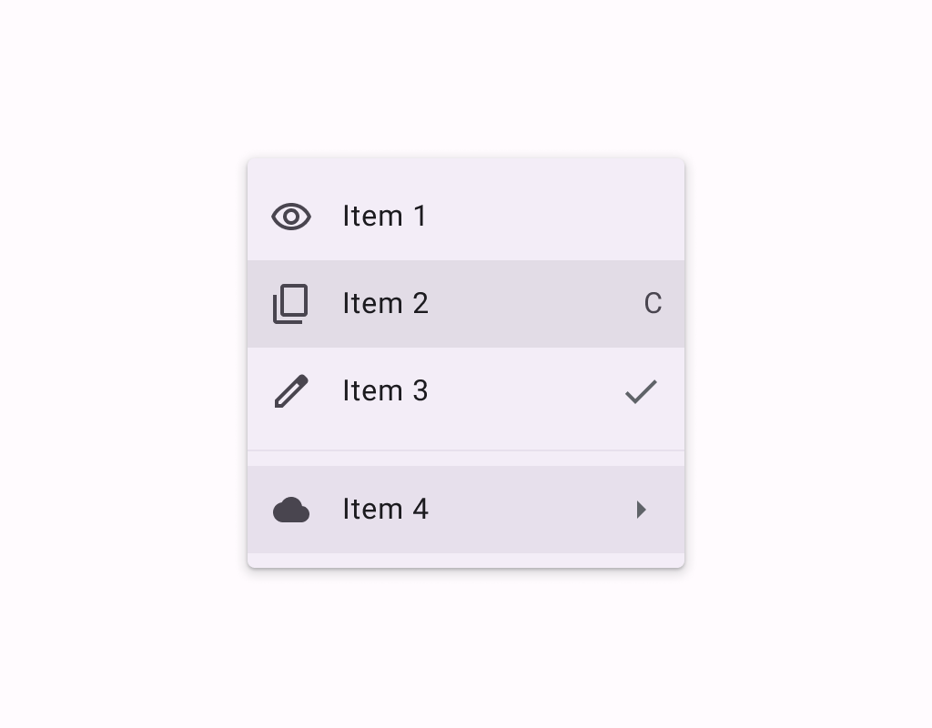
Menus display a list of choices on a temporary surface. They appear when users interact with a
button, action, or other control.
Common
```kotlin
@Composable
expect fun DropdownMenuItem(
text: @Composable () -> Unit,
onClick: () -> Unit,
modifier: Modifier = Modifier,
leadingIcon: @Composable (() -> Unit)? = null,
trailingIcon: @Composable (() -> Unit)? = null,
enabled: Boolean = true,
colors: MenuItemColors = MenuDefaults.itemColors(),
contentPadding: PaddingValues = MenuDefaults.DropdownMenuItemContentPadding,
interactionSource: MutableInteractionSource? = null,
)
```
#### Parameters
| | |
| --- | --- |
| text | text of the menu item |
| onClick | called when this menu item is clicked |
| modifier | the `Modifier` to be applied to this menu item |
| leadingIcon | optional leading icon to be displayed at the beginning of the item's text |
| trailingIcon | optional trailing icon to be displayed at the end of the item's text. This trailing icon slot can also accept `Text` to indicate a keyboard shortcut. |
| enabled | controls the enabled state of this menu item. When `false`, this component will not respond to user input, and it will appear visually disabled and disabled to accessibility services. |
| colors | `MenuItemColors` that will be used to resolve the colors used for this menu item in different states. See `MenuDefaults.itemColors`. |
| contentPadding | the padding applied to the content of this menu item |
| interactionSource | an optional hoisted `MutableInteractionSource` for observing and emitting `Interaction`s for this menu item. You can use this to change the menu item's appearance or preview the menu item in different states. Note that if `null` is provided, interactions will still happen internally. |
Common
> **Deprecated** Maintained for binary compatibility.
```kotlin
@ExperimentalMaterial3ExpressiveApi
@Composable
fun DropdownMenuItem(
onClick: () -> Unit,
text: @Composable () -> Unit,
shape: Shape,
modifier: Modifier = Modifier,
leadingIcon: @Composable (() -> Unit)? = null,
trailingIcon: @Composable (() -> Unit)? = null,
enabled: Boolean = true,
colors: MenuItemColors = MenuDefaults.itemColors(),
contentPadding: PaddingValues = MenuDefaults.DropdownMenuItemContentPadding,
interactionSource: MutableInteractionSource? = null,
) =
DropdownMenuItem(
onClick = onClick,
text = text,
shape = shape,
modifier = modifier,
supportingText = null,
leadingIcon = leadingIcon,
trailingIcon = trailingIcon,
enabled = enabled,
colors = colors,
contentPadding = contentPadding,
interactionSource = interactionSource,
)
```
#### Parameters
| | |
| --- | --- |
| onClick | called when this menu item is clicked |
| text | text of the menu item. |
| shape | `Shape` of this menu item. The shapes provided should be determined by the number of items in the group or menu as well as the item's position in the menu. Please use `MenuDefaults.leadingItemShape` for the first item in a list, `MenuDefaults.middleItemShape` for the middle items in a list, and `MenuDefaults.trailingItemShape` for the last item in a list. |
| modifier | the `Modifier` to be applied to this menu item. |
| leadingIcon | optional leading icon to be displayed when the item is unchecked. |
| trailingIcon | optional trailing icon to be displayed at the end of the item's text. |
| enabled | controls the enabled state of this menu item. When `false`, this component will not respond to user input. |
| colors | `MenuItemColors` that will be used to resolve the colors for this menu item. |
| contentPadding | the padding applied to the content of this menu item. |
| interactionSource | an optional hoisted `MutableInteractionSource` for observing and emitting `Interaction`s for this menu item. |
Common
```kotlin
@ExperimentalMaterial3ExpressiveApi
@Composable
fun DropdownMenuItem(
onClick: () -> Unit,
text: @Composable () -> Unit,
shape: Shape,
modifier: Modifier = Modifier,
leadingIcon: @Composable (() -> Unit)? = null,
trailingIcon: @Composable (() -> Unit)? = null,
enabled: Boolean = true,
colors: MenuItemColors = MenuDefaults.itemColors(),
contentPadding: PaddingValues = MenuDefaults.DropdownMenuSelectableItemContentPadding,
interactionSource: MutableInteractionSource? = null,
supportingText: @Composable (() -> Unit)? = null,
)
```
#### Parameters
| | |
| --- | --- |
| onClick | called when this menu item is clicked |
| text | text of the menu item. |
| shape | `Shape` of this menu item. The shapes provided should be determined by the number of items in the group or menu as well as the item's position in the menu. Please use `MenuDefaults.leadingItemShape` for the first item in a list, `MenuDefaults.middleItemShape` for the middle items in a list, and `MenuDefaults.trailingItemShape` for the last item in a list. |
| modifier | the `Modifier` to be applied to this menu item. |
| leadingIcon | optional leading icon to be displayed when the item is unchecked. |
| trailingIcon | optional trailing icon to be displayed at the end of the item's text. |
| enabled | controls the enabled state of this menu item. When `false`, this component will not respond to user input. |
| colors | `MenuItemColors` that will be used to resolve the colors for this menu item. |
| contentPadding | the padding applied to the content of this menu item. |
| interactionSource | an optional hoisted `MutableInteractionSource` for observing and emitting `Interaction`s for this menu item. |
| supportingText | optional supporting text of the menu item. |
Common
> **Deprecated** Maintained for binary compatibility.
```kotlin
@ExperimentalMaterial3ExpressiveApi
@Composable
fun DropdownMenuItem(
checked: Boolean,
onCheckedChange: (Boolean) -> Unit,
text: @Composable () -> Unit,
shapes: MenuItemShapes,
modifier: Modifier = Modifier,
leadingIcon: @Composable (() -> Unit)? = null,
checkedLeadingIcon: @Composable (() -> Unit)? = null,
trailingIcon: @Composable (() -> Unit)? = null,
enabled: Boolean = true,
colors: MenuItemColors = MenuDefaults.selectableItemColors(),
contentPadding: PaddingValues = MenuDefaults.DropdownMenuSelectableItemContentPadding,
interactionSource: MutableInteractionSource? = null,
) =
DropdownMenuItem(
checked = checked,
onCheckedChange = onCheckedChange,
text = text,
shapes = shapes,
modifier = modifier,
supportingText = null,
leadingIcon = leadingIcon,
trailingIcon = trailingIcon,
checkedLeadingIcon = checkedLeadingIcon,
enabled = enabled,
colors = colors,
contentPadding = contentPadding,
interactionSource = interactionSource,
)
```
#### Parameters
| | |
| --- | --- |
| checked | whether this menu item is currently checked. |
| onCheckedChange | called when this menu item is clicked, with the new checked state. |
| text | text of the menu item. |
| shapes | `MenuItemShapes` that will be used to resolve the shapes for this menu item. The shape of this item is determined by the value of `checked`. The shapes provided should be determined by the number of items in the group or menu as well as the item's position in the menu. There is a convenience function that can be used to easily determine the shape to be used at `MenuDefaults.itemShape` |
| modifier | the `Modifier` to be applied to this menu item. |
| leadingIcon | optional leading icon to be displayed when the item is unchecked. |
| checkedLeadingIcon | optional leading icon to be displayed when the item is checked. |
| trailingIcon | optional trailing icon to be displayed at the end of the item's text. |
| enabled | controls the enabled state of this menu item. When `false`, this component will not respond to user input. |
| colors | `MenuItemColors` that will be used to resolve the colors for this menu item. There are two predefined `MenuItemColors` at `MenuDefaults.selectableItemColors` and `MenuDefaults.selectableItemVibrantColors` which you can use or modify. |
| contentPadding | the padding applied to the content of this menu item. |
| interactionSource | an optional hoisted `MutableInteractionSource` for observing and emitting `Interaction`s for this menu item. |
Common
```kotlin
@ExperimentalMaterial3ExpressiveApi
@Composable
fun DropdownMenuItem(
checked: Boolean,
onCheckedChange: (Boolean) -> Unit,
text: @Composable () -> Unit,
shapes: MenuItemShapes,
modifier: Modifier = Modifier,
leadingIcon: @Composable (() -> Unit)? = null,
checkedLeadingIcon: @Composable (() -> Unit)? = null,
trailingIcon: @Composable (() -> Unit)? = null,
enabled: Boolean = true,
colors: MenuItemColors = MenuDefaults.selectableItemColors(),
contentPadding: PaddingValues = MenuDefaults.DropdownMenuSelectableItemContentPadding,
interactionSource: MutableInteractionSource? = null,
supportingText: @Composable (() -> Unit)? = null,
)
```
#### Parameters
| | |
| --- | --- |
| checked | whether this menu item is currently checked. |
| onCheckedChange | called when this menu item is clicked, with the new checked state. |
| text | text of the menu item. |
| shapes | `MenuItemShapes` that will be used to resolve the shapes for this menu item. The shape of this item is determined by the value of `checked`. The shapes provided should be determined by the number of items in the group or menu as well as the item's position in the menu. There is a convenience function that can be used to easily determine the shape to be used at `MenuDefaults.itemShape` |
| modifier | the `Modifier` to be applied to this menu item. |
| leadingIcon | optional leading icon to be displayed when the item is unchecked. |
| checkedLeadingIcon | optional leading icon to be displayed when the item is checked. |
| trailingIcon | optional trailing icon to be displayed at the end of the item's text. |
| enabled | controls the enabled state of this menu item. When `false`, this component will not respond to user input. |
| colors | `MenuItemColors` that will be used to resolve the colors for this menu item. There are two predefined `MenuItemColors` at `MenuDefaults.selectableItemColors` and `MenuDefaults.selectableItemVibrantColors` which you can use or modify. |
| contentPadding | the padding applied to the content of this menu item. |
| interactionSource | an optional hoisted `MutableInteractionSource` for observing and emitting `Interaction`s for this menu item. |
| supportingText | optional supporting text of the menu item. |
Common
> **Deprecated** Maintained for binary compatibility.
```kotlin
@ExperimentalMaterial3ExpressiveApi
@Composable
fun DropdownMenuItem(
selected: Boolean,
onClick: () -> Unit,
text: @Composable () -> Unit,
shapes: MenuItemShapes,
modifier: Modifier = Modifier,
leadingIcon: @Composable (() -> Unit)? = null,
checkedLeadingIcon: @Composable (() -> Unit)? = null,
trailingIcon: @Composable (() -> Unit)? = null,
enabled: Boolean = true,
colors: MenuItemColors = MenuDefaults.selectableItemColors(),
contentPadding: PaddingValues = MenuDefaults.DropdownMenuSelectableItemContentPadding,
interactionSource: MutableInteractionSource? = null,
) =
DropdownMenuItem(
selected = selected,
onClick = onClick,
text = text,
shapes = shapes,
modifier = modifier,
supportingText = null,
leadingIcon = leadingIcon,
trailingIcon = trailingIcon,
selectedLeadingIcon = checkedLeadingIcon,
enabled = enabled,
colors = colors,
contentPadding = contentPadding,
interactionSource = interactionSource,
)
```
#### Parameters
| | |
| --- | --- |
| selected | whether this menu item is currently selected. |
| onClick | called when this menu item is clicked. |
| text | text of the menu item. |
| shapes | `MenuItemShapes` that will be used to resolve the shapes for this menu item. The shape of this item is determined by the value of `selected`. The shapes provided should be determined by the number of items in the group or menu as well as the item's position in the menu. There is a convenience function that can be used to easily determine the shape to be used at `MenuDefaults.itemShape` |
| modifier | the `Modifier` to be applied to this menu item. |
| leadingIcon | optional leading icon to be displayed when the item is unchecked. |
| checkedLeadingIcon | optional leading icon to be displayed when the item is checked. |
| trailingIcon | optional trailing icon to be displayed at the end of the item's text. |
| enabled | controls the enabled state of this menu item. When `false`, this component will not respond to user input. |
| colors | `MenuItemColors` that will be used to resolve the colors for this menu item. There are two predefined `MenuItemColors` at `MenuDefaults.selectableItemColors` and `MenuDefaults.selectableItemVibrantColors` which you can use or modify. |
| contentPadding | the padding applied to the content of this menu item. |
| interactionSource | an optional hoisted `MutableInteractionSource` for observing and emitting `Interaction`s for this menu item. |
Common
```kotlin
@ExperimentalMaterial3ExpressiveApi
@Composable
fun DropdownMenuItem(
selected: Boolean,
onClick: () -> Unit,
text: @Composable () -> Unit,
shapes: MenuItemShapes,
modifier: Modifier = Modifier,
leadingIcon: @Composable (() -> Unit)? = null,
selectedLeadingIcon: @Composable (() -> Unit)? = null,
trailingIcon: @Composable (() -> Unit)? = null,
enabled: Boolean = true,
colors: MenuItemColors = MenuDefaults.selectableItemColors(),
contentPadding: PaddingValues = MenuDefaults.DropdownMenuSelectableItemContentPadding,
interactionSource: MutableInteractionSource? = null,
supportingText: @Composable (() -> Unit)? = null,
)
```
#### Parameters
| | |
| --- | --- |
| selected | whether this menu item is currently selected. |
| onClick | called when this menu item is clicked. |
| text | text of the menu item. |
| shapes | `MenuItemShapes` that will be used to resolve the shapes for this menu item. The shape of this item is determined by the value of `selected`. The shapes provided should be determined by the number of items in the group or menu as well as the item's position in the menu. There is a convenience function that can be used to easily determine the shape to be used at `MenuDefaults.itemShape` |
| modifier | the `Modifier` to be applied to this menu item. |
| leadingIcon | optional leading icon to be displayed when the item is unchecked. |
| selectedLeadingIcon | optional leading icon to be displayed when the item is selected. |
| trailingIcon | optional trailing icon to be displayed at the end of the item's text. |
| enabled | controls the enabled state of this menu item. When `false`, this component will not respond to user input. |
| colors | `MenuItemColors` that will be used to resolve the colors for this menu item. There are two predefined `MenuItemColors` at `MenuDefaults.selectableItemColors` and `MenuDefaults.selectableItemVibrantColors` which you can use or modify. |
| contentPadding | the padding applied to the content of this menu item. |
| interactionSource | an optional hoisted `MutableInteractionSource` for observing and emitting `Interaction`s for this menu item. |
| supportingText | optional supporting text of the menu item. |
Android
```kotlin
@Composable
actual fun DropdownMenuItem(
text: @Composable () -> Unit,
onClick: () -> Unit,
modifier: Modifier,
leadingIcon: @Composable (() -> Unit)?,
trailingIcon: @Composable (() -> Unit)?,
enabled: Boolean,
colors: MenuItemColors,
contentPadding: PaddingValues,
interactionSource: MutableInteractionSource?,
)
```