---
title: "ExtendedFloatingActionButton"
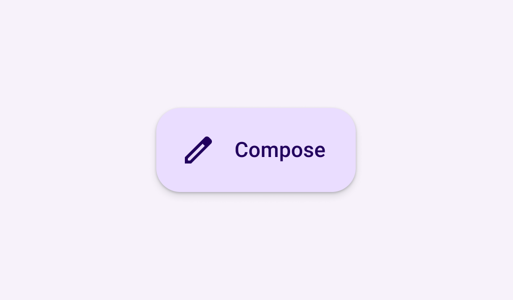
description: "Extended FABs help people take primary actions. They're wider than FABs to accommodate a text
label and larger target area."
type: "component"
social_image: "/static/images/material3/extended-fab.png"
---
Composable Component
Extended FABs help people take primary actions. They're wider than FABs to accommodate a text
label and larger target area.
Common
```kotlin
@Composable
fun ExtendedFloatingActionButton(
onClick: () -> Unit,
modifier: Modifier = Modifier,
shape: Shape = FloatingActionButtonDefaults.extendedFabShape,
containerColor: Color = FloatingActionButtonDefaults.containerColor,
contentColor: Color = contentColorFor(containerColor),
elevation: FloatingActionButtonElevation = FloatingActionButtonDefaults.elevation(),
interactionSource: MutableInteractionSource? = null,
content: @Composable RowScope.() -> Unit,
)
```
#### Parameters
| | |
| --- | --- |
| onClick | called when this FAB is clicked |
| modifier | the `Modifier` to be applied to this FAB |
| shape | defines the shape of this FAB's container and shadow (when using `elevation`) |
| containerColor | the color used for the background of this FAB. Use `Color.Transparent` to have no color. |
| contentColor | the preferred color for content inside this FAB. Defaults to either the matching content color for `containerColor`, or to the current `LocalContentColor` if `containerColor` is not a color from the theme. |
| elevation | `FloatingActionButtonElevation` used to resolve the elevation for this FAB in different states. This controls the size of the shadow below the FAB. Additionally, when the container color is `ColorScheme.surface`, this controls the amount of primary color applied as an overlay. See also: `Surface`. |
| interactionSource | an optional hoisted `MutableInteractionSource` for observing and emitting `Interaction`s for this FAB. You can use this to change the FAB's appearance or preview the FAB in different states. Note that if `null` is provided, interactions will still happen internally. |
| content | the content of this FAB, typically a `Text` label |
Common
```kotlin
@Composable
fun ExtendedFloatingActionButton(
text: @Composable () -> Unit,
icon: @Composable () -> Unit,
onClick: () -> Unit,
modifier: Modifier = Modifier,
expanded: Boolean = true,
shape: Shape = FloatingActionButtonDefaults.extendedFabShape,
containerColor: Color = FloatingActionButtonDefaults.containerColor,
contentColor: Color = contentColorFor(containerColor),
elevation: FloatingActionButtonElevation = FloatingActionButtonDefaults.elevation(),
interactionSource: MutableInteractionSource? = null,
)
```
#### Parameters
| | |
| --- | --- |
| text | label displayed inside this FAB |
| icon | icon for this FAB, typically an `Icon` |
| onClick | called when this FAB is clicked |
| modifier | the `Modifier` to be applied to this FAB |
| expanded | controls the expansion state of this FAB. In an expanded state, the FAB will show both the `icon` and `text`. In a collapsed state, the FAB will show only the `icon`. |
| shape | defines the shape of this FAB's container and shadow (when using `elevation`) |
| containerColor | the color used for the background of this FAB. Use `Color.Transparent` to have no color. |
| contentColor | the preferred color for content inside this FAB. Defaults to either the matching content color for `containerColor`, or to the current `LocalContentColor` if `containerColor` is not a color from the theme. |
| elevation | `FloatingActionButtonElevation` used to resolve the elevation for this FAB in different states. This controls the size of the shadow below the FAB. Additionally, when the container color is `ColorScheme.surface`, this controls the amount of primary color applied as an overlay. See also: `Surface`. |
| interactionSource | an optional hoisted `MutableInteractionSource` for observing and emitting `Interaction`s for this FAB. You can use this to change the FAB's appearance or preview the FAB in different states. Note that if `null` is provided, interactions will still happen internally. |
## Code Examples
### AnimatedExtendedFloatingActionButtonSample
```kotlin
@OptIn(ExperimentalMaterial3Api::class)
@Preview
@Composable
fun AnimatedExtendedFloatingActionButtonSample() {
val listState = rememberLazyListState()
// The FAB is initially expanded. Once the first visible item is past the first item we
// collapse the FAB. We use a remembered derived state to minimize unnecessary compositions.
val expandedFab by remember { derivedStateOf { listState.firstVisibleItemIndex == 0 } }
Scaffold(
floatingActionButton = {
// A collapsed FAB should have a tooltip associated with it.
TooltipBox(
positionProvider =
TooltipDefaults.rememberTooltipPositionProvider(TooltipAnchorPosition.Above),
tooltip = {
if (!expandedFab) {
PlainTooltip { Text("Localized description") }
}
},
state = rememberTooltipState(),
) {
ExtendedFloatingActionButton(
onClick = { /* do something */ },
expanded = expandedFab,
icon = { Icon(Icons.Filled.Add, "Localized Description") },
text = { Text(text = "Extended FAB") },
)
}
},
floatingActionButtonPosition = FabPosition.End,
) {
LazyColumn(state = listState, modifier = Modifier.fillMaxSize()) {
for (index in 0 until 100) {
item { Text(text = "List item - $index", modifier = Modifier.padding(24.dp)) }
}
}
}
}
```
### ExtendedFloatingActionButtonSample
```kotlin
@Preview
@Composable
fun ExtendedFloatingActionButtonSample() {
ExtendedFloatingActionButton(
onClick = { /* do something */ },
icon = { Icon(Icons.Filled.Add, "Localized description") },
text = { Text(text = "Extended FAB") },
)
}
```
### ExtendedFloatingActionButtonTextSample
```kotlin
@Preview
@Composable
fun ExtendedFloatingActionButtonTextSample() {
ExtendedFloatingActionButton(onClick = { /* do something */ }) { Text(text = "Extended FAB") }
}
```