---
title: "InputChip"
description: "Chips help people enter information, make selections, filter content, or trigger actions. Chips
can show multiple interactive elements together in the same area, such as a list of selectable
movie times, or a series of email contacts."
type: "component"
social_image: "/static/images/material3/input-chip.png"
---
Composable Component
Chips help people enter information, make selections, filter content, or trigger actions. Chips
can show multiple interactive elements together in the same area, such as a list of selectable
movie times, or a series of email contacts.
Common
```kotlin
@Composable
fun InputChip(
selected: Boolean,
onClick: () -> Unit,
label: @Composable () -> Unit,
modifier: Modifier = Modifier,
enabled: Boolean = true,
leadingIcon: @Composable (() -> Unit)? = null,
avatar: @Composable (() -> Unit)? = null,
trailingIcon: @Composable (() -> Unit)? = null,
shape: Shape = InputChipDefaults.shape,
colors: SelectableChipColors = InputChipDefaults.inputChipColors(),
elevation: SelectableChipElevation? = InputChipDefaults.inputChipElevation(),
border: BorderStroke? = InputChipDefaults.inputChipBorder(enabled, selected),
horizontalArrangement: Arrangement.Horizontal = InputChipDefaults.horizontalArrangement(),
contentPadding: PaddingValues =
InputChipDefaults.contentPadding(avatar != null, leadingIcon != null, trailingIcon != null),
interactionSource: MutableInteractionSource? = null,
)
```
#### Parameters
| | |
| --- | --- |
| selected | whether this chip is selected or not |
| onClick | called when this chip is clicked |
| label | text label for this chip |
| modifier | the `Modifier` to be applied to this chip |
| enabled | controls the enabled state of this chip. When `false`, this component will not respond to user input, and it will appear visually disabled and disabled to accessibility services. |
| leadingIcon | optional icon at the start of the chip, preceding the `label` text |
| avatar | optional avatar at the start of the chip, preceding the `label` text |
| trailingIcon | optional icon at the end of the chip |
| shape | defines the shape of this chip's container, border (when `border` is not null), and shadow (when using `elevation`) |
| colors | `ChipColors` that will be used to resolve the colors used for this chip in different states. See `InputChipDefaults.inputChipColors`. |
| elevation | `ChipElevation` used to resolve the elevation for this chip in different states. This controls the size of the shadow below the chip. Additionally, when the container color is `ColorScheme.surface`, this controls the amount of primary color applied as an overlay. See `InputChipDefaults.inputChipElevation`. |
| border | the border to draw around the container of this chip. Pass `null` for no border. See `InputChipDefaults.inputChipBorder`. |
| horizontalArrangement | the horizontal arrangement of the chip's children. If there aren't any icons, then the horizontal padding between the `label` and the `border` will be the sum of `contentPadding` and the spacing in this `horizontalArrangement`. |
| contentPadding | the padding around the content of this chip, including the `leadingIcon`, `avatar`, `label`, and `trailingIcon`. |
| interactionSource | an optional hoisted `MutableInteractionSource` for observing and emitting `Interaction`s for this chip. You can use this to change the chip's appearance or preview the chip in different states. Note that if `null` is provided, interactions will still happen internally. |
Common
> **Deprecated** Maintained for binary compatibility
```kotlin
@Composable
fun InputChip(
selected: Boolean,
onClick: () -> Unit,
label: @Composable () -> Unit,
modifier: Modifier = Modifier,
enabled: Boolean = true,
leadingIcon: @Composable (() -> Unit)? = null,
avatar: @Composable (() -> Unit)? = null,
trailingIcon: @Composable (() -> Unit)? = null,
shape: Shape = InputChipDefaults.shape,
colors: SelectableChipColors = InputChipDefaults.inputChipColors(),
elevation: SelectableChipElevation? = InputChipDefaults.inputChipElevation(),
border: BorderStroke? = InputChipDefaults.inputChipBorder(enabled, selected),
interactionSource: MutableInteractionSource? = null,
)
```
#### Parameters
| | |
| --- | --- |
| selected | whether this chip is selected or not |
| onClick | called when this chip is clicked |
| label | text label for this chip |
| modifier | the `Modifier` to be applied to this chip |
| enabled | controls the enabled state of this chip. When `false`, this component will not respond to user input, and it will appear visually disabled and disabled to accessibility services. |
| leadingIcon | optional icon at the start of the chip, preceding the `label` text |
| avatar | optional avatar at the start of the chip, preceding the `label` text |
| trailingIcon | optional icon at the end of the chip |
| shape | defines the shape of this chip's container, border (when `border` is not null), and shadow (when using `elevation`) |
| colors | `ChipColors` that will be used to resolve the colors used for this chip in different states. See `InputChipDefaults.inputChipColors`. |
| elevation | `ChipElevation` used to resolve the elevation for this chip in different states. This controls the size of the shadow below the chip. Additionally, when the container color is `ColorScheme.surface`, this controls the amount of primary color applied as an overlay. See `InputChipDefaults.inputChipElevation`. |
| border | the border to draw around the container of this chip. Pass `null` for no border. See `InputChipDefaults.inputChipBorder`. |
| interactionSource | an optional hoisted `MutableInteractionSource` for observing and emitting `Interaction`s for this chip. You can use this to change the chip's appearance or preview the chip in different states. Note that if `null` is provided, interactions will still happen internally. |
## Code Examples
### ChipGroupReflowSample
```kotlin
@OptIn(ExperimentalLayoutApi::class)
@Preview
@Composable
fun ChipGroupReflowSample() {
var selected by remember { mutableStateOf(false) }
val colorNames =
listOf(
"Blue",
"Yellow",
"Red",
"Orange",
"Black",
"Green",
"White",
"Magenta",
"Gray",
"Transparent",
)
Column {
FlowRow(
modifier =
Modifier.fillMaxWidth(1f)
.wrapContentHeight(align = Alignment.Top)
.then(
if (selected) {
Modifier.verticalScroll(rememberScrollState())
} else {
Modifier.horizontalScroll(rememberScrollState())
}
),
horizontalArrangement = Arrangement.Start,
maxLines = if (!selected) 1 else Int.MAX_VALUE,
) {
/*
* When chip lists exceed the available horizontal screen space, one option is to
* provide a leading chip that expands the list into a vertical scrolling list. This
* ensures all options are accessible while maintaining the position of the content
* below the chip list.
*/
FilterChip(
selected = selected,
modifier =
Modifier.padding(horizontal = 4.dp)
.align(alignment = Alignment.CenterVertically),
onClick = { selected = !selected },
label = { Text("Show All") },
leadingIcon = {
Icon(
imageVector = Icons.Filled.Tune,
contentDescription = "Localized Description",
modifier = Modifier.size(FilterChipDefaults.IconSize),
)
},
)
Box(
Modifier.height(FilterChipDefaults.Height)
.align(alignment = Alignment.CenterVertically)
) {
VerticalDivider()
}
colorNames.fastForEachIndexed { index, element ->
AssistChip(
modifier =
Modifier.padding(horizontal = 4.dp)
.align(alignment = Alignment.CenterVertically),
onClick = { /* do something*/ },
label = { Text("$element $index") },
)
}
}
}
}
```
### ChipGroupSingleLineSample
```kotlin
@Preview
@Composable
fun ChipGroupSingleLineSample() {
var expanded by remember { mutableStateOf(false) }
val listSize = 9
val chipData = List(listSize) { index -> "Chip $index" }
Column(horizontalAlignment = Alignment.CenterHorizontally) {
Row(modifier = Modifier.horizontalScroll(rememberScrollState())) {
AssistChip(
onClick = { expanded = !expanded },
label = { Text("Show All") },
leadingIcon = {
Icon(
imageVector = Icons.Filled.Tune,
contentDescription = "Localized Description",
modifier = Modifier.size(FilterChipDefaults.IconSize),
)
},
)
/*
* When chip lists exceed the available horizontal screen space, one option is to
* provide a chip button that opens a menu displaying all chip options. This ensures
* all options are accessible while maintaining the position of the content below the
* chip list.
*/
DropdownMenu(expanded = expanded, onDismissRequest = { expanded = false }) {
repeat(listSize) { index ->
DropdownMenuItem(
text = { Text(chipData[index]) },
onClick = {},
trailingIcon = {
Icon(Icons.AutoMirrored.Filled.ArrowRight, contentDescription = null)
},
)
}
}
repeat(listSize) { index ->
AssistChip(
modifier = Modifier.padding(horizontal = 4.dp),
onClick = { /* do something*/ },
label = { Text(chipData[index]) },
trailingIcon = { Icon(Icons.Filled.ArrowDropDown, contentDescription = null) },
)
}
}
}
}
```
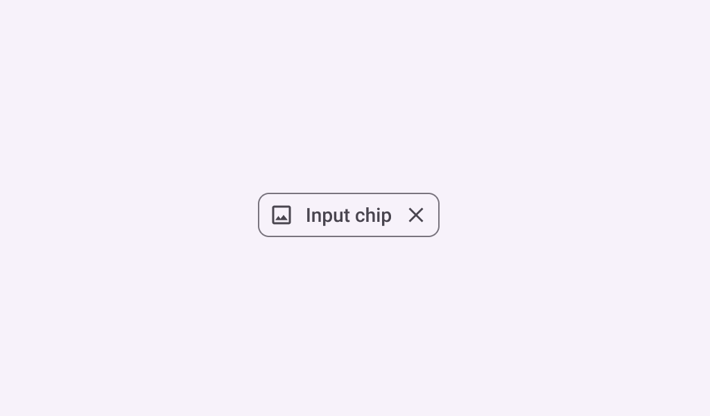
### InputChipSample
```kotlin
@Preview
@Composable
fun InputChipSample() {
var selected by remember { mutableStateOf(false) }
InputChip(
selected = selected,
onClick = { selected = !selected },
label = { Text("Input Chip") },
)
}
```
### InputChipWithAvatarSample
```kotlin
@Preview
@Composable
fun InputChipWithAvatarSample() {
var selected by remember { mutableStateOf(false) }
InputChip(
selected = selected,
onClick = { selected = !selected },
label = { Text("Input Chip") },
avatar = {
Icon(
Icons.Filled.Person,
contentDescription = "Localized description",
Modifier.size(InputChipDefaults.AvatarSize),
)
},
)
}
```