Composable Component
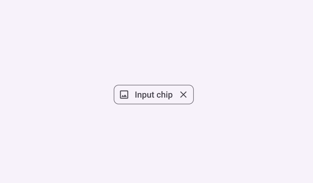
Chips help people enter information, make selections, filter content, or trigger actions. Chips
can show multiple interactive elements together in the same area, such as a list of selectable
movie times, or a series of email contacts.
InputChip
Common
```kotlin
@Composable
fun InputChip(
selected: Boolean,
onClick: () -> Unit,
label: @Composable () -> Unit,
modifier: Modifier = Modifier,
enabled: Boolean = true,
leadingIcon: @Composable (() -> Unit)? = null,
avatar: @Composable (() -> Unit)? = null,
trailingIcon: @Composable (() -> Unit)? = null,
shape: Shape = InputChipDefaults.shape,
colors: SelectableChipColors = InputChipDefaults.inputChipColors(),
elevation: SelectableChipElevation? = InputChipDefaults.inputChipElevation(),
border: BorderStroke? = InputChipDefaults.inputChipBorder(enabled, selected),
horizontalArrangement: Arrangement.Horizontal = InputChipDefaults.horizontalArrangement(),
contentPadding: PaddingValues =
InputChipDefaults.contentPadding(avatar != null, leadingIcon != null, trailingIcon != null),
interactionSource: MutableInteractionSource? = null,
)
```
#### Parameters
| | |
| --- | --- |
| selected | whether this chip is selected or not |
| onClick | called when this chip is clicked |
| label | text label for this chip |
| modifier | the `Modifier` to be applied to this chip |
| enabled | controls the enabled state of this chip. When `false`, this component will not respond to user input, and it will appear visually disabled and disabled to accessibility services. |
| leadingIcon | optional icon at the start of the chip, preceding the `label` text |
| avatar | optional avatar at the start of the chip, preceding the `label` text |
| trailingIcon | optional icon at the end of the chip |
| shape | defines the shape of this chip's container, border (when `border` is not null), and shadow (when using `elevation`) |
| colors | `ChipColors` that will be used to resolve the colors used for this chip in different states. See `InputChipDefaults.inputChipColors`. |
| elevation | `ChipElevation` used to resolve the elevation for this chip in different states. This controls the size of the shadow below the chip. Additionally, when the container color is `ColorScheme.surface`, this controls the amount of primary color applied as an overlay. See `InputChipDefaults.inputChipElevation`. |
| border | the border to draw around the container of this chip. Pass `null` for no border. See `InputChipDefaults.inputChipBorder`. |
| horizontalArrangement | the horizontal arrangement of the chip's children. If there aren't any icons, then the horizontal padding between the `label` and the `border` will be the sum of `contentPadding` and the spacing in this `horizontalArrangement`. |
| contentPadding | the padding around the content of this chip, including the `leadingIcon`, `avatar`, `label`, and `trailingIcon`. |
| interactionSource | an optional hoisted `MutableInteractionSource` for observing and emitting `Interaction`s for this chip. You can use this to change the chip's appearance or preview the chip in different states. Note that if `null` is provided, interactions will still happen internally. |
Common
> **Deprecated** Maintained for binary compatibility
```kotlin
@Composable
fun InputChip(
selected: Boolean,
onClick: () -> Unit,
label: @Composable () -> Unit,
modifier: Modifier = Modifier,
enabled: Boolean = true,
leadingIcon: @Composable (() -> Unit)? = null,
avatar: @Composable (() -> Unit)? = null,
trailingIcon: @Composable (() -> Unit)? = null,
shape: Shape = InputChipDefaults.shape,
colors: SelectableChipColors = InputChipDefaults.inputChipColors(),
elevation: SelectableChipElevation? = InputChipDefaults.inputChipElevation(),
border: BorderStroke? = InputChipDefaults.inputChipBorder(enabled, selected),
interactionSource: MutableInteractionSource? = null,
)
```
#### Parameters
| | |
| --- | --- |
| selected | whether this chip is selected or not |
| onClick | called when this chip is clicked |
| label | text label for this chip |
| modifier | the `Modifier` to be applied to this chip |
| enabled | controls the enabled state of this chip. When `false`, this component will not respond to user input, and it will appear visually disabled and disabled to accessibility services. |
| leadingIcon | optional icon at the start of the chip, preceding the `label` text |
| avatar | optional avatar at the start of the chip, preceding the `label` text |
| trailingIcon | optional icon at the end of the chip |
| shape | defines the shape of this chip's container, border (when `border` is not null), and shadow (when using `elevation`) |
| colors | `ChipColors` that will be used to resolve the colors used for this chip in different states. See `InputChipDefaults.inputChipColors`. |
| elevation | `ChipElevation` used to resolve the elevation for this chip in different states. This controls the size of the shadow below the chip. Additionally, when the container color is `ColorScheme.surface`, this controls the amount of primary color applied as an overlay. See `InputChipDefaults.inputChipElevation`. |
| border | the border to draw around the container of this chip. Pass `null` for no border. See `InputChipDefaults.inputChipBorder`. |
| interactionSource | an optional hoisted `MutableInteractionSource` for observing and emitting `Interaction`s for this chip. You can use this to change the chip's appearance or preview the chip in different states. Note that if `null` is provided, interactions will still happen internally. |