Composable Component
Lists are continuous, vertical indexes of text or images.
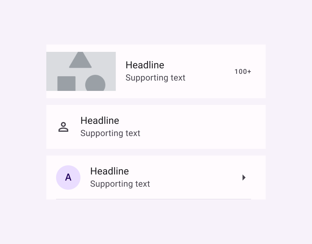
ListItem
Common
```kotlin
@Composable
fun ListItem(
headlineContent: @Composable () -> Unit,
modifier: Modifier = Modifier,
overlineContent: @Composable (() -> Unit)? = null,
supportingContent: @Composable (() -> Unit)? = null,
leadingContent: @Composable (() -> Unit)? = null,
trailingContent: @Composable (() -> Unit)? = null,
colors: ListItemColors = ListItemDefaults.colors(),
tonalElevation: Dp = ListItemDefaults.Elevation,
shadowElevation: Dp = ListItemDefaults.Elevation,
)
```
#### Parameters
| | |
| --- | --- |
| headlineContent | the headline content of the list item |
| modifier | `Modifier` to be applied to the list item |
| overlineContent | the content displayed above the headline content |
| supportingContent | the supporting content of the list item |
| leadingContent | the leading content of the list item |
| trailingContent | the trailing meta text, icon, switch or checkbox |
| colors | `ListItemColors` that will be used to resolve the background and content color for this list item in different states. See `ListItemDefaults.colors` |
| tonalElevation | the tonal elevation of this list item |
| shadowElevation | the shadow elevation of this list item |
ListItem
Common
```kotlin
@ExperimentalMaterial3ExpressiveApi
@Composable
fun ListItem(
onClick: () -> Unit,
modifier: Modifier = Modifier,
enabled: Boolean = true,
leadingContent: @Composable (() -> Unit)? = null,
trailingContent: @Composable (() -> Unit)? = null,
overlineContent: @Composable (() -> Unit)? = null,
supportingContent: @Composable (() -> Unit)? = null,
verticalAlignment: Alignment.Vertical = ListItemDefaults.verticalAlignment(),
onLongClick: (() -> Unit)? = null,
onLongClickLabel: String? = null,
shapes: ListItemShapes = ListItemDefaults.shapes(),
colors: ListItemColors = ListItemDefaults.colors(),
elevation: ListItemElevation = ListItemDefaults.elevation(),
contentPadding: PaddingValues = ListItemDefaults.ContentPadding,
interactionSource: MutableInteractionSource? = null,
content: @Composable () -> Unit,
)
```
#### Parameters
| | |
| --- | --- |
| onClick | called when this list item is clicked. |
| modifier | the `Modifier` to be applied to this list item. |
| enabled | controls the enabled state of this list item. When `false`, this component will not respond to user input, and it will appear visually disabled and disabled to accessibility services. |
| leadingContent | the leading content of this list item, such as an icon or avatar. |
| trailingContent | the trailing content of this list item, such as a checkbox, switch, or icon. |
| overlineContent | the content displayed above the main content of the list item. |
| supportingContent | the content displayed below the main content of the list item. |
| verticalAlignment | the vertical alignment of children within the list item, after accounting for `contentPadding`. |
| onLongClick | called when this list item is long clicked (long-pressed). |
| onLongClickLabel | semantic / accessibility label for the `onLongClick` action. |
| shapes | the `ListItemShapes` that this list item will use to morph between depending on the user's interaction with the list item. See `ListItemDefaults.shapes`. |
| colors | the `ListItemColors` that will be used to resolve the colors used for this list item in different states. See `ListItemDefaults.colors`. |
| elevation | the `ListItemElevation` used to resolve the elevation for this list item in different states. See `ListItemDefaults.elevation`. |
| contentPadding | the padding to be applied to the content of this list item. |
| interactionSource | an optional hoisted `MutableInteractionSource` for observing and emitting `Interaction`s for this list item. You can use this to change the list item's appearance or preview the list item in different states. Note that if `null` is provided, interactions will still happen internally. |
| content | the main content of this list item. Also known as the headline or label. |
ListItem
Common
```kotlin
@ExperimentalMaterial3ExpressiveApi
@Composable
fun ListItem(
selected: Boolean,
onClick: () -> Unit,
modifier: Modifier = Modifier,
enabled: Boolean = true,
leadingContent: @Composable (() -> Unit)? = null,
trailingContent: @Composable (() -> Unit)? = null,
overlineContent: @Composable (() -> Unit)? = null,
supportingContent: @Composable (() -> Unit)? = null,
verticalAlignment: Alignment.Vertical = ListItemDefaults.verticalAlignment(),
onLongClick: (() -> Unit)? = null,
onLongClickLabel: String? = null,
shapes: ListItemShapes = ListItemDefaults.shapes(),
colors: ListItemColors = ListItemDefaults.colors(),
elevation: ListItemElevation = ListItemDefaults.elevation(),
contentPadding: PaddingValues = ListItemDefaults.ContentPadding,
interactionSource: MutableInteractionSource? = null,
content: @Composable () -> Unit,
)
```
#### Parameters
| | |
| --- | --- |
| selected | whether or not this list item is selected. |
| onClick | called when this list item is clicked. |
| modifier | the `Modifier` to be applied to this list item. |
| enabled | controls the enabled state of this list item. When `false`, this component will not respond to user input, and it will appear visually disabled and disabled to accessibility services. |
| leadingContent | the leading content of this list item, such as an icon or avatar. |
| trailingContent | the trailing content of this list item, such as a checkbox, switch, or icon. |
| overlineContent | the content displayed above the main content of the list item. |
| supportingContent | the content displayed below the main content of the list item. |
| verticalAlignment | the vertical alignment of children within the list item, after accounting for `contentPadding`. |
| onLongClick | called when this list item is long clicked (long-pressed). |
| onLongClickLabel | semantic / accessibility label for the `onLongClick` action. |
| shapes | the `ListItemShapes` that this list item will use to morph between depending on the user's interaction with the list item. See `ListItemDefaults.shapes`. |
| colors | the `ListItemColors` that will be used to resolve the colors used for this list item in different states. See `ListItemDefaults.colors`. |
| elevation | the `ListItemElevation` used to resolve the elevation for this list item in different states. See `ListItemDefaults.elevation`. |
| contentPadding | the padding to be applied to the content of this list item. |
| interactionSource | an optional hoisted `MutableInteractionSource` for observing and emitting `Interaction`s for this list item. You can use this to change the list item's appearance or preview the list item in different states. Note that if `null` is provided, interactions will still happen internally. |
| content | the main content of this list item. Also known as the headline or label. |
ListItem
Common
```kotlin
@ExperimentalMaterial3ExpressiveApi
@Composable
fun ListItem(
checked: Boolean,
onCheckedChange: (Boolean) -> Unit,
modifier: Modifier = Modifier,
enabled: Boolean = true,
leadingContent: @Composable (() -> Unit)? = null,
trailingContent: @Composable (() -> Unit)? = null,
overlineContent: @Composable (() -> Unit)? = null,
supportingContent: @Composable (() -> Unit)? = null,
verticalAlignment: Alignment.Vertical = ListItemDefaults.verticalAlignment(),
onLongClick: (() -> Unit)? = null,
onLongClickLabel: String? = null,
shapes: ListItemShapes = ListItemDefaults.shapes(),
colors: ListItemColors = ListItemDefaults.colors(),
elevation: ListItemElevation = ListItemDefaults.elevation(),
contentPadding: PaddingValues = ListItemDefaults.ContentPadding,
interactionSource: MutableInteractionSource? = null,
content: @Composable () -> Unit,
)
```
#### Parameters
| | |
| --- | --- |
| checked | whether this list item is toggled on or off. |
| onCheckedChange | called when this toggleable list item is clicked. |
| modifier | the `Modifier` to be applied to this list item. |
| enabled | controls the enabled state of this list item. When `false`, this component will not respond to user input, and it will appear visually disabled and disabled to accessibility services. |
| leadingContent | the leading content of this list item, such as an icon or avatar. |
| trailingContent | the trailing content of this list item, such as a checkbox, switch, or icon. |
| overlineContent | the content displayed above the main content of the list item. |
| supportingContent | the content displayed below the main content of the list item. |
| verticalAlignment | the vertical alignment of children within the list item, after accounting for `contentPadding`. |
| onLongClick | called when this list item is long clicked (long-pressed). |
| onLongClickLabel | semantic / accessibility label for the `onLongClick` action. |
| shapes | the `ListItemShapes` that this list item will use to morph between depending on the user's interaction with the list item. See `ListItemDefaults.shapes`. |
| colors | the `ListItemColors` that will be used to resolve the colors used for this list item in different states. See `ListItemDefaults.colors`. |
| elevation | the `ListItemElevation` used to resolve the elevation for this list item in different states. See `ListItemDefaults.elevation`. |
| contentPadding | the padding to be applied to the content of this list item. |
| interactionSource | an optional hoisted `MutableInteractionSource` for observing and emitting `Interaction`s for this list item. You can use this to change the list item's appearance or preview the list item in different states. Note that if `null` is provided, interactions will still happen internally. |
| content | the main content of this list item. Also known as the headline or label. |