Composable Component
Navigation drawers provide ergonomic access to destinations in an app.
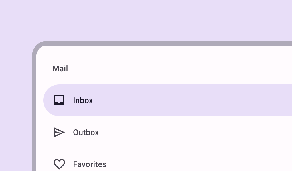
ModalNavigationDrawer
Common
```kotlin
@Composable
fun ModalNavigationDrawer(
drawerContent: @Composable () -> Unit,
modifier: Modifier = Modifier,
drawerState: DrawerState = rememberDrawerState(DrawerValue.Closed),
gesturesEnabled: Boolean = true,
scrimColor: Color = DrawerDefaults.scrimColor,
content: @Composable () -> Unit,
)
```
#### Parameters
| | |
| --- | --- |
| drawerContent | content inside this drawer |
| modifier | the `Modifier` to be applied to this drawer |
| drawerState | state of the drawer |
| gesturesEnabled | whether or not the drawer can be interacted by gestures |
| scrimColor | color of the scrim that obscures content when the drawer is open |
| content | content of the rest of the UI |