Composable Component
Snackbars provide brief messages about app processes at the bottom of the screen.
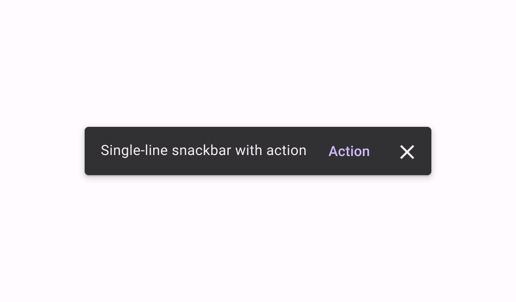
Snackbar
Common
```kotlin
@Composable
fun Snackbar(
modifier: Modifier = Modifier,
action: @Composable (() -> Unit)? = null,
dismissAction: @Composable (() -> Unit)? = null,
actionOnNewLine: Boolean = false,
shape: Shape = SnackbarDefaults.shape,
containerColor: Color = SnackbarDefaults.color,
contentColor: Color = SnackbarDefaults.contentColor,
actionContentColor: Color = SnackbarDefaults.actionContentColor,
dismissActionContentColor: Color = SnackbarDefaults.dismissActionContentColor,
content: @Composable () -> Unit,
)
```
#### Parameters
| | |
| --- | --- |
| modifier | the `Modifier` to be applied to this snackbar |
| action | action / button component to add as an action to the snackbar. Consider using `ColorScheme.inversePrimary` as the color for the action, if you do not have a predefined color you wish to use instead. |
| dismissAction | action / button component to add as an additional close affordance action when a snackbar is non self-dismissive. Consider using `ColorScheme.inverseOnSurface` as the color for the action, if you do not have a predefined color you wish to use instead. |
| actionOnNewLine | whether or not action should be put on a separate line. Recommended for action with long action text. |
| shape | defines the shape of this snackbar's container |
| containerColor | the color used for the background of this snackbar. Use `Color.Transparent` to have no color. |
| contentColor | the preferred color for content inside this snackbar |
| actionContentColor | the preferred content color for the optional `action` inside this snackbar |
| dismissActionContentColor | the preferred content color for the optional `dismissAction` inside this snackbar |
| content | content to show information about a process that an app has performed or will perform |
Snackbar
Common
```kotlin
@Composable
fun Snackbar(
snackbarData: SnackbarData,
modifier: Modifier = Modifier,
actionOnNewLine: Boolean = false,
shape: Shape = SnackbarDefaults.shape,
containerColor: Color = SnackbarDefaults.color,
contentColor: Color = SnackbarDefaults.contentColor,
actionColor: Color = SnackbarDefaults.actionColor,
actionContentColor: Color = SnackbarDefaults.actionContentColor,
dismissActionContentColor: Color = SnackbarDefaults.dismissActionContentColor,
)
```
#### Parameters
| | |
| --- | --- |
| snackbarData | data about the current snackbar showing via `SnackbarHostState` |
| modifier | the `Modifier` to be applied to this snackbar |
| actionOnNewLine | whether or not action should be put on a separate line. Recommended for action with long action text. |
| shape | defines the shape of this snackbar's container |
| containerColor | the color used for the background of this snackbar. Use `Color.Transparent` to have no color. |
| contentColor | the preferred color for content inside this snackbar |
| actionColor | the color of the snackbar's action |
| actionContentColor | the preferred content color for the optional action inside this snackbar. See `SnackbarVisuals.actionLabel`. |
| dismissActionContentColor | the preferred content color for the optional dismiss action inside this snackbar. See `SnackbarVisuals.withDismissAction`. |