Composable Component
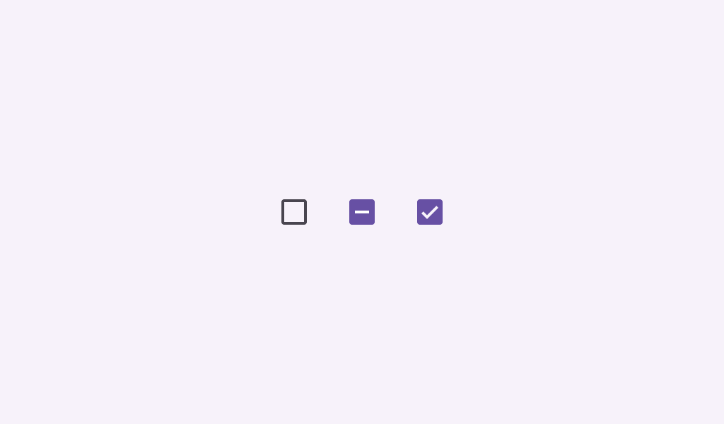
Checkboxes can have a parent-child relationship with other checkboxes. When the parent checkbox
is checked, all child checkboxes are checked. If a parent checkbox is unchecked, all child
checkboxes are unchecked. If some, but not all, child checkboxes are checked, the parent checkbox
becomes an indeterminate checkbox.
TriStateCheckbox
Common
```kotlin
@Composable
fun TriStateCheckbox(
state: ToggleableState,
onClick: (() -> Unit)?,
modifier: Modifier = Modifier,
enabled: Boolean = true,
colors: CheckboxColors = CheckboxDefaults.colors(),
interactionSource: MutableInteractionSource? = null,
)
```
#### Parameters
| | |
| --- | --- |
| state | whether this checkbox is checked, unchecked, or in an indeterminate state |
| onClick | called when this checkbox is clicked. If `null`, then this checkbox will not be interactable, unless something else handles its input events and updates its `state`. |
| modifier | the `Modifier` to be applied to this checkbox |
| enabled | controls the enabled state of this checkbox. When `false`, this component will not respond to user input, and it will appear visually disabled and disabled to accessibility services. |
| colors | `CheckboxColors` that will be used to resolve the colors used for this checkbox in different states. See `CheckboxDefaults.colors`. |
| interactionSource | an optional hoisted `MutableInteractionSource` for observing and emitting `Interaction`s for this checkbox. You can use this to change the checkbox's appearance or preview the checkbox in different states. Note that if `null` is provided, interactions will still happen internally. |
TriStateCheckbox
Common
```kotlin
@Composable
fun TriStateCheckbox(
state: ToggleableState,
onClick: (() -> Unit)?,
checkmarkStroke: Stroke,
outlineStroke: Stroke,
modifier: Modifier = Modifier,
enabled: Boolean = true,
colors: CheckboxColors = CheckboxDefaults.colors(),
interactionSource: MutableInteractionSource? = null,
)
```
#### Parameters
| | |
| --- | --- |
| state | whether this checkbox is checked, unchecked, or in an indeterminate state |
| onClick | called when this checkbox is clicked. If `null`, then this checkbox will not be interactable, unless something else handles its input events and updates its `state`. |
| checkmarkStroke | stroke for the checkmark. |
| outlineStroke | stroke for the checkmark's box outline. Note that this stroke is applied when drawing the outline's rounded rectangle, so attributions such as `androidx.compose.ui.graphics.StrokeJoin` will be ignored. |
| modifier | the `Modifier` to be applied to this checkbox |
| enabled | controls the enabled state of this checkbox. When `false`, this component will not respond to user input, and it will appear visually disabled and disabled to accessibility services. |
| colors | `CheckboxColors` that will be used to resolve the colors used for this checkbox in different states. See `CheckboxDefaults.colors`. |
| interactionSource | an optional hoisted `MutableInteractionSource` for observing and emitting `Interaction`s for this checkbox. You can use this to change the checkbox's appearance or preview the checkbox in different states. Note that if `null` is provided, interactions will still happen internally. |