---
title: "TwoRowsTopAppBar"
description: "A basic two-rows Material Design top app bar."
type: "component"
social_image: "/static/images/material3/medium-top-app-bar.png"
---
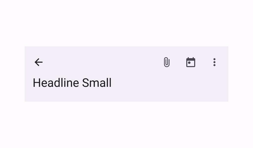
Composable Component
A basic two-rows Material Design top app bar.
Common
```kotlin
@ExperimentalMaterial3ExpressiveApi
@Composable
fun TwoRowsTopAppBar(
title: @Composable (expanded: Boolean) -> Unit,
modifier: Modifier = Modifier,
subtitle: (@Composable (expanded: Boolean) -> Unit)? = null,
navigationIcon: @Composable () -> Unit = {},
actions: @Composable RowScope.() -> Unit = {},
titleHorizontalAlignment: Alignment.Horizontal = Alignment.Start,
collapsedHeight: Dp = Dp.Unspecified,
expandedHeight: Dp = Dp.Unspecified,
windowInsets: WindowInsets = TopAppBarDefaults.windowInsets,
colors: TopAppBarColors = TopAppBarDefaults.topAppBarColors(),
scrollBehavior: TopAppBarScrollBehavior? = null,
)
```
#### Parameters
| | |
| --- | --- |
| title | a lambda for providing a title to be displayed in the top app bar in collapsed and expanded states. By default a small-app-bar `TextStyle` is applied to the Composition, and you may override it by wrapping your provided component with a composition local. Note that unlike the large or medium top app bars, the `TwoRowsTopAppBar` does not append bottom padding to the expanded title Composable by default. Padding should be applied directly to the provided expanded title, or to the `subtitle` that appears below it. |
| modifier | the `Modifier` to be applied to this top app bar |
| subtitle | a lambda for providing an optional subtitle to be displayed in the top app bar in collapsed and expanded states. |
| navigationIcon | the navigation icon displayed at the start of the top app bar. This should typically be an `IconButton` or `IconToggleButton`. |
| actions | the actions displayed at the end of the top app bar. This should typically be `IconButton`s. The default layout here is a `Row`, so icons inside will be placed horizontally. |
| titleHorizontalAlignment | the horizontal alignment of the title and subtitle |
| collapsedHeight | the app bar's height in its collapsed state. Note that this value might be adjusted to support displaying larger fonts. In case the provided value is `Dp.Unspecified` or `Dp.Infinity`, the height will default to `TopAppBarDefaults.MediumAppBarCollapsedHeight`. |
| expandedHeight | this app bar's height in its expanded state. When a specified `scrollBehavior` causes the app bar to collapse or expand, this value will represent the total height that the app-bar will expand to. The expanded height is expected to be greater or equal to the `collapsedHeight`, and the function will throw an `IllegalArgumentException` otherwise. Note that this value might be adjusted to support displaying larger fonts. In case the provided value is `Dp.Unspecified` or `Dp.Infinity`, the height will default to `TopAppBarDefaults.MediumFlexibleAppBarWithSubtitleExpandedHeight` when an `expandedSubtitle` is provided, or to `TopAppBarDefaults.MediumFlexibleAppBarWithoutSubtitleExpandedHeight` when it's not. |
| windowInsets | a window insets that app bar will respect. |
| colors | `TopAppBarColors` that will be used to resolve the colors used for this top app bar in different states. See `TopAppBarDefaults.topAppBarColors`. |
| scrollBehavior | a `TopAppBarScrollBehavior` which holds various offset values that will be applied by this top app bar to set up its height and colors. A scroll behavior is designed to work in conjunction with a scrolled content to change the top app bar appearance as the content scrolls. See `TopAppBarScrollBehavior.nestedScrollConnection`. |
## Code Examples
### CustomTwoRowsTopAppBar
```kotlin
/**
* A sample for a [TwoRowsTopAppBar] that collapses when the content is scrolled up, and appears
* when the content is completely scrolled back down.
*/
@OptIn(ExperimentalMaterial3Api::class, ExperimentalMaterial3ExpressiveApi::class)
@Preview
@Composable
fun CustomTwoRowsTopAppBar() {
val scrollBehavior = TopAppBarDefaults.exitUntilCollapsedScrollBehavior()
Scaffold(
modifier = Modifier.nestedScroll(scrollBehavior.nestedScrollConnection),
topBar = {
TwoRowsTopAppBar(
title = { expanded ->
if (expanded) {
Text("Expanded TopAppBar", maxLines = 1, overflow = TextOverflow.Ellipsis)
} else {
Text("Collapsed TopAppBar", maxLines = 1, overflow = TextOverflow.Ellipsis)
}
},
subtitle = { expanded ->
if (expanded) {
Text(
"Expanded Subtitle",
maxLines = 1,
overflow = TextOverflow.Ellipsis,
modifier = Modifier.padding(bottom = 24.dp),
)
} else {
Text("Collapsed Subtitle", maxLines = 1, overflow = TextOverflow.Ellipsis)
}
},
collapsedHeight = 64.dp,
expandedHeight = 156.dp,
navigationIcon = {
TooltipBox(
positionProvider =
TooltipDefaults.rememberTooltipPositionProvider(
TooltipAnchorPosition.Above
),
tooltip = { PlainTooltip { Text("Menu") } },
state = rememberTooltipState(),
) {
IconButton(onClick = { /* doSomething() */ }) {
Icon(imageVector = Icons.Filled.Menu, contentDescription = "Menu")
}
}
},
scrollBehavior = scrollBehavior,
)
},
content = { innerPadding ->
Column(
Modifier.fillMaxWidth().padding(innerPadding).verticalScroll(rememberScrollState())
) {
CompositionLocalProvider(
LocalTextStyle provides MaterialTheme.typography.bodyLarge
) {
Text(text = remember { LoremIpsum().values.first() })
}
}
},
)
}
```