Composable Component
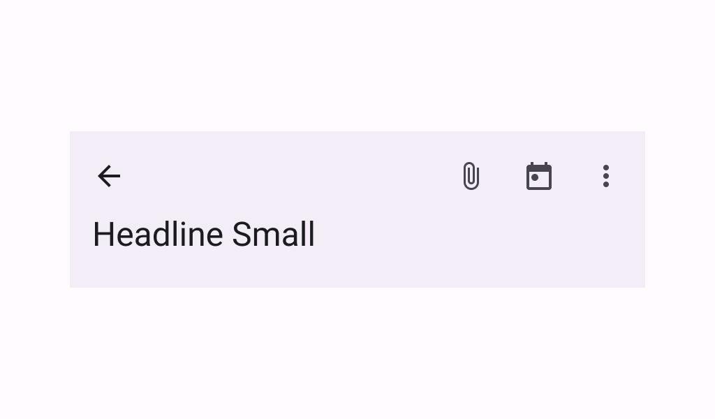
A basic two-rows Material Design top app bar.
Common
```kotlin
@ExperimentalMaterial3ExpressiveApi
@Composable
fun TwoRowsTopAppBar(
title: @Composable (expanded: Boolean) -> Unit,
modifier: Modifier = Modifier,
subtitle: (@Composable (expanded: Boolean) -> Unit)? = null,
navigationIcon: @Composable () -> Unit = {},
actions: @Composable RowScope.() -> Unit = {},
titleHorizontalAlignment: Alignment.Horizontal = Alignment.Start,
collapsedHeight: Dp = Dp.Unspecified,
expandedHeight: Dp = Dp.Unspecified,
windowInsets: WindowInsets = TopAppBarDefaults.windowInsets,
colors: TopAppBarColors = TopAppBarDefaults.topAppBarColors(),
scrollBehavior: TopAppBarScrollBehavior? = null,
)
```
#### Parameters
| | |
| --- | --- |
| title | a lambda for providing a title to be displayed in the top app bar in collapsed and expanded states. By default a small-app-bar `TextStyle` is applied to the Composition, and you may override it by wrapping your provided component with a composition local. Note that unlike the large or medium top app bars, the `TwoRowsTopAppBar` does not append bottom padding to the expanded title Composable by default. Padding should be applied directly to the provided expanded title, or to the `subtitle` that appears below it. |
| modifier | the `Modifier` to be applied to this top app bar |
| subtitle | a lambda for providing an optional subtitle to be displayed in the top app bar in collapsed and expanded states. |
| navigationIcon | the navigation icon displayed at the start of the top app bar. This should typically be an `IconButton` or `IconToggleButton`. |
| actions | the actions displayed at the end of the top app bar. This should typically be `IconButton`s. The default layout here is a `Row`, so icons inside will be placed horizontally. |
| titleHorizontalAlignment | the horizontal alignment of the title and subtitle |
| collapsedHeight | the app bar's height in its collapsed state. Note that this value might be adjusted to support displaying larger fonts. In case the provided value is `Dp.Unspecified` or `Dp.Infinity`, the height will default to `TopAppBarDefaults.MediumAppBarCollapsedHeight`. |
| expandedHeight | this app bar's height in its expanded state. When a specified `scrollBehavior` causes the app bar to collapse or expand, this value will represent the total height that the app-bar will expand to. The expanded height is expected to be greater or equal to the `collapsedHeight`, and the function will throw an `IllegalArgumentException` otherwise. Note that this value might be adjusted to support displaying larger fonts. In case the provided value is `Dp.Unspecified` or `Dp.Infinity`, the height will default to `TopAppBarDefaults.MediumFlexibleAppBarWithSubtitleExpandedHeight` when an `expandedSubtitle` is provided, or to `TopAppBarDefaults.MediumFlexibleAppBarWithoutSubtitleExpandedHeight` when it's not. |
| windowInsets | a window insets that app bar will respect. |
| colors | `TopAppBarColors` that will be used to resolve the colors used for this top app bar in different states. See `TopAppBarDefaults.topAppBarColors`. |
| scrollBehavior | a `TopAppBarScrollBehavior` which holds various offset values that will be applied by this top app bar to set up its height and colors. A scroll behavior is designed to work in conjunction with a scrolled content to change the top app bar appearance as the content scrolls. See `TopAppBarScrollBehavior.nestedScrollConnection`. |