---
title: "WideNavigationRail"
description: "Material design wide navigation rail."
type: "component"
social_image: "/static/images/material3/wide-navigation-rail-collapsed.png"
---
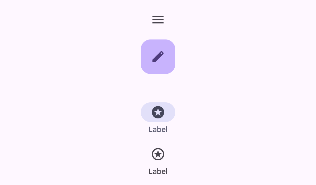
Composable Component
Material design wide navigation rail.
Common
```kotlin
@Composable
fun WideNavigationRail(
modifier: Modifier = Modifier,
state: WideNavigationRailState = rememberWideNavigationRailState(),
shape: Shape = WideNavigationRailDefaults.shape,
colors: WideNavigationRailColors = WideNavigationRailDefaults.colors(),
header: @Composable (() -> Unit)? = null,
windowInsets: WindowInsets = WideNavigationRailDefaults.windowInsets,
arrangement: Arrangement.Vertical = WideNavigationRailDefaults.arrangement,
contentPadding: PaddingValues = WideNavigationRailDefaults.ContentPadding,
content: @Composable () -> Unit,
)
```
#### Parameters
| | |
| --- | --- |
| modifier | the `Modifier` to be applied to this wide navigation rail |
| state | the `WideNavigationRailState` of this wide navigation rail |
| shape | defines the shape of this wide navigation rail's container. |
| colors | `WideNavigationRailColors` that will be used to resolve the colors used for this wide navigation rail. See `WideNavigationRailDefaults.colors` |
| header | optional header that may hold a `FloatingActionButton` or a logo |
| windowInsets | a window insets of the wide navigation rail |
| arrangement | the `Arrangement.Vertical` of this wide navigation rail for its content. Note that if there's a header present, the items will be arranged on the remaining space below it, except for the center arrangement which considers the entire height of the container |
| contentPadding | the spacing values to apply internally between the container and the content |
| content | the content of this wide navigation rail, typically `WideNavigationRailItem`s |
Common
> **Deprecated** Deprecated in favor of function with contentPadding parameter
```kotlin
@Composable
fun WideNavigationRail(
modifier: Modifier = Modifier,
state: WideNavigationRailState = rememberWideNavigationRailState(),
shape: Shape = WideNavigationRailDefaults.shape,
colors: WideNavigationRailColors = WideNavigationRailDefaults.colors(),
header: @Composable (() -> Unit)? = null,
windowInsets: WindowInsets = WideNavigationRailDefaults.windowInsets,
arrangement: Arrangement.Vertical = WideNavigationRailDefaults.arrangement,
content: @Composable () -> Unit,
)
```
#### Parameters
| | |
| --- | --- |
| modifier | the `Modifier` to be applied to this wide navigation rail |
| state | the `WideNavigationRailState` of this wide navigation rail |
| shape | defines the shape of this wide navigation rail's container. |
| colors | `WideNavigationRailColors` that will be used to resolve the colors used for this wide navigation rail. See `WideNavigationRailDefaults.colors` |
| header | optional header that may hold a `FloatingActionButton` or a logo |
| windowInsets | a window insets of the wide navigation rail |
| arrangement | the `Arrangement.Vertical` of this wide navigation rail for its content. Note that if there's a header present, the items will be arranged on the remaining space below it, except for the center arrangement which considers the entire height of the container |
| content | the content of this wide navigation rail, typically `WideNavigationRailItem`s |
## Code Examples
### WideNavigationRailCollapsedSample
```kotlin
@Preview
@Composable
fun WideNavigationRailCollapsedSample() {
var selectedItem by remember { mutableIntStateOf(0) }
val items = listOf("Home", "Search", "Settings")
val selectedIcons = listOf(Icons.Filled.Home, Icons.Filled.Favorite, Icons.Filled.Star)
val unselectedIcons =
listOf(Icons.Outlined.Home, Icons.Outlined.FavoriteBorder, Icons.Outlined.StarBorder)
WideNavigationRail {
items.forEachIndexed { index, item ->
WideNavigationRailItem(
railExpanded = false,
icon = {
Icon(
if (selectedItem == index) selectedIcons[index] else unselectedIcons[index],
contentDescription = null,
)
},
label = { Text(item) },
selected = selectedItem == index,
onClick = { selectedItem = index },
)
}
}
}
```
### WideNavigationRailExpandedSample
```kotlin
@Preview
@Composable
fun WideNavigationRailExpandedSample() {
var selectedItem by remember { mutableIntStateOf(0) }
val items = listOf("Home", "Search", "Settings")
val selectedIcons = listOf(Icons.Filled.Home, Icons.Filled.Favorite, Icons.Filled.Star)
val unselectedIcons =
listOf(Icons.Outlined.Home, Icons.Outlined.FavoriteBorder, Icons.Outlined.StarBorder)
WideNavigationRail(
state = rememberWideNavigationRailState(initialValue = WideNavigationRailValue.Expanded)
) {
items.forEachIndexed { index, item ->
WideNavigationRailItem(
railExpanded = true,
icon = {
Icon(
if (selectedItem == index) selectedIcons[index] else unselectedIcons[index],
contentDescription = null,
)
},
label = { Text(item) },
selected = selectedItem == index,
onClick = { selectedItem = index },
)
}
}
}
```
### WideNavigationRailResponsiveSample
```kotlin
@OptIn(ExperimentalMaterial3Api::class)
@Preview
@Composable
fun WideNavigationRailResponsiveSample() {
var selectedItem by remember { mutableIntStateOf(0) }
val items = listOf("Home", "Search", "Settings")
val selectedIcons = listOf(Icons.Filled.Home, Icons.Filled.Favorite, Icons.Filled.Star)
val unselectedIcons =
listOf(Icons.Outlined.Home, Icons.Outlined.FavoriteBorder, Icons.Outlined.StarBorder)
val state = rememberWideNavigationRailState()
val scope = rememberCoroutineScope()
val headerDescription =
if (state.targetValue == WideNavigationRailValue.Expanded) {
"Collapse rail"
} else {
"Expand rail"
}
Row(Modifier.fillMaxWidth()) {
WideNavigationRail(
state = state,
header = {
// Header icon button should have a tooltip.
TooltipBox(
positionProvider =
TooltipDefaults.rememberTooltipPositionProvider(
TooltipAnchorPosition.Above
),
tooltip = { PlainTooltip { Text(headerDescription) } },
state = rememberTooltipState(),
) {
IconButton(
modifier =
Modifier.padding(start = 24.dp).semantics {
// The button must announce the expanded or collapsed state of the
// rail for accessibility.
stateDescription =
if (state.currentValue == WideNavigationRailValue.Expanded) {
"Expanded"
} else {
"Collapsed"
}
},
onClick = {
scope.launch {
if (state.targetValue == WideNavigationRailValue.Expanded)
state.collapse()
else state.expand()
}
},
) {
if (state.targetValue == WideNavigationRailValue.Expanded) {
Icon(Icons.AutoMirrored.Filled.MenuOpen, headerDescription)
} else {
Icon(Icons.Filled.Menu, headerDescription)
}
}
}
},
) {
items.forEachIndexed { index, item ->
WideNavigationRailItem(
railExpanded = state.targetValue == WideNavigationRailValue.Expanded,
icon = {
val imageVector =
if (selectedItem == index) {
selectedIcons[index]
} else {
unselectedIcons[index]
}
Icon(imageVector = imageVector, contentDescription = null)
},
label = { Text(item) },
selected = selectedItem == index,
onClick = { selectedItem = index },
)
}
}
val textString =
if (state.currentValue == WideNavigationRailValue.Expanded) {
"Expanded"
} else {
"Collapsed"
}
Column {
Text(modifier = Modifier.padding(16.dp), text = "Is animating: " + state.isAnimating)
Text(modifier = Modifier.padding(16.dp), text = "The rail is $textString.")
Text(
modifier = Modifier.padding(16.dp),
text =
"Note: This demo is best shown in portrait mode, as landscape mode" +
" may result in a compact height in certain devices. For any" +
" compact screen dimensions, use a Navigation Bar instead.",
)
}
}
}
```