---
title: "ClassicCard"
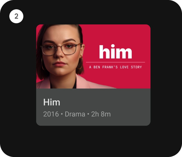
description: "`ClassicCard` is an opinionated TV Material card that offers a 4 slot layout to show information
about a subject."
type: "component"
social_image: "/static/images/tv/classic-card.webp"
---
Composable Component
`ClassicCard` is an opinionated TV Material card that offers a 4 slot layout to show information
about a subject.
Android
```kotlin
@Composable
fun ClassicCard(
onClick: () -> Unit,
image: @Composable BoxScope.() -> Unit,
title: @Composable () -> Unit,
modifier: Modifier = Modifier,
onLongClick: (() -> Unit)? = null,
subtitle: @Composable () -> Unit = {},
description: @Composable () -> Unit = {},
shape: CardShape = CardDefaults.shape(),
colors: CardColors = CardDefaults.colors(),
scale: CardScale = CardDefaults.scale(),
border: CardBorder = CardDefaults.border(),
glow: CardGlow = CardDefaults.glow(),
contentPadding: PaddingValues = PaddingValues(),
interactionSource: MutableInteractionSource? = null,
)
```
#### Parameters
| | |
| --- | --- |
| onClick | called when this card is clicked. |
| image | defines the `Composable` image to be displayed on top of the Card. |
| title | defines the `Composable` title placed below the image in the Card. |
| modifier | the `Modifier` to be applied to this card. |
| onLongClick | called when this card is long clicked (long-pressed). |
| subtitle | defines the `Composable` supporting text placed below the title of the Card. |
| description | defines the `Composable` description placed below the subtitle of the Card. |
| shape | `CardShape` defines the shape of this card's container in different interaction states. See `CardDefaults.shape`. |
| colors | `CardColors` defines the background & content colors used in this card for different interaction states. See `CardDefaults.colors`. |
| scale | `CardScale` defines size of the card relative to its original size for different interaction states. See `CardDefaults.scale`. |
| border | `CardBorder` defines a border around the card for different interaction states. See `CardDefaults.border`. |
| glow | `CardGlow` defines a shadow to be shown behind the card for different interaction states. See `CardDefaults.glow`. |
| contentPadding | `PaddingValues` defines the inner padding applied to the card's content. |
| interactionSource | an optional hoisted `MutableInteractionSource` for observing and emitting `Interaction`s for this card. You can use this to change the card's appearance or preview the card in different states. Note that if `null` is provided, interactions will still happen internally. |
## Code Examples
### ClassicCardSample
```kotlin
@Composable
fun ClassicCardSample() {
ClassicCard(
modifier = Modifier.size(150.dp, 120.dp),
image = { Box(modifier = Modifier.fillMaxWidth().height(80.dp).background(Color.Blue)) },
title = { Text("Classic Card") },
contentPadding = PaddingValues(8.dp),
onClick = {},
)
}
```