Composable Component
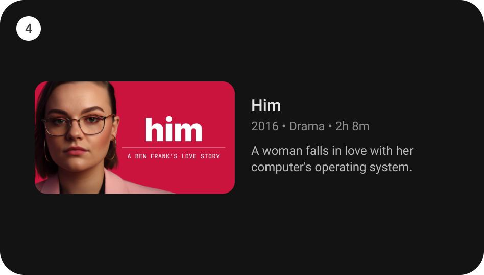
`WideCardContainer` is an opinionated TV Material Card layout with an image and text content to
show information about a subject.
WideCardContainer
Android
```kotlin
@Composable
fun WideCardContainer(
imageCard: @Composable (interactionSource: MutableInteractionSource) -> Unit,
title: @Composable () -> Unit,
modifier: Modifier = Modifier,
subtitle: @Composable () -> Unit = {},
description: @Composable () -> Unit = {},
contentColor: CardContainerColors = CardContainerDefaults.contentColor(),
interactionSource: MutableInteractionSource = remember { MutableInteractionSource() },
)
```
#### Parameters
| | |
| --- | --- |
| imageCard | defines the `Composable` to be used for the image card. |
| title | defines the `Composable` title placed below the image card in the CardContainer. |
| modifier | the `Modifier` to be applied to this CardContainer. |
| subtitle | defines the `Composable` supporting text placed below the title in CardContainer. |
| description | defines the `Composable` description placed below the subtitle in CardContainer. |
| contentColor | `CardContainerColors` defines the content color used in the CardContainer for different interaction states. See `CardContainerDefaults.contentColor`. |
| interactionSource | a hoisted `MutableInteractionSource` for observing and emitting `Interaction`s for this CardContainer. This interaction source param would also be forwarded to be used with the `imageCard` composable. |