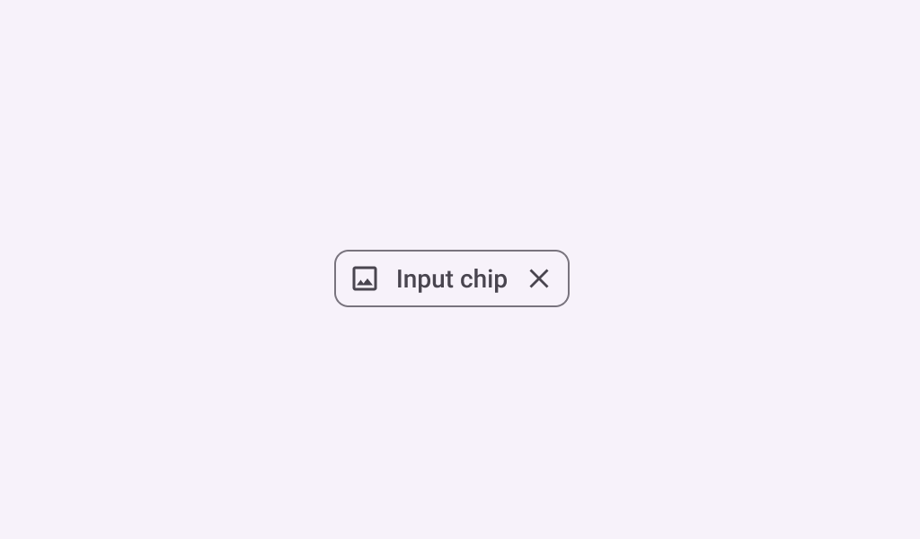
InputChip
Source set: Common
@Composable
fun InputChip(
    selected: Boolean,
    onClick: () -> Unit,
    label: @Composable () -> Unit,
    modifier: Modifier = Modifier,
    enabled: Boolean = true,
    leadingIcon: @Composable (() -> Unit)? = null,
    avatar: @Composable (() -> Unit)? = null,
    trailingIcon: @Composable (() -> Unit)? = null,
    shape: Shape = InputChipDefaults.shape,
    colors: SelectableChipColors = InputChipDefaults.inputChipColors(),
    elevation: SelectableChipElevation? = InputChipDefaults.inputChipElevation(),
    border: BorderStroke? = InputChipDefaults.inputChipBorder(enabled, selected),
    horizontalArrangement: Arrangement.Horizontal = InputChipDefaults.horizontalArrangement(),
    contentPadding: PaddingValues =
        InputChipDefaults.contentPadding(avatar != null, leadingIcon != null, trailingIcon != null),
    interactionSource: MutableInteractionSource? = null,
)
Parameters
| selected | whether this chip is selected or not |
| onClick | called when this chip is clicked |
| label | text label for this chip |
| modifier | the Modifier to be applied to this chip |
| enabled | controls the enabled state of this chip. When false, this component will not respond to user input, and it will appear visually disabled and disabled to accessibility services. |
| leadingIcon | optional icon at the start of the chip, preceding the label text |
| avatar | optional avatar at the start of the chip, preceding the label text |
| trailingIcon | optional icon at the end of the chip |
| shape | defines the shape of this chip's container, border (when border is not null), and shadow (when using elevation) |
| colors | ChipColors that will be used to resolve the colors used for this chip in different states. See InputChipDefaults.inputChipColors. |
| elevation | ChipElevation used to resolve the elevation for this chip in different states. This controls the size of the shadow below the chip. Additionally, when the container color is ColorScheme.surface, this controls the amount of primary color applied as an overlay. See InputChipDefaults.inputChipElevation. |
| border | the border to draw around the container of this chip. Pass null for no border. See InputChipDefaults.inputChipBorder. |
| horizontalArrangement | the horizontal arrangement of the chip's children. If there aren't any icons, then the horizontal padding between the label and the border will be the sum of contentPadding and the spacing in this horizontalArrangement. |
| contentPadding | the padding around the content of this chip, including the leadingIcon, avatar, label, and trailingIcon. |
| interactionSource | an optional hoisted MutableInteractionSource for observing and emitting Interactions for this chip. You can use this to change the chip's appearance or preview the chip in different states. Note that if null is provided, interactions will still happen internally. |
InputChip
Source set: Common
@Material3ExpressiveApi
@Composable
fun InputChip(
    selected: Boolean,
    onClick: () -> Unit,
    label: @Composable () -> Unit,
    shapes: ChipShapes,
    modifier: Modifier = Modifier,
    enabled: Boolean = true,
    leadingIcon: @Composable (() -> Unit)? = null,
    avatar: @Composable (() -> Unit)? = null,
    trailingIcon: @Composable (() -> Unit)? = null,
    colors: SelectableChipColors = InputChipDefaults.tonalInputChipColors(),
    elevation: SelectableChipElevation? = InputChipDefaults.inputChipElevation(),
    border: BorderStroke? = InputChipDefaults.inputChipBorder(enabled, selected),
    horizontalArrangement: Arrangement.Horizontal =
        InputChipDefaults.horizontalArrangement(
            avatar != null,
            leadingIcon != null,
            trailingIcon != null,
        ),
    contentPadding: PaddingValues =
        InputChipDefaults.contentPadding(avatar != null, leadingIcon != null, trailingIcon != null),
    interactionSource: MutableInteractionSource? = null,
)
Parameters
| selected | whether this chip is selected or not |
| onClick | called when this chip is clicked |
| label | text label for this chip |
| shapes | the ChipShapes that this chip with morph between depending on the chip's selected state. |
| modifier | the Modifier to be applied to this chip |
| enabled | controls the enabled state of this chip. When false, this component will not respond to user input, and it will appear visually disabled and disabled to accessibility services. |
| leadingIcon | optional icon at the start of the chip, preceding the label text |
| avatar | optional avatar at the start of the chip, preceding the label text |
| trailingIcon | optional icon at the end of the chip |
| colors | ChipColors that will be used to resolve the colors used for this chip in different states. See InputChipDefaults.inputChipColors. |
| elevation | ChipElevation used to resolve the elevation for this chip in different states. This controls the size of the shadow below the chip. Additionally, when the container color is ColorScheme.surface, this controls the amount of primary color applied as an overlay. See InputChipDefaults.inputChipElevation. |
| border | the border to draw around the container of this chip. Pass null for no border. See InputChipDefaults.inputChipBorder. |
| horizontalArrangement | the horizontal arrangement of the chip's children. If there aren't any icons, then the horizontal padding between the label and the border will be the sum of contentPadding and the spacing in this horizontalArrangement. |
| contentPadding | the padding around the content of this chip, including the leadingIcon, avatar, label, and trailingIcon. |
| interactionSource | an optional hoisted MutableInteractionSource for observing and emitting Interactions for this chip. You can use this to change the chip's appearance or preview the chip in different states. Note that if null is provided, interactions will still happen internally. |
InputChip
Deprecated
Maintained for binary compatibility
Source set: Common
@Composable
fun InputChip(
    selected: Boolean,
    onClick: () -> Unit,
    label: @Composable () -> Unit,
    modifier: Modifier = Modifier,
    enabled: Boolean = true,
    leadingIcon: @Composable (() -> Unit)? = null,
    avatar: @Composable (() -> Unit)? = null,
    trailingIcon: @Composable (() -> Unit)? = null,
    shape: Shape = InputChipDefaults.shape,
    colors: SelectableChipColors = InputChipDefaults.inputChipColors(),
    elevation: SelectableChipElevation? = InputChipDefaults.inputChipElevation(),
    border: BorderStroke? = InputChipDefaults.inputChipBorder(enabled, selected),
    interactionSource: MutableInteractionSource? = null,
)
Parameters
| selected | whether this chip is selected or not |
| onClick | called when this chip is clicked |
| label | text label for this chip |
| modifier | the Modifier to be applied to this chip |
| enabled | controls the enabled state of this chip. When false, this component will not respond to user input, and it will appear visually disabled and disabled to accessibility services. |
| leadingIcon | optional icon at the start of the chip, preceding the label text |
| avatar | optional avatar at the start of the chip, preceding the label text |
| trailingIcon | optional icon at the end of the chip |
| shape | defines the shape of this chip's container, border (when border is not null), and shadow (when using elevation) |
| colors | ChipColors that will be used to resolve the colors used for this chip in different states. See InputChipDefaults.inputChipColors. |
| elevation | ChipElevation used to resolve the elevation for this chip in different states. This controls the size of the shadow below the chip. Additionally, when the container color is ColorScheme.surface, this controls the amount of primary color applied as an overlay. See InputChipDefaults.inputChipElevation. |
| border | the border to draw around the container of this chip. Pass null for no border. See InputChipDefaults.inputChipBorder. |
| interactionSource | an optional hoisted MutableInteractionSource for observing and emitting Interactions for this chip. You can use this to change the chip's appearance or preview the chip in different states. Note that if null is provided, interactions will still happen internally. |
