
After 2 years of iterations on Compose Unstyled, a brand new Compose library is born: Composables UI.
Composables UI is a ready-to-use, fully-accessible component library for Compose Multiplatform.
Components for every platform
Composables UI is designed to work out of the box on every platform you build apps for.
Components adapt automatically to the device's capabilities.
Try the live demo below and see how buttons adapt to Touch and Mouse based devices:
Beautiful defaults
Composables UI comes with thoughtful defaults for the states your components need every day.
Focus states are handled for you, with clear focus rings for keyboard and desktop use, while touch interactions keep their ripple feedback.
Disabled states are also designed in from the start, so components feel consistent and intentional across platforms without extra work from your side.
Every component has consistent styling through the Theming system. Thanks to that, Composables UI ships with dark mode since day one.
Make it yours
Composables UI is designed to be modified.
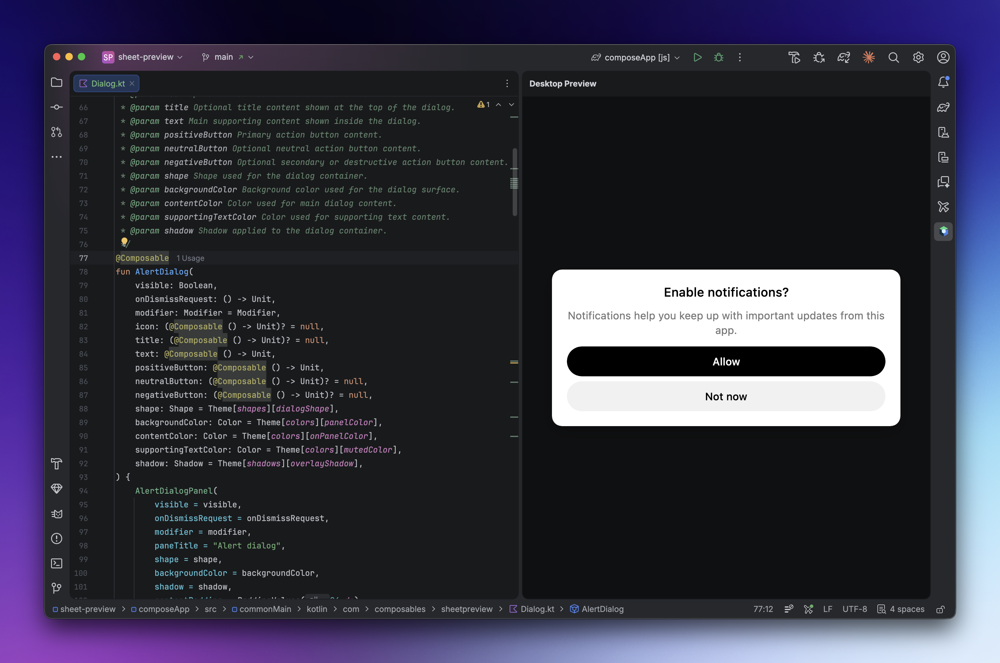
You can use it in two ways: add it as a single Gradle dependency, or copy the source code of individual components directly from the documentation.
That means you can start fast, then take full control whenever your product needs something more specific. Need to customize a bottom sheet beyond the library API? Head over to the Bottom Sheets docs, copy the component into your project, and shape it around your own design system.
Over time, Composables UI can stay as your component library, or fade into the background as your own design language takes over.
Powered by Compose Unstyled
Compose Unstyled recently reached 2.0 with the goal of becoming the API to build component libraries and design system for Jetpack Compose and Compose Multiplatform.
Composables UI was the perfect playground to put Compose Unstyled to the test.
Building app-facing components helped shape Compose Unstyled itself and stress-test its APIs in practice.
Thanks to the development of Composables UI, Compose Unstyled got a few upgrades:
- Tooltips now have a new flexible positioning API with anchors and placements.
- Portals is a new utility composable that allows you to render composables within the same composition tree. Handy for non-modal tooltips, snackbars, toasts and more.
- Added new
extend {}API in Themes, that allow you to create themes with predefined Composition Locals. - Polish the API of various components, to make them easier to extend in your design system.
- Added a new Breakpoint API for building apps for tablets and desktops.
and a bunch more.
Now that Composables UI exists, I can finally support more opinionated components that you have asked in the past such as cards, list items, date pickers, forms and more.
Compose Unstyled will continue to receive updates and will remain the base from which component libraries are build.
Try it out
Check out the sample app to get a taste of what you can build with Composables UI.
Then head over to the documentation to get started with Composables UI, browse the live previews, and explore the API references.
Composables UI is free for everyone under the MIT License. You can use it on commercial projects and hobby projects alike.
Further reading
We need your feedback
Give Composables UI and Compose Unstyled a go and let us know what you think.
Join our Github community to share your feedback, report issues and help shape future updates of the libraries.
- Visit Composables UI on Github
- Visit Compose Unstyled on Github
