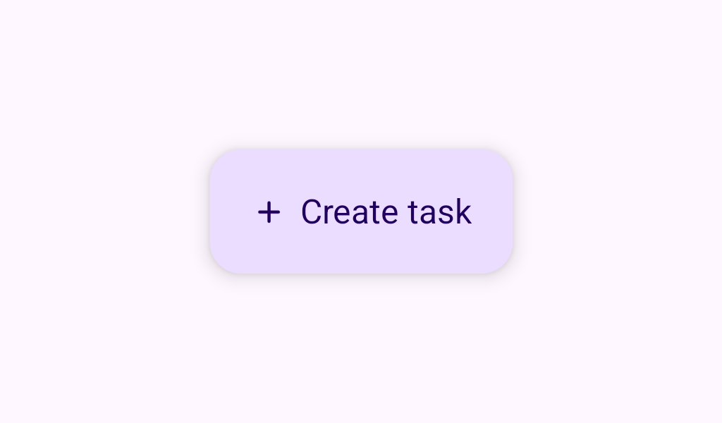
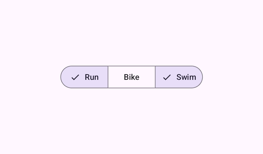
Button
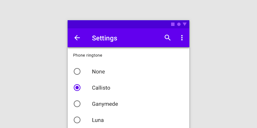
In Material 3 Compose
Browse all Buttons components for Jetpack Compose and Compose Multiplatform.
Ship iOS, desktop, and web apps with Compose Multiplatform
Add subscriptions to your apps in minutes


