Alert
In Wear Material Compose
RadioButton
PREVIEW IS NOT AVAILABLE YET
Kotlin
@Composable
fun SelectableChipWithRadioButton() {
    var selectedRadioIndex by remember { mutableStateOf(0) }
    Column(
        modifier = Modifier.fillMaxSize(),
        verticalArrangement = Arrangement.Center,
        horizontalAlignment = Alignment.CenterHorizontally,
    ) {
        SelectableChip(
            modifier = Modifier.fillMaxWidth(),
            selected = selectedRadioIndex == 0,
            onClick = { selectedRadioIndex = 0 },
            label = {
                // The primary label should have a maximum 3 lines of text
                Text("Primary label", maxLines = 3, overflow = TextOverflow.Ellipsis)
            },
            secondaryLabel = {
                // and the secondary label should have max 2 lines of text.
                Text("Secondary label", maxLines = 2, overflow = TextOverflow.Ellipsis)
            },
            appIcon = {
                Icon(
                    painter = painterResource(id = R.drawable.ic_airplanemode_active_24px),
                    contentDescription = "airplane",
                    modifier = Modifier.size(24.dp).wrapContentSize(align = Alignment.Center),
                )
            },
            enabled = true,
        )
        Spacer(modifier = Modifier.height(8.dp))
        SelectableChip(
            modifier = Modifier.fillMaxWidth(),
            selected = selectedRadioIndex == 1,
            onClick = { selectedRadioIndex = 1 },
            label = {
                // The primary label should have a maximum 3 lines of text
                Text("Alternative label", maxLines = 3, overflow = TextOverflow.Ellipsis)
            },
            secondaryLabel = {
                // and the secondary label should have max 2 lines of text.
                Text("Alternative secondary", maxLines = 2, overflow = TextOverflow.Ellipsis)
            },
            appIcon = {
                Icon(
                    painter = painterResource(id = R.drawable.ic_airplanemode_active_24px),
                    contentDescription = "airplane",
                    modifier = Modifier.size(24.dp).wrapContentSize(align = Alignment.Center),
                )
            },
            enabled = true,
        )
    }
}
AppCard
In Wear Material Compose
Button
In Wear Material Compose
Card
In Wear Material Compose
Checkbox
In Wear Material Compose
Chip
In Wear Material Compose
CircularProgressIndicator
In Wear Material Compose
CompactButton
In Wear Material Compose
CompactChip
In Wear Material Compose
Confirmation
In Wear Material Compose
Dialog
In Wear Material Compose
HorizontalPageIndicator
In Wear Material Compose
Icon
In Wear Material Compose
InlineSlider
In Wear Material Compose
ListHeader
In Wear Material Compose
MaterialTheme
In Wear Material Compose
OutlinedButton
In Wear Material Compose
OutlinedChip
In Wear Material Compose
OutlinedCompactButton
In Wear Material Compose
OutlinedCompactChip
In Wear Material Compose
Picker
In Wear Material Compose
PickerGroup
In Wear Material Compose
PositionIndicator
In Wear Material Compose
ProvideTextStyle
In Wear Material Compose
Scaffold
In Wear Material Compose
ScalingLazyColumn
In Wear Material Compose
SelectableChip
In Wear Material Compose
SplitSelectableChip
In Wear Material Compose
SplitToggleChip
In Wear Material Compose
Stepper
In Wear Material Compose
SwipeToDismissBox
In Wear Material Compose
SwipeToRevealCard
In Wear Material Compose
SwipeToRevealChip
In Wear Material Compose
SwipeToRevealPrimaryAction
In Wear Material Compose
SwipeToRevealSecondaryAction
In Wear Material Compose
SwipeToRevealUndoAction
In Wear Material Compose
Switch
In Wear Material Compose
Text
In Wear Material Compose
TimeText
In Wear Material Compose
TitleCard
In Wear Material Compose
ToggleButton
In Wear Material Compose
ToggleChip
In Wear Material Compose
Vignette
In Wear Material Compose
Button
In Material 3 Compose

ButtonGroup
In Material 3 Compose
ElevatedButton
In Material 3 Compose
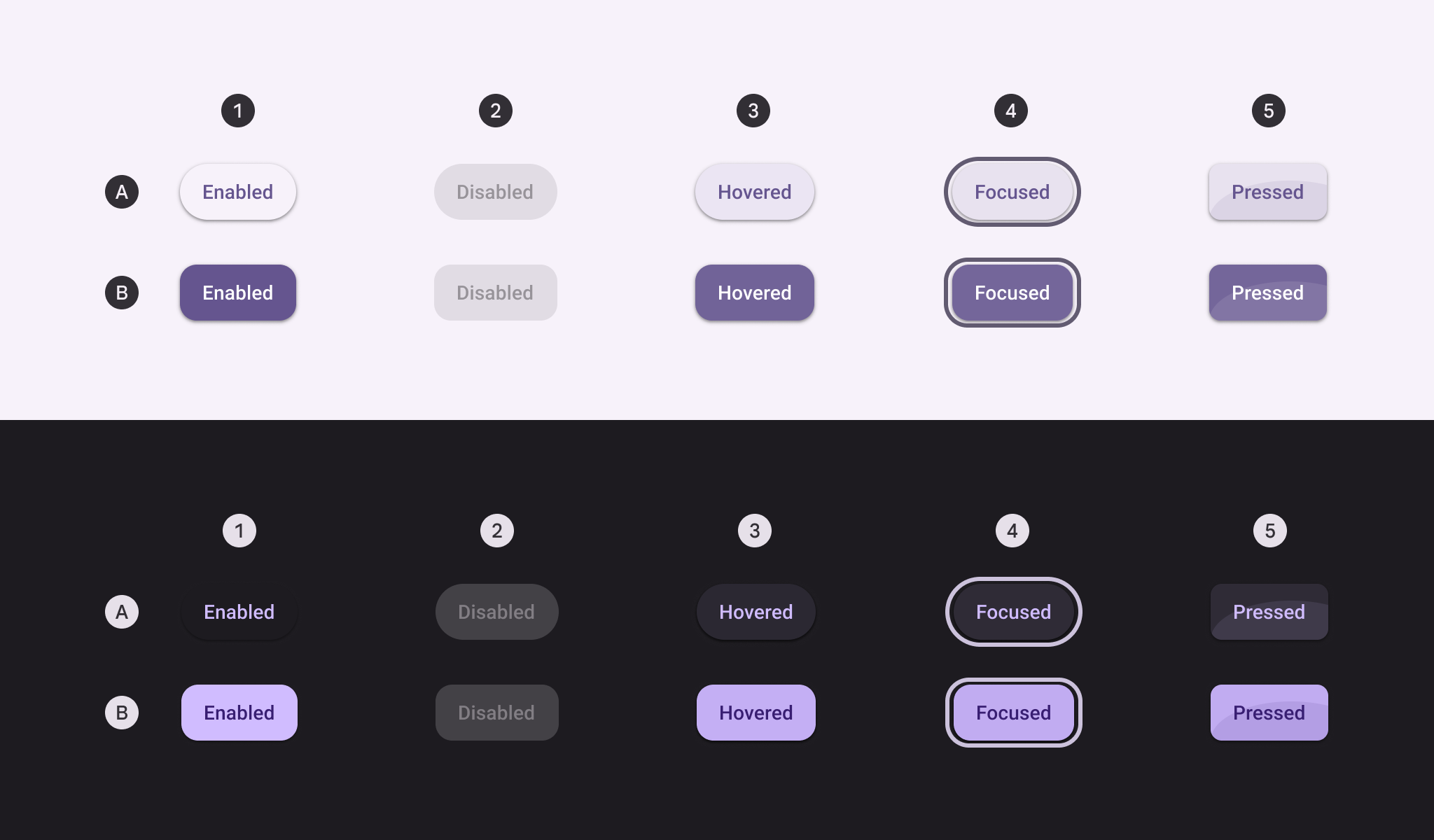
ElevatedToggleButton
In Material 3 Compose
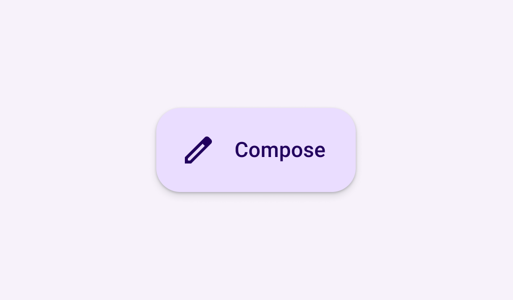
ExtendedFloatingActionButton
In Material 3 Compose

FilledIconButton
In Material 3 Compose

FilledIconToggleButton
In Material 3 Compose
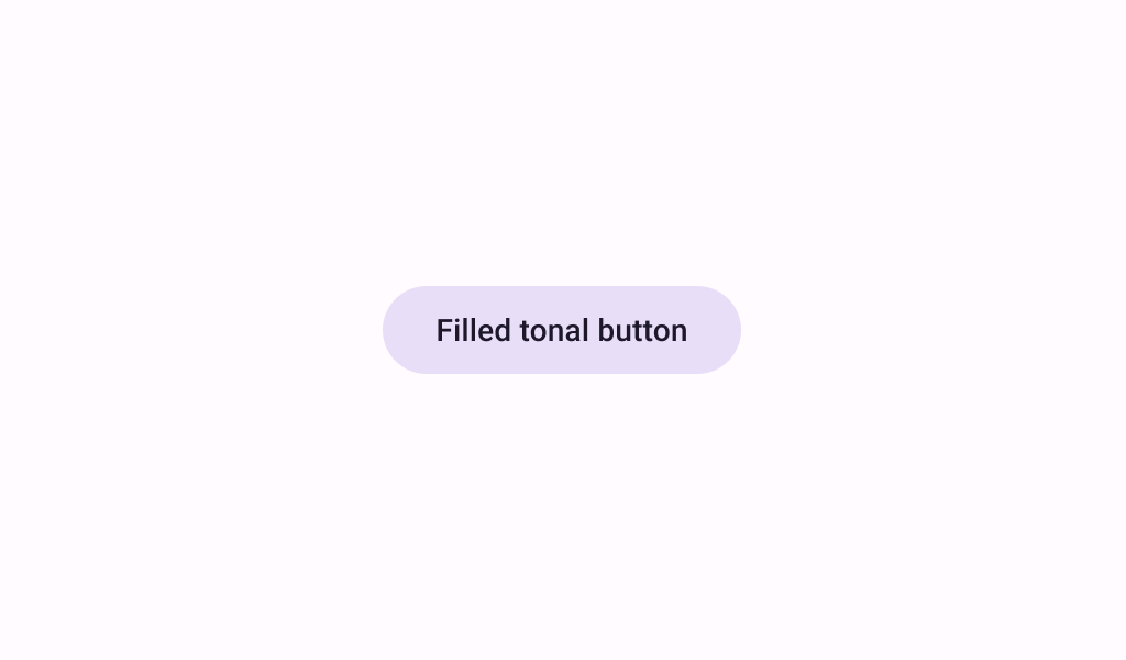
FilledTonalButton
In Material 3 Compose

FilledTonalIconButton
In Material 3 Compose
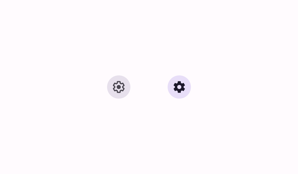
FilledTonalIconToggleButton
In Material 3 Compose
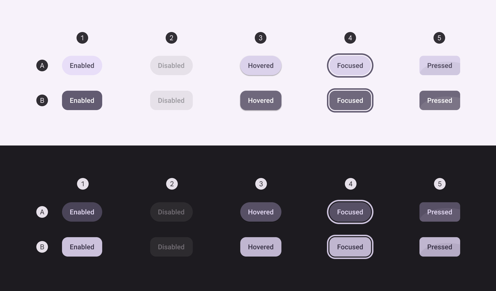
FilledTonalToggleButton
In Material 3 Compose
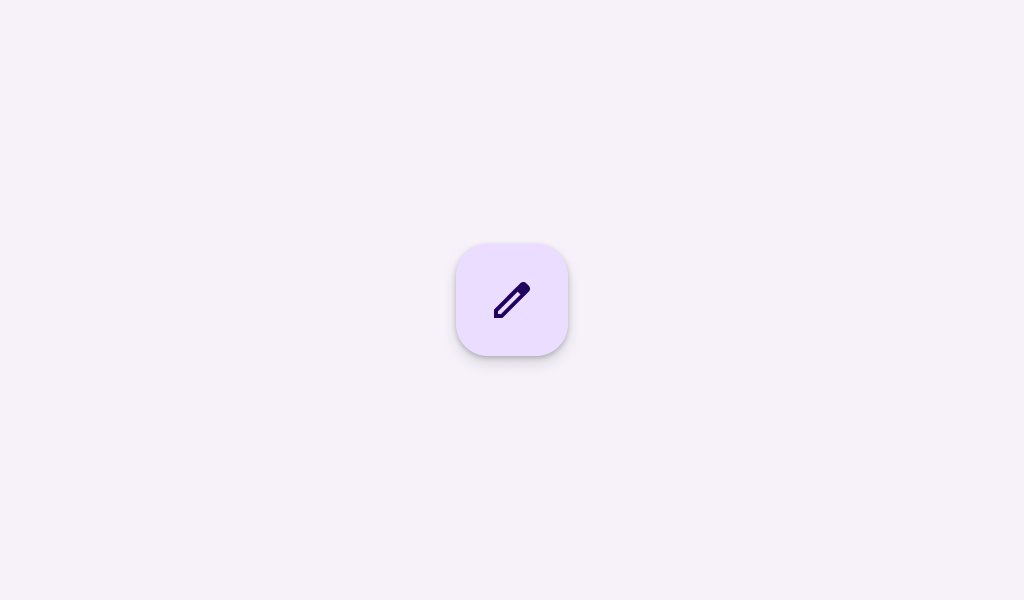
FloatingActionButton
In Material 3 Compose
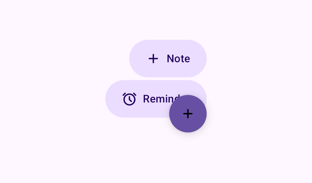
FloatingActionButtonMenu
In Material 3 Compose
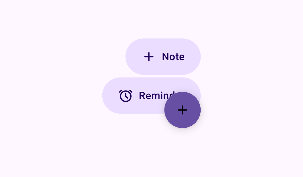
FloatingActionButtonMenuItem
In Material 3 Compose

IconButton
In Material 3 Compose

IconToggleButton
In Material 3 Compose

LargeExtendedFloatingActionButton
In Material 3 Compose
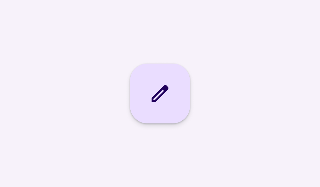
LargeFloatingActionButton
In Material 3 Compose
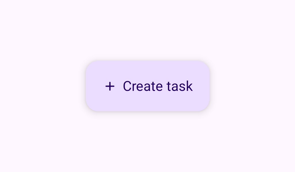
MediumExtendedFloatingActionButton
In Material 3 Compose
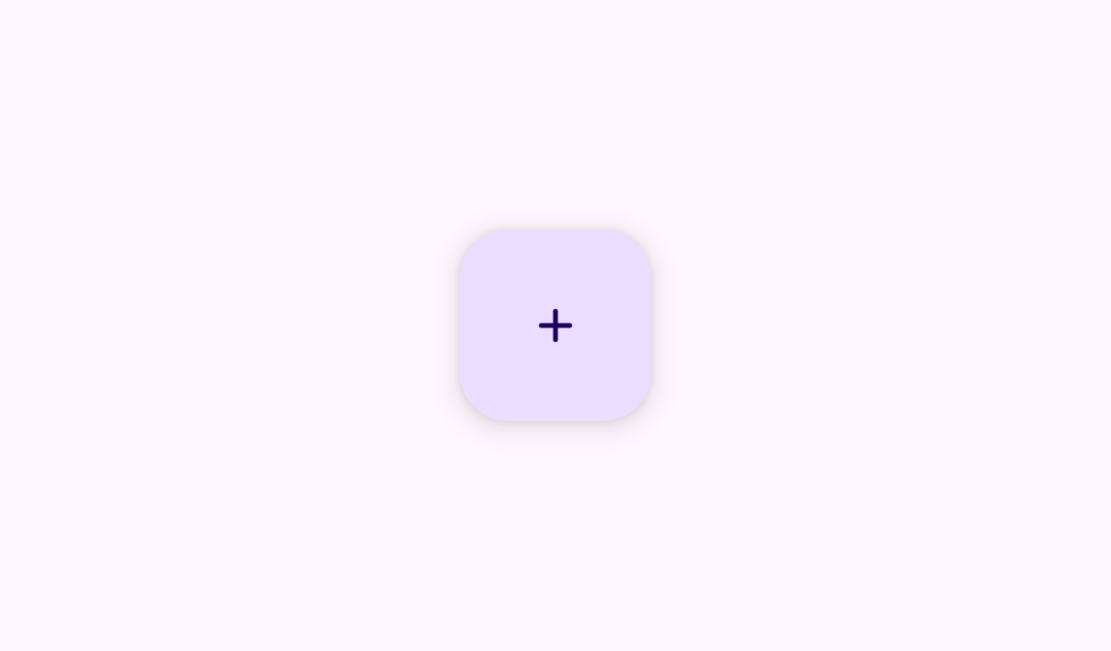
MediumFloatingActionButton
In Material 3 Compose
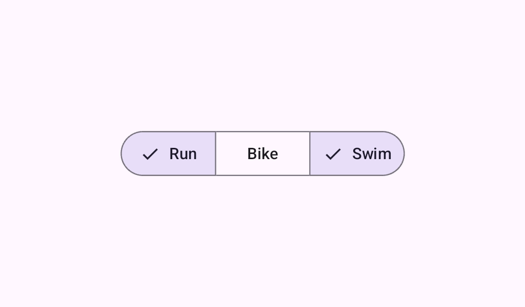
MultiChoiceSegmentedButtonRow
In Material 3 Compose
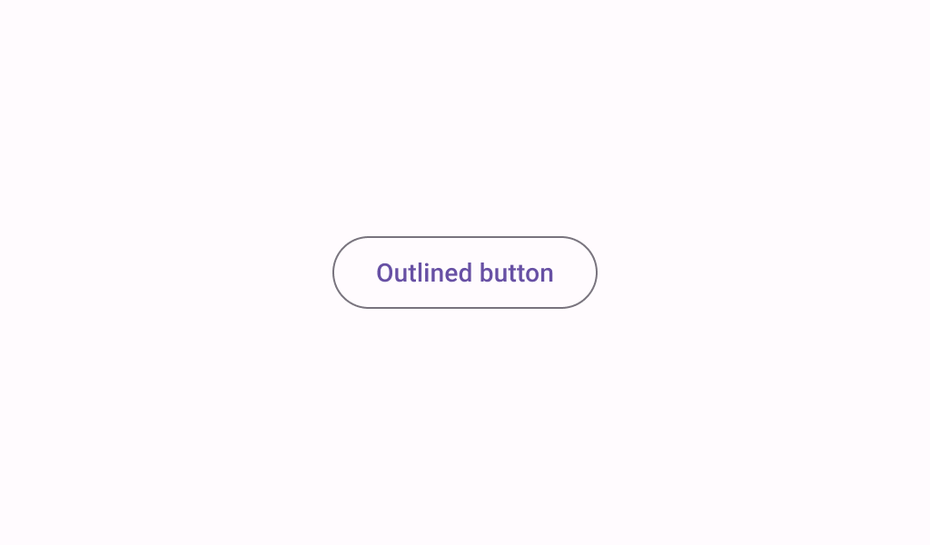
OutlinedButton
In Material 3 Compose
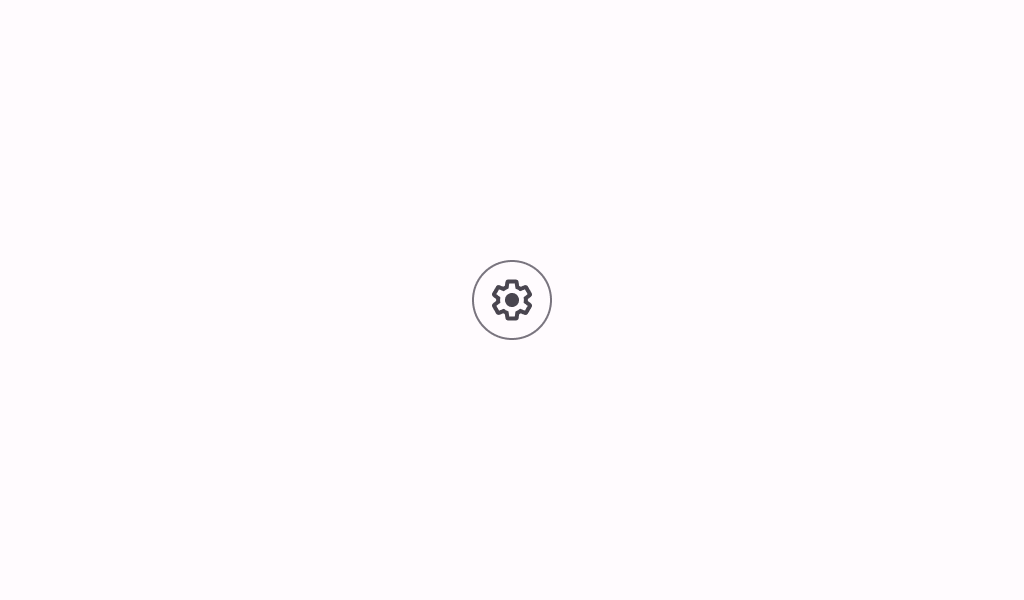
OutlinedIconButton
In Material 3 Compose
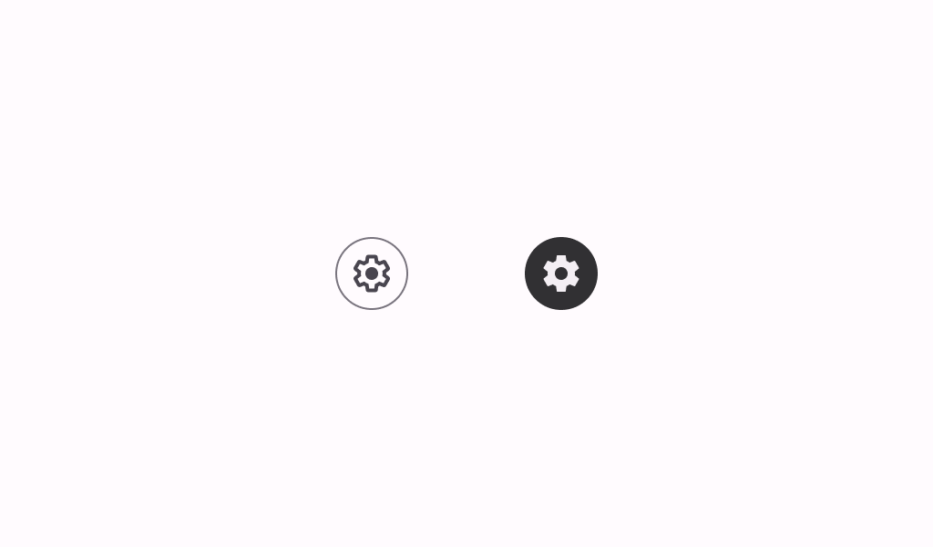
OutlinedIconToggleButton
In Material 3 Compose
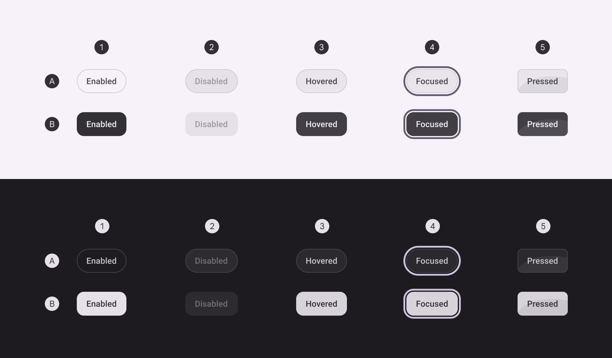
OutlinedToggleButton
In Material 3 Compose
RadioButton
In Material 3 Compose
SegmentedButton
In Material 3 Compose
SingleChoiceSegmentedButtonRow
In Material 3 Compose
SmallExtendedFloatingActionButton
In Material 3 Compose
SmallFloatingActionButton
In Material 3 Compose

SplitButton
In Material 3 Compose
SplitButtonLayout
In Material 3 Compose
TextButton
In Material 3 Compose
ToggleButton
In Material 3 Compose
ToggleFloatingActionButton
In Material 3 Compose
TonalToggleButton
In Material 3 Compose
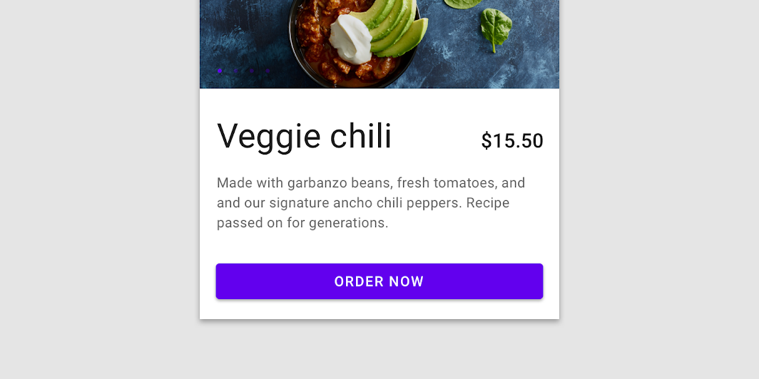
Button
In Material Compose
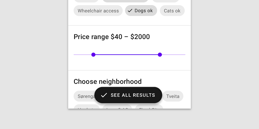
ExtendedFloatingActionButton
In Material Compose

FloatingActionButton
In Material Compose
IconButton
In Material Compose
IconToggleButton
In Material Compose
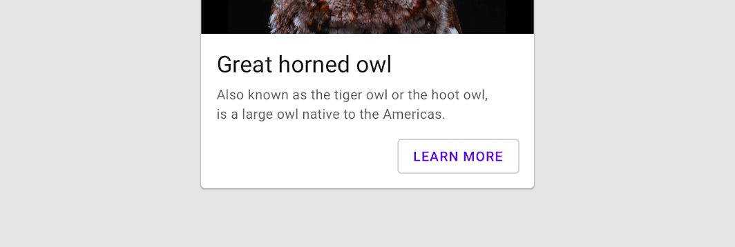
OutlinedButton
In Material Compose
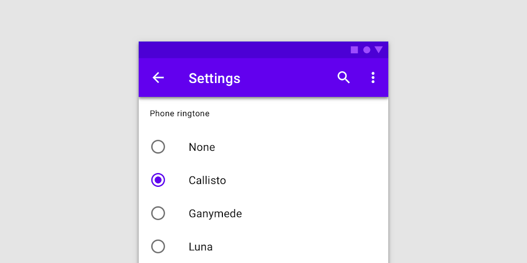
RadioButton
In Material Compose
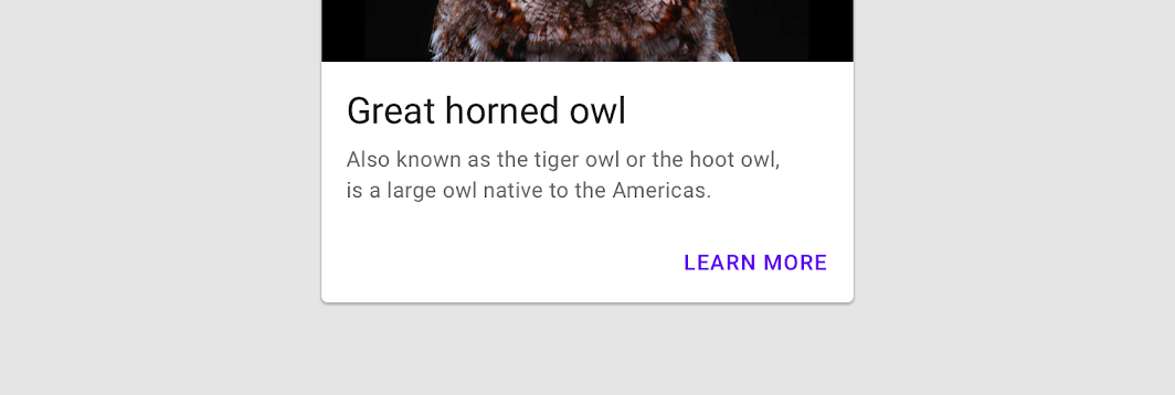
TextButton
In Material Compose
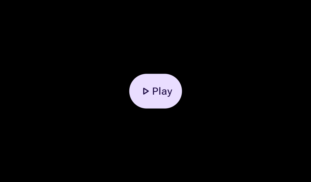
Button
In Wear Material 3 Compose
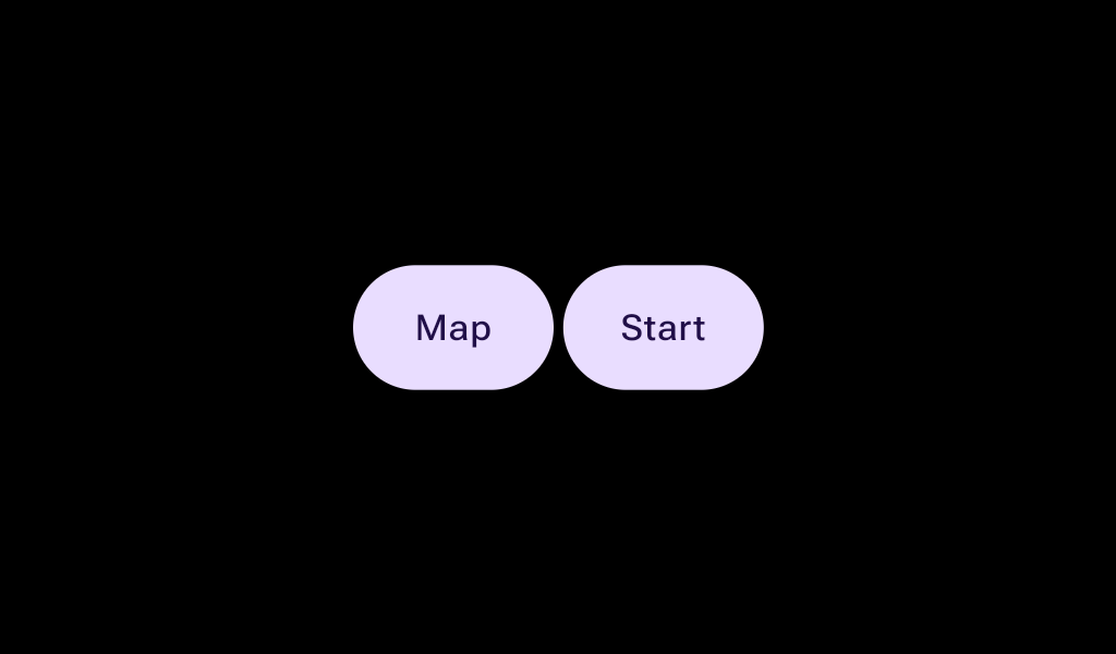
ButtonGroup
In Wear Material 3 Compose

CheckboxButton
In Wear Material 3 Compose

ChildButton
In Wear Material 3 Compose
CompactButton
In Wear Material 3 Compose
EdgeButton
In Wear Material 3 Compose
FilledIconButton
In Wear Material 3 Compose
FilledTonalButton
In Wear Material 3 Compose

FilledTonalIconButton
In Wear Material 3 Compose

IconButton
In Wear Material 3 Compose

IconToggleButton
In Wear Material 3 Compose
OutlinedButton
In Wear Material 3 Compose

OutlinedIconButton
In Wear Material 3 Compose
RadioButton
In Wear Material 3 Compose

SplitCheckboxButton
In Wear Material 3 Compose
SplitRadioButton
In Wear Material 3 Compose
SplitSwitchButton
In Wear Material 3 Compose
SwitchButton
In Wear Material 3 Compose

TextButton
In Wear Material 3 Compose
TextToggleButton
In Wear Material 3 Compose
Button
In Wear Material Compose
CompactButton
In Wear Material Compose
OutlinedButton
In Wear Material Compose
OutlinedCompactButton
In Wear Material Compose
ToggleButton
In Wear Material Compose
Button
In Compose TV Material
IconButton
In Compose TV Material
OutlinedButton
In Compose TV Material
OutlinedIconButton
In Compose TV Material
RadioButton
In Compose TV Material
WideButton
In Compose TV Material
SpaceToggleButton
In XR Compose Material3
Button
In XR Glimmer
ButtonGroup
In XR Glimmer
IconButton
In XR Glimmer
IconToggleButton
In XR Glimmer
ToggleButton
In XR Glimmer
