BottomNavigation
Composable Component
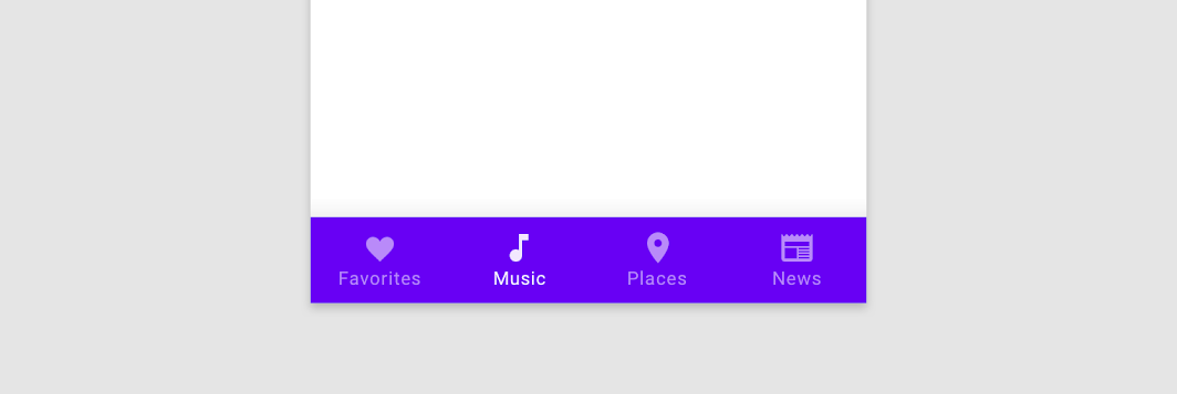
Bottom navigation bars allow movement between primary destinations in an app.
Common
@Composable
fun BottomNavigation(
    windowInsets: WindowInsets,
    modifier: Modifier = Modifier,
    backgroundColor: Color = MaterialTheme.colors.primarySurface,
    contentColor: Color = contentColorFor(backgroundColor),
    elevation: Dp = BottomNavigationDefaults.Elevation,
    content: @Composable RowScope.() -> Unit,
)
Parameters
| windowInsets | a window insets that bottom navigation will respect. |
| modifier | optional Modifier for this BottomNavigation |
| backgroundColor | The background color for this BottomNavigation |
| contentColor | The preferred content color provided by this BottomNavigation to its children. Defaults to either the matching content color for backgroundColor, or if backgroundColor is not a color from the theme, this will keep the same value set above this BottomNavigation. |
| elevation | elevation for this BottomNavigation |
| content | destinations inside this BottomNavigation, this should contain multiple BottomNavigationItems |
Common
@Composable
fun BottomNavigation(
    modifier: Modifier = Modifier,
    backgroundColor: Color = MaterialTheme.colors.primarySurface,
    contentColor: Color = contentColorFor(backgroundColor),
    elevation: Dp = BottomNavigationDefaults.Elevation,
    content: @Composable RowScope.() -> Unit,
)
Parameters
| modifier | optional Modifier for this BottomNavigation |
| backgroundColor | The background color for this BottomNavigation |
| contentColor | The preferred content color provided by this BottomNavigation to its children. Defaults to either the matching content color for backgroundColor, or if backgroundColor is not a color from the theme, this will keep the same value set above this BottomNavigation. |
| elevation | elevation for this BottomNavigation |
| content | destinations inside this BottomNavigation, this should contain multiple BottomNavigationItems |
Code Examples
BottomNavigationSample
@Composable
fun BottomNavigationSample() {
    var selectedItem by remember { mutableStateOf(0) }
    val items = listOf("Songs", "Artists", "Playlists")
    BottomNavigation(windowInsets = BottomNavigationDefaults.windowInsets) {
        items.forEachIndexed { index, item ->
            BottomNavigationItem(
                icon = { Icon(Icons.Filled.Favorite, contentDescription = null) },
                label = { Text(item) },
                selected = selectedItem == index,
                onClick = { selectedItem = index },
            )
        }
    }
}
Create your own Component Library
Material Components are meant to be used as is and they do not allow customizations. To build your own Jetpack Compose component library use Compose Unstyled

