Getting Started

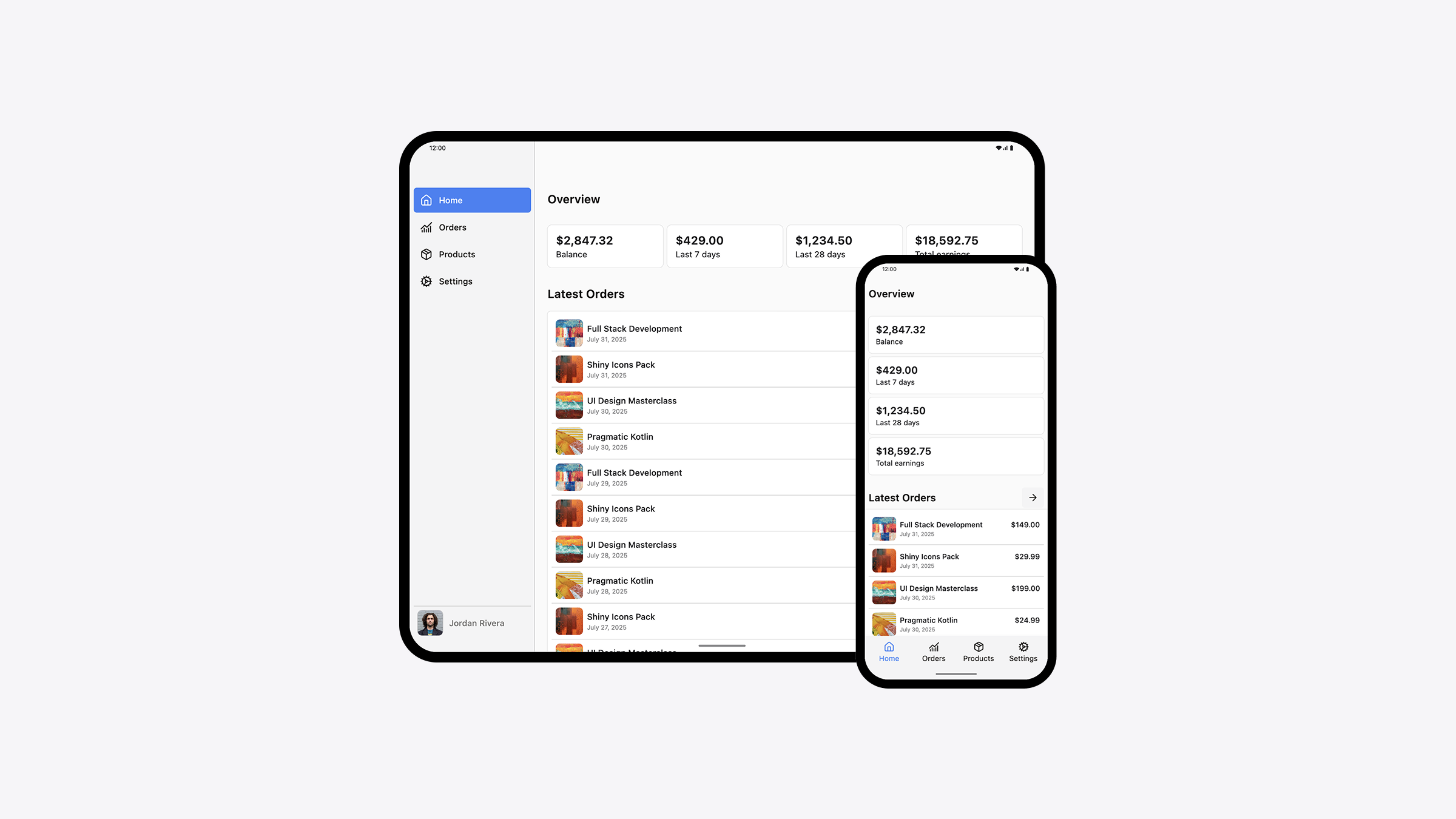
In this page you will find how to use the Composables UI Kit in your Compose UI projects. The UI Kit is built on top of Compose Unstyled and can be used on both Jetpack Compose and Compose Multiplatform projects.

The UI Kit is an excellent starting point for your own component libraries. All components in the UI Kit are production-ready, modern and accessible. They can be used with touch (mobile devices), keyboard and mouse (web and desktop). Use them as is, or edit the code to your needs based off your requirements.
Set up a Compose UI Project

To set up Compose in an Android project, follow our Jetpack Compose guide.

To quickly start a Compose Multiplatform project, use the KMP wizard and select the platforms you would like your app to run on.

Add the UI Kit into your project

Download the UI Kit via your Dashboard.

Then extract its contents inside of the kotlin (or java) folder in your project.

Install Dependencies

After you have added the files into your project, go to the respective app/build.gradle.kts file and add the following dependencies into your dependencies {} block:

dependencies {
    implementation("com.composables:core:1.36.1")
    // required for TimePicker component
    implementation("org.jetbrains.kotlinx:kotlinx-datetime:0.6.2")
}

To add the components in your project, simply copy and paste the contents of the zip file you got via your dashboard into your project.

Optional: Setup Inter font

The UI Kit has been designed using the Inter font. Inter is a modern font for User Interfaces. This step is optional and you can use any kind of font you like.

Use Inter in Jetpack Compose

Add the Inter fonts variations into your res/font folder.

Then in the Theme.kt file, create a variable for it and assign it to the defaultFontFamily of the theme:

val Inter = FontFamily(
    Font(R.font.inter_thin, weight = FontWeight.Thin),
    Font(R.font.inter_extralight, weight = FontWeight.ExtraLight),
    Font(R.font.inter_light, weight = FontWeight.Light),
    Font(R.font.inter_regular, weight = FontWeight.Normal),
    Font(R.font.inter_medium, weight = FontWeight.Medium),
    Font(R.font.inter_semibold, weight = FontWeight.SemiBold),
    Font(R.font.inter_bold, weight = FontWeight.Bold),
    Font(R.font.inter_extrabold, weight = FontWeight.ExtraBold),
    Font(R.font.inter_black, weight = FontWeight.Black),
)

val UiKitTheme = buildTheme {
    // replace 
    val defaultFontFamily = FontFamily.Default

    // with
    val defaultFontFamily = Inter
    
    // leave the rest as is
}

Use Inter in Compose Multiplatform

Enable Compose Resources and add Inter to the commonMain/composeResources/font directory.

Then use the following code to load and assign the font family into the theme:

val UiKitTheme = buildTheme {
    // replace 
    val defaultFontFamily = FontFamily.Default
    
    // with
    val defaultFontFamily = loadVariableFont(Res.font.Inter)

    // leave the rest as is
}

@Composable
fun loadVariableFont(variableFont: FontResource): FontFamily {
    val weights = listOf(
        FontWeight.W100,
        FontWeight.W200,
        FontWeight.W300,
        FontWeight.W400,
        FontWeight.W500,
        FontWeight.W600,
        FontWeight.W700,
        FontWeight.W800,
        FontWeight.W900,
    )
    return FontFamily(
        weights.map { fontWeight ->
            Font(
                resource = variableFont,
                variationSettings = FontVariation.Settings(weight = fontWeight),
                weight = fontWeight,
            )
        }
    )
}

Optional: Install Lucide icons

The UI Kit has been designed using the Lucide icon set.

Add the following to your app/build.gradle.kts:

implementation("com.composables:icons-lucide:1.0.0")