Card
Composable Component
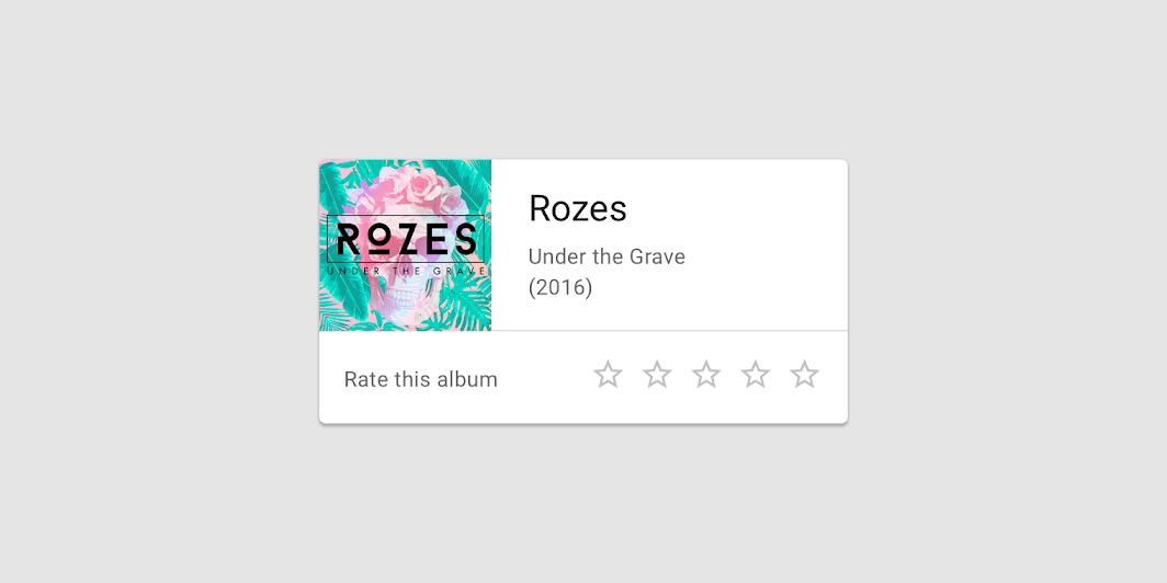
Cards contain content and actions about a single subject.
Common
@Composable
fun Card(
    modifier: Modifier = Modifier,
    shape: Shape = MaterialTheme.shapes.medium,
    backgroundColor: Color = MaterialTheme.colors.surface,
    contentColor: Color = contentColorFor(backgroundColor),
    border: BorderStroke? = null,
    elevation: Dp = 1.dp,
    content: @Composable () -> Unit,
)
Parameters
| modifier | Modifier to be applied to the layout of the card. |
| shape | Defines the card's shape as well its shadow. A shadow is only displayed if the elevation is greater than zero. |
| backgroundColor | The background color. |
| contentColor | The preferred content color provided by this card to its children. Defaults to either the matching content color for backgroundColor, or if backgroundColor is not a color from the theme, this will keep the same value set above this card. |
| border | Optional border to draw on top of the card |
| elevation | The z-coordinate at which to place this card. This controls the size of the shadow below the card. |
| content | The content displayed on the card. |
Common
@ExperimentalMaterialApi
@Composable
fun Card(
    onClick: () -> Unit,
    modifier: Modifier = Modifier,
    enabled: Boolean = true,
    shape: Shape = MaterialTheme.shapes.medium,
    backgroundColor: Color = MaterialTheme.colors.surface,
    contentColor: Color = contentColorFor(backgroundColor),
    border: BorderStroke? = null,
    elevation: Dp = 1.dp,
    interactionSource: MutableInteractionSource? = null,
    content: @Composable () -> Unit,
)
Parameters
| onClick | callback to be called when the card is clicked |
| modifier | Modifier to be applied to the layout of the card. |
| enabled | Controls the enabled state of the card. When false, this card will not be clickable |
| shape | Defines the card's shape as well its shadow. A shadow is only displayed if the elevation is greater than zero. |
| backgroundColor | The background color. |
| contentColor | The preferred content color provided by this card to its children. Defaults to either the matching content color for backgroundColor, or if backgroundColor is not a color from the theme, this will keep the same value set above this card. |
| border | Optional border to draw on top of the card |
| elevation | The z-coordinate at which to place this card. This controls the size of the shadow below the card. |
| interactionSource | an optional hoisted MutableInteractionSource for observing and emitting Interactions for this card. You can use this to change the card's appearance or preview the card in different states. Note that if null is provided, interactions will still happen internally. |
| content | The content displayed on the card. |
Code Examples
CardSample
@Composable
fun CardSample() {
    Card { Text("Card Content") }
}
ClickableCardSample
@OptIn(ExperimentalMaterialApi::class)
@Composable
fun ClickableCardSample() {
    var count by remember { mutableStateOf(0) }
    Card(onClick = { count++ }) { Text("Clickable card content with count: $count") }
}
Create your own Component Library
Material Components are meant to be used as is and they do not allow customizations. To build your own Jetpack Compose component library use Compose Unstyled

