DropdownMenu
Composable Component
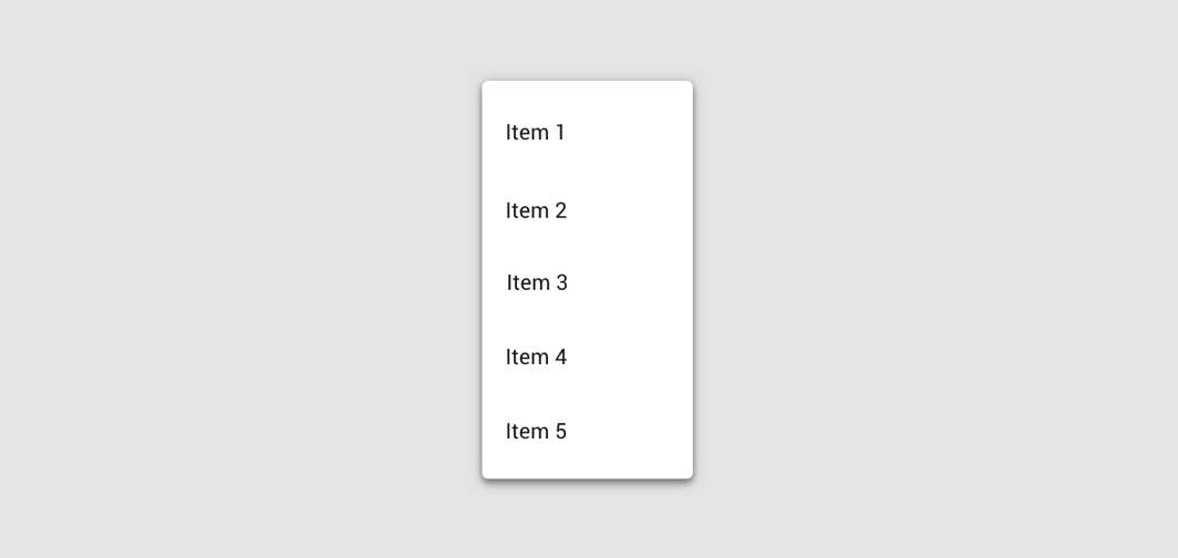
A dropdown menu is a compact way of displaying multiple choices. It appears upon interaction with an element (such as an icon or button) or when users perform a specific action.
Common
@Composable
expect fun DropdownMenu(
    expanded: Boolean,
    onDismissRequest: () -> Unit,
    modifier: Modifier = Modifier,
    offset: DpOffset = DpOffset(0.dp, 0.dp),
    scrollState: ScrollState = rememberScrollState(),
    properties: PopupProperties = DefaultMenuProperties,
    content: @Composable ColumnScope.() -> Unit,
)
Parameters
| expanded | whether the menu is expanded or not |
| onDismissRequest | called when the user requests to dismiss the menu, such as by tapping outside the menu's bounds |
| modifier | Modifier to be applied to the menu's content |
| offset | DpOffset from the original position of the menu. The offset respects the LayoutDirection, so the offset's x position will be added in LTR and subtracted in RTL. |
| scrollState | a ScrollState to used by the menu's content for items vertical scrolling |
| properties | PopupProperties for further customization of this popup's behavior |
| content | the content of this dropdown menu, typically a DropdownMenuItem |
Android
Deprecated Replaced by a DropdownMenu function with a ScrollState parameter
@Composable
fun DropdownMenu(
    expanded: Boolean,
    onDismissRequest: () -> Unit,
    modifier: Modifier = Modifier,
    offset: DpOffset = DpOffset(0.dp, 0.dp),
    properties: PopupProperties = PopupProperties(focusable = true),
    content: @Composable ColumnScope.() -> Unit,
) =
    DropdownMenu(
        expanded = expanded,
        onDismissRequest = onDismissRequest,
        modifier = modifier,
        offset = offset,
        scrollState = rememberScrollState(),
        properties = properties,
        content = content,
    )
Android
@Composable
actual fun DropdownMenu(
    expanded: Boolean,
    onDismissRequest: () -> Unit,
    modifier: Modifier,
    offset: DpOffset,
    scrollState: ScrollState,
    properties: PopupProperties,
    content: @Composable ColumnScope.() -> Unit,
)
Code Examples
MenuSample
@Composable
fun MenuSample() {
    var expanded by remember { mutableStateOf(false) }
    Box(modifier = Modifier.fillMaxSize().wrapContentSize(Alignment.TopStart)) {
        IconButton(onClick = { expanded = true }) {
            Icon(Icons.Default.MoreVert, contentDescription = "Localized description")
        }
        DropdownMenu(expanded = expanded, onDismissRequest = { expanded = false }) {
            DropdownMenuItem(onClick = { /* Handle refresh! */ }) { Text("Refresh") }
            DropdownMenuItem(onClick = { /* Handle settings! */ }) { Text("Settings") }
            Divider()
            DropdownMenuItem(onClick = { /* Handle send feedback! */ }) { Text("Send Feedback") }
        }
    }
}
MenuWithScrollStateSample
@Composable
fun MenuWithScrollStateSample() {
    var expanded by remember { mutableStateOf(false) }
    val scrollState = rememberScrollState()
    Box(modifier = Modifier.fillMaxSize().wrapContentSize(Alignment.TopStart)) {
        IconButton(onClick = { expanded = true }) {
            Icon(Icons.Default.MoreVert, contentDescription = "Localized description")
        }
        DropdownMenu(
            expanded = expanded,
            onDismissRequest = { expanded = false },
            scrollState = scrollState,
        ) {
            repeat(30) {
                DropdownMenuItem(onClick = { /* Handle item! */ }) { Text("Item ${it + 1}") }
            }
        }
        LaunchedEffect(expanded) {
            if (expanded) {
                // Scroll to show the bottom menu items.
                scrollState.scrollTo(scrollState.maxValue)
            }
        }
    }
}
Create your own Component Library
Material Components are meant to be used as is and they do not allow customizations. To build your own Jetpack Compose component library use Compose Unstyled

