ListItem
Composable Component
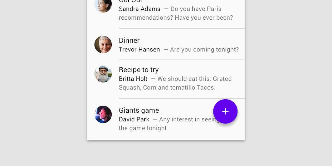
Lists are continuous, vertical indexes of text or images.
Common
@Composable
@ExperimentalMaterialApi
fun ListItem(
    modifier: Modifier = Modifier,
    icon: @Composable (() -> Unit)? = null,
    secondaryText: @Composable (() -> Unit)? = null,
    singleLineSecondaryText: Boolean = true,
    overlineText: @Composable (() -> Unit)? = null,
    trailing: @Composable (() -> Unit)? = null,
    text: @Composable () -> Unit,
)
Parameters
| modifier | Modifier to be applied to the list item |
| icon | The leading supporting visual of the list item |
| secondaryText | The secondary text of the list item |
| singleLineSecondaryText | Whether the secondary text is single line |
| overlineText | The text displayed above the primary text |
| trailing | The trailing meta text, icon, switch or checkbox |
| text | The primary text of the list item |
Code Examples
ClickableListItems
@Composable
@OptIn(ExperimentalMaterialApi::class)
fun ClickableListItems() {
    Column {
        var switched by remember { mutableStateOf(false) }
        val onSwitchedChange: (Boolean) -> Unit = { switched = it }
        ListItem(
            text = { Text("Switch ListItem") },
            trailing = {
                Switch(
                    checked = switched,
                    onCheckedChange = null, // null recommended for accessibility with screenreaders
                )
            },
            modifier =
                Modifier.toggleable(
                    role = Role.Switch,
                    value = switched,
                    onValueChange = onSwitchedChange,
                ),
        )
        Divider()
        var checked by remember { mutableStateOf(true) }
        val onCheckedChange: (Boolean) -> Unit = { checked = it }
        ListItem(
            text = { Text("Checkbox ListItem") },
            trailing = {
                Checkbox(
                    checked = checked,
                    onCheckedChange = null, // null recommended for accessibility with screenreaders
                )
            },
            modifier =
                Modifier.toggleable(
                    role = Role.Checkbox,
                    value = checked,
                    onValueChange = onCheckedChange,
                ),
        )
        Divider()
    }
}
OneLineListItems
@Composable
@OptIn(ExperimentalMaterialApi::class)
fun OneLineListItems() {
    Column {
        ListItem(text = { Text("One line list item with no icon") })
        Divider()
        ListItem(
            text = { Text("One line list item with 24x24 icon") },
            icon = { Icon(Icons.Filled.Favorite, contentDescription = null) },
        )
        Divider()
        ListItem(
            text = { Text("One line list item with 40x40 icon") },
            icon = {
                Icon(
                    Icons.Filled.Favorite,
                    contentDescription = null,
                    modifier = Modifier.size(40.dp),
                )
            },
        )
        Divider()
        ListItem(
            text = { Text("One line list item with 56x56 icon") },
            icon = {
                Icon(
                    Icons.Filled.Favorite,
                    contentDescription = null,
                    modifier = Modifier.size(56.dp),
                )
            },
        )
        Divider()
        ListItem(
            text = { Text("One line clickable list item") },
            icon = {
                Icon(
                    Icons.Filled.Favorite,
                    contentDescription = null,
                    modifier = Modifier.size(56.dp),
                )
            },
            modifier = Modifier.clickable {},
        )
        Divider()
        ListItem(
            text = { Text("One line list item with trailing icon") },
            trailing = { Icon(Icons.Filled.Favorite, contentDescription = "Localized Description") },
        )
        Divider()
        ListItem(
            text = { Text("One line list item") },
            icon = {
                Icon(
                    Icons.Filled.Favorite,
                    contentDescription = null,
                    modifier = Modifier.size(40.dp),
                )
            },
            trailing = { Icon(Icons.Filled.Favorite, contentDescription = "Localized description") },
        )
        Divider()
    }
}
ThreeLineListItems
@Composable
@OptIn(ExperimentalMaterialApi::class)
fun ThreeLineListItems() {
    Column {
        ListItem(
            text = { Text("Three line list item") },
            secondaryText = {
                Text(
                    "This is a long secondary text for the current list item, " +
                        "displayed on two lines"
                )
            },
            singleLineSecondaryText = false,
            trailing = { Text("meta") },
        )
        Divider()
        ListItem(
            text = { Text("Three line list item") },
            overlineText = { Text("OVERLINE") },
            secondaryText = { Text("Secondary text") },
        )
        Divider()
        ListItem(
            text = { Text("Three line list item with 24x24 icon") },
            secondaryText = {
                Text(
                    "This is a long secondary text for the current list item " +
                        "displayed on two lines"
                )
            },
            singleLineSecondaryText = false,
            icon = { Icon(Icons.Filled.Favorite, contentDescription = null) },
        )
        Divider()
        ListItem(
            text = { Text("Three line list item with trailing icon") },
            secondaryText = {
                Text(
                    "This is a long secondary text for the current list" +
                        " item, displayed on two lines"
                )
            },
            singleLineSecondaryText = false,
            trailing = { Icon(Icons.Filled.Favorite, contentDescription = "Localized description") },
        )
        Divider()
        ListItem(
            text = { Text("Three line list item") },
            overlineText = { Text("OVERLINE") },
            secondaryText = { Text("Secondary text") },
            trailing = { Text("meta") },
        )
        Divider()
    }
}
TwoLineListItems
@Composable
@OptIn(ExperimentalMaterialApi::class)
fun TwoLineListItems() {
    Column {
        ListItem(text = { Text("Two line list item") }, secondaryText = { Text("Secondary text") })
        Divider()
        ListItem(text = { Text("Two line list item") }, overlineText = { Text("OVERLINE") })
        Divider()
        ListItem(
            text = { Text("Two line list item with 24x24 icon") },
            secondaryText = { Text("Secondary text") },
            icon = { Icon(Icons.Filled.Favorite, contentDescription = null) },
        )
        Divider()
        ListItem(
            text = { Text("Two line list item with 40x40 icon") },
            secondaryText = { Text("Secondary text") },
            icon = {
                Icon(
                    Icons.Filled.Favorite,
                    contentDescription = null,
                    modifier = Modifier.size(40.dp),
                )
            },
        )
        Divider()
        ListItem(
            text = { Text("Two line list item with 40x40 icon") },
            secondaryText = { Text("Secondary text") },
            trailing = { Text("meta") },
            icon = {
                Icon(
                    Icons.Filled.Favorite,
                    contentDescription = null,
                    modifier = Modifier.size(40.dp),
                )
            },
        )
        Divider()
    }
}
Create your own Component Library
Material Components are meant to be used as is and they do not allow customizations. To build your own Jetpack Compose component library use Compose Unstyled

