ModalDrawer
Composable Component
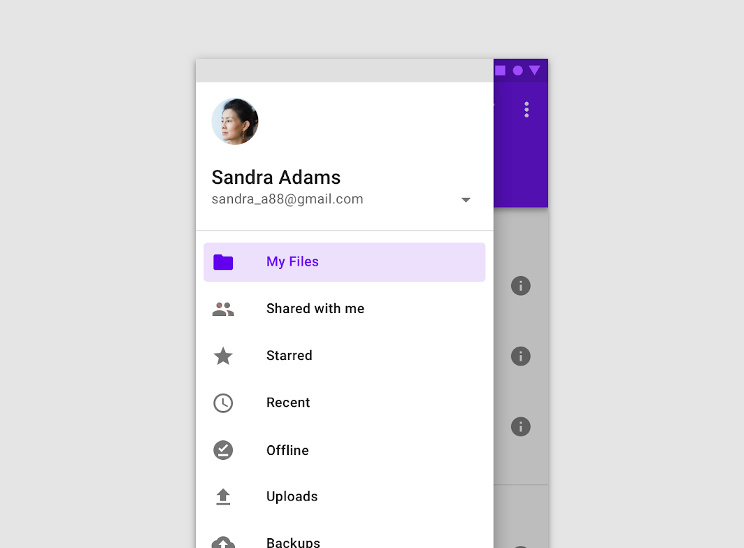
Modal navigation drawers block interaction with the rest of an app’s content with a scrim. They are elevated above most of the app’s UI and don’t affect the screen’s layout grid.
Common
@Composable
fun ModalDrawer(
    drawerContent: @Composable ColumnScope.() -> Unit,
    modifier: Modifier = Modifier,
    drawerState: DrawerState = rememberDrawerState(DrawerValue.Closed),
    gesturesEnabled: Boolean = true,
    drawerShape: Shape = DrawerDefaults.shape,
    drawerElevation: Dp = DrawerDefaults.Elevation,
    drawerBackgroundColor: Color = DrawerDefaults.backgroundColor,
    drawerContentColor: Color = contentColorFor(drawerBackgroundColor),
    scrimColor: Color = DrawerDefaults.scrimColor,
    content: @Composable () -> Unit,
)
Parameters
| drawerContent | composable that represents content inside the drawer |
| modifier | optional modifier for the drawer |
| drawerState | state of the drawer |
| gesturesEnabled | whether or not drawer can be interacted by gestures |
| drawerShape | shape of the drawer sheet |
| drawerElevation | drawer sheet elevation. This controls the size of the shadow below the drawer sheet |
| drawerBackgroundColor | background color to be used for the drawer sheet |
| drawerContentColor | color of the content to use inside the drawer sheet. Defaults to either the matching content color for drawerBackgroundColor, or, if it is not a color from the theme, this will keep the same value set above this Surface. |
| scrimColor | color of the scrim that obscures content when the drawer is open |
| content | content of the rest of the UI |
Code Examples
ModalDrawerSample
@Composable
fun ModalDrawerSample() {
    val drawerState = rememberDrawerState(DrawerValue.Closed)
    val scope = rememberCoroutineScope()
    ModalDrawer(
        drawerState = drawerState,
        drawerContent = {
            Button(
                modifier = Modifier.align(Alignment.CenterHorizontally).padding(top = 16.dp),
                onClick = { scope.launch { drawerState.close() } },
                content = { Text("Close Drawer") },
            )
        },
        content = {
            Column(
                modifier = Modifier.fillMaxSize().padding(16.dp),
                horizontalAlignment = Alignment.CenterHorizontally,
            ) {
                Text(text = if (drawerState.isClosed) ">>> Swipe >>>" else "<<< Swipe <<<")
                Spacer(Modifier.height(20.dp))
                Button(onClick = { scope.launch { drawerState.open() } }) { Text("Click to open") }
            }
        },
    )
}
Create your own Component Library
Material Components are meant to be used as is and they do not allow customizations. To build your own Jetpack Compose component library use Compose Unstyled

