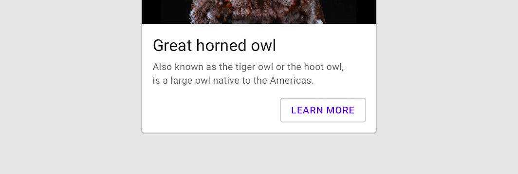
OutlinedButton
Composable Component
Outlined buttons are medium-emphasis buttons. They contain actions that are important, but aren't the primary action in an app.

Common
@Composable
fun OutlinedButton(
    onClick: () -> Unit,
    modifier: Modifier = Modifier,
    enabled: Boolean = true,
    interactionSource: MutableInteractionSource? = null,
    elevation: ButtonElevation? = null,
    shape: Shape = MaterialTheme.shapes.small,
    border: BorderStroke? = ButtonDefaults.outlinedBorder,
    colors: ButtonColors = ButtonDefaults.outlinedButtonColors(),
    contentPadding: PaddingValues = ButtonDefaults.ContentPadding,
    content: @Composable RowScope.() -> Unit,
) =
    Button(
        onClick = onClick,
        modifier = modifier,
        enabled = enabled,
        interactionSource = interactionSource,
        elevation = elevation,
        shape = shape,
        border = border,
        colors = colors,
        contentPadding = contentPadding,
        content = content,
    )
Parameters
| onClick | Will be called when the user clicks the button |
| modifier | Modifier to be applied to the button |
| enabled | Controls the enabled state of the button. When false, this button will not be clickable |
| interactionSource | an optional hoisted MutableInteractionSource for observing and emitting Interactions for this button. You can use this to change the button's appearance or preview the button in different states. Note that if null is provided, interactions will still happen internally. |
| elevation | ButtonElevation used to resolve the elevation for this button in different states. An OutlinedButton typically has no elevation, see Button for a button with elevation. |
| shape | Defines the button's shape as well as its shadow |
| border | Border to draw around the button |
| colors | ButtonColors that will be used to resolve the background and content color for this button in different states. See ButtonDefaults.outlinedButtonColors. |
| contentPadding | The spacing values to apply internally between the container and the content |
| content | The content displayed on the button, expected to be text, icon or image. |
Code Examples
OutlinedButtonSample
@Composable
fun OutlinedButtonSample() {
    OutlinedButton(onClick = { /* Do something! */ }) { Text("Outlined Button") }
}
Create your own Component Library
Material Components are meant to be used as is and they do not allow customizations. To build your own Jetpack Compose component library use Compose Unstyled
