TopAppBar
Composable Component
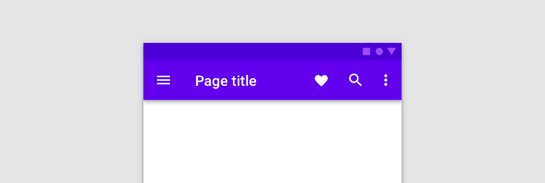
The top app bar displays information and actions relating to the current screen.
Common
@Composable
fun TopAppBar(
    title: @Composable () -> Unit,
    windowInsets: WindowInsets,
    modifier: Modifier = Modifier,
    navigationIcon: @Composable (() -> Unit)? = null,
    actions: @Composable RowScope.() -> Unit = {},
    backgroundColor: Color = MaterialTheme.colors.primarySurface,
    contentColor: Color = contentColorFor(backgroundColor),
    elevation: Dp = AppBarDefaults.TopAppBarElevation,
)
Parameters
| title | The title to be displayed in the center of the TopAppBar |
| windowInsets | a window insets that app bar will respect. |
| modifier | The Modifier to be applied to this TopAppBar |
| navigationIcon | The navigation icon displayed at the start of the TopAppBar. This should typically be an IconButton or IconToggleButton. |
| actions | The actions displayed at the end of the TopAppBar. This should typically be IconButtons. The default layout here is a Row, so icons inside will be placed horizontally. |
| backgroundColor | The background color for the TopAppBar. Use Color.Transparent to have no color. |
| contentColor | The preferred content color provided by this TopAppBar to its children. Defaults to either the matching content color for backgroundColor, or if backgroundColor is not a color from the theme, this will keep the same value set above this TopAppBar. |
| elevation | the elevation of this TopAppBar. |
Common
@Composable
fun TopAppBar(
    title: @Composable () -> Unit,
    modifier: Modifier = Modifier,
    navigationIcon: @Composable (() -> Unit)? = null,
    actions: @Composable RowScope.() -> Unit = {},
    backgroundColor: Color = MaterialTheme.colors.primarySurface,
    contentColor: Color = contentColorFor(backgroundColor),
    elevation: Dp = AppBarDefaults.TopAppBarElevation,
)
Parameters
| title | The title to be displayed in the center of the TopAppBar |
| modifier | The Modifier to be applied to this TopAppBar |
| navigationIcon | The navigation icon displayed at the start of the TopAppBar. This should typically be an IconButton or IconToggleButton. |
| actions | The actions displayed at the end of the TopAppBar. This should typically be IconButtons. The default layout here is a Row, so icons inside will be placed horizontally. |
| backgroundColor | The background color for the TopAppBar. Use Color.Transparent to have no color. |
| contentColor | The preferred content color provided by this TopAppBar to its children. Defaults to either the matching content color for backgroundColor, or if backgroundColor is not a color from the theme, this will keep the same value set above this TopAppBar. |
| elevation | the elevation of this TopAppBar. |
Common
@Composable
fun TopAppBar(
    windowInsets: WindowInsets,
    modifier: Modifier = Modifier,
    backgroundColor: Color = MaterialTheme.colors.primarySurface,
    contentColor: Color = contentColorFor(backgroundColor),
    elevation: Dp = AppBarDefaults.TopAppBarElevation,
    contentPadding: PaddingValues = AppBarDefaults.ContentPadding,
    content: @Composable RowScope.() -> Unit,
)
Parameters
| windowInsets | a window insets that app bar will respect. |
| modifier | The Modifier to be applied to this TopAppBar |
| backgroundColor | The background color for the TopAppBar. Use Color.Transparent to have no color. |
| contentColor | The preferred content color provided by this TopAppBar to its children. Defaults to either the matching content color for backgroundColor, or if backgroundColor is not a color from the theme, this will keep the same value set above this TopAppBar. |
| elevation | the elevation of this TopAppBar. |
| contentPadding | the padding applied to the content of this TopAppBar |
| content | the content of this TopAppBar.The default layout here is a Row, so content inside will be placed horizontally. |
Common
@Composable
fun TopAppBar(
    modifier: Modifier = Modifier,
    backgroundColor: Color = MaterialTheme.colors.primarySurface,
    contentColor: Color = contentColorFor(backgroundColor),
    elevation: Dp = AppBarDefaults.TopAppBarElevation,
    contentPadding: PaddingValues = AppBarDefaults.ContentPadding,
    content: @Composable RowScope.() -> Unit,
)
Parameters
| modifier | The Modifier to be applied to this TopAppBar |
| backgroundColor | The background color for the TopAppBar. Use Color.Transparent to have no color. |
| contentColor | The preferred content color provided by this TopAppBar to its children. Defaults to either the matching content color for backgroundColor, or if backgroundColor is not a color from the theme, this will keep the same value set above this TopAppBar. |
| elevation | the elevation of this TopAppBar. |
| contentPadding | the padding applied to the content of this TopAppBar |
| content | the content of this TopAppBar.The default layout here is a Row, so content inside will be placed horizontally. |
Code Examples
SimpleTopAppBar
@Composable
fun SimpleTopAppBar() {
    TopAppBar(
        windowInsets = AppBarDefaults.topAppBarWindowInsets,
        title = { Text("Simple TopAppBar") },
        navigationIcon = {
            IconButton(onClick = { /* doSomething() */ }) {
                Icon(Icons.Filled.Menu, contentDescription = null)
            }
        },
        actions = {
            // RowScope here, so these icons will be placed horizontally
            IconButton(onClick = { /* doSomething() */ }) {
                Icon(Icons.Filled.Favorite, contentDescription = "Localized description")
            }
            IconButton(onClick = { /* doSomething() */ }) {
                Icon(Icons.Filled.Favorite, contentDescription = "Localized description")
            }
        },
    )
}
Create your own Component Library
Material Components are meant to be used as is and they do not allow customizations. To build your own Jetpack Compose component library use Compose Unstyled

