TriStateCheckbox
Composable Component
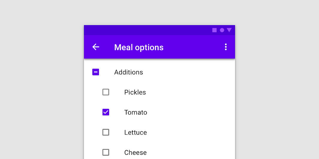
Checkboxes can have a parent-child relationship with other checkboxes. When the parent checkbox is checked, all child checkboxes are checked. If a parent checkbox is unchecked, all child checkboxes are unchecked. If some, but not all, child checkboxes are checked, the parent checkbox becomes an indeterminate checkbox.
Common
@Composable
fun TriStateCheckbox(
    state: ToggleableState,
    onClick: (() -> Unit)?,
    modifier: Modifier = Modifier,
    enabled: Boolean = true,
    interactionSource: MutableInteractionSource? = null,
    colors: CheckboxColors = CheckboxDefaults.colors(),
)
Parameters
| state | whether TriStateCheckbox is checked, unchecked or in indeterminate state |
| onClick | callback to be invoked when checkbox is being clicked, therefore the change of ToggleableState state is requested. If null, then this is passive and relies entirely on a higher-level component to control the state. |
| modifier | Modifier to be applied to the layout of the checkbox |
| enabled | whether the component is enabled or grayed out |
| interactionSource | an optional hoisted MutableInteractionSource for observing and emitting Interactions for this checkbox. You can use this to change the checkbox's appearance or preview the checkbox in different states. Note that if null is provided, interactions will still happen internally. |
| colors | CheckboxColors that will be used to determine the color of the checkmark / box / border in different states. See CheckboxDefaults.colors. |
Code Examples
TriStateCheckboxSample
@Composable
fun TriStateCheckboxSample() {
    Column {
        // define dependent checkboxes states
        val (state, onStateChange) = remember { mutableStateOf(true) }
        val (state2, onStateChange2) = remember { mutableStateOf(true) }
        // TriStateCheckbox state reflects state of dependent checkboxes
        val parentState =
            remember(state, state2) {
                if (state && state2) ToggleableState.On
                else if (!state && !state2) ToggleableState.Off else ToggleableState.Indeterminate
            }
        // click on TriStateCheckbox can set state for dependent checkboxes
        val onParentClick = {
            val s = parentState != ToggleableState.On
            onStateChange(s)
            onStateChange2(s)
        }
        TriStateCheckbox(
            state = parentState,
            onClick = onParentClick,
            colors = CheckboxDefaults.colors(checkedColor = MaterialTheme.colors.primary),
        )
        Spacer(Modifier.size(25.dp))
        Column(Modifier.padding(10.dp, 0.dp, 0.dp, 0.dp)) {
            Checkbox(state, onStateChange)
            Spacer(Modifier.size(25.dp))
            Checkbox(state2, onStateChange2)
        }
    }
}
Create your own Component Library
Material Components are meant to be used as is and they do not allow customizations. To build your own Jetpack Compose component library use Compose Unstyled

