BadgedBox
Composable Component
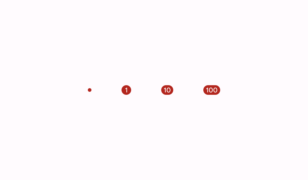
Material Design badge box.
Common
@Composable
fun BadgedBox(
    badge: @Composable BoxScope.() -> Unit,
    modifier: Modifier = Modifier,
    content: @Composable BoxScope.() -> Unit,
)
Parameters
| badge | the badge to be displayed - typically a Badge |
| modifier | the Modifier to be applied to this BadgedBox |
| content | the anchor to which this badge will be positioned |
Code Examples
NavigationBarItemWithBadge
@Preview
@Composable
fun NavigationBarItemWithBadge() {
    NavigationBar {
        NavigationBarItem(
            icon = {
                BadgedBox(
                    badge = {
                        Badge(
                            modifier =
                                Modifier.semantics { contentDescription = "New notification" }
                        )
                    }
                ) {
                    Icon(Icons.Filled.Star, contentDescription = "Favorite")
                }
            },
            selected = false,
            onClick = {},
        )
        NavigationBarItem(
            icon = {
                BadgedBox(
                    badge = {
                        Badge {
                            val badgeNumber = "8"
                            Text(
                                badgeNumber,
                                modifier =
                                    Modifier.semantics {
                                        contentDescription = "$badgeNumber new notifications"
                                    },
                            )
                        }
                    }
                ) {
                    Icon(Icons.Filled.Star, contentDescription = "Favorite")
                }
            },
            selected = false,
            onClick = {},
        )
        NavigationBarItem(
            icon = {
                BadgedBox(
                    badge = {
                        Badge {
                            val badgeNumber = "999+"
                            Text(
                                badgeNumber,
                                modifier =
                                    Modifier.semantics {
                                        contentDescription = "$badgeNumber new notifications"
                                    },
                            )
                        }
                    }
                ) {
                    Icon(Icons.Filled.Star, contentDescription = "Favorite")
                }
            },
            selected = false,
            onClick = {},
        )
    }
}
Create your own Component Library
Material Components are meant to be used as is and they do not allow customizations. To build your own Jetpack Compose component library use Compose Unstyled

