BottomAppBar
Composable Component
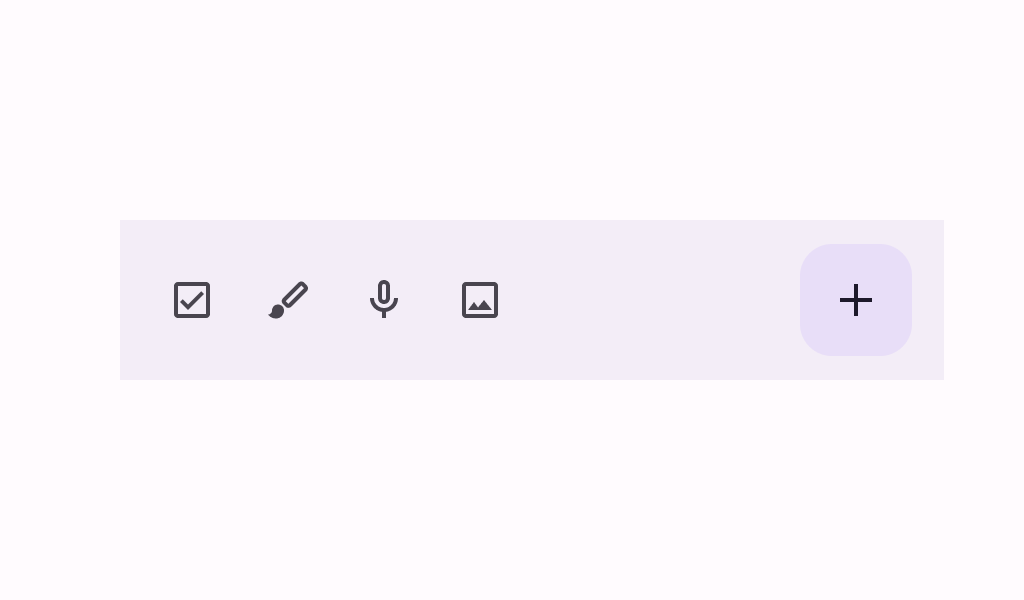
A bottom app bar displays navigation and key actions at the bottom of small screens.
Common
@Composable
fun BottomAppBar(
    actions: @Composable RowScope.() -> Unit,
    modifier: Modifier = Modifier,
    floatingActionButton: @Composable (() -> Unit)? = null,
    containerColor: Color = BottomAppBarDefaults.containerColor,
    contentColor: Color = contentColorFor(containerColor),
    tonalElevation: Dp = BottomAppBarDefaults.ContainerElevation,
    contentPadding: PaddingValues = BottomAppBarDefaults.ContentPadding,
    windowInsets: WindowInsets = BottomAppBarDefaults.windowInsets,
) =
    BottomAppBar(
        actions = actions,
        modifier = modifier,
        floatingActionButton = floatingActionButton,
        containerColor = containerColor,
        contentColor = contentColor,
        tonalElevation = tonalElevation,
        contentPadding = contentPadding,
        windowInsets = windowInsets,
        scrollBehavior = null,
    )
Parameters
| actions | the icon content of this BottomAppBar. The default layout here is a Row, so content inside will be placed horizontally. |
| modifier | the Modifier to be applied to this BottomAppBar |
| floatingActionButton | optional floating action button at the end of this BottomAppBar |
| containerColor | the color used for the background of this BottomAppBar. Use Color.Transparent to have no color. |
| contentColor | the preferred color for content inside this BottomAppBar. Defaults to either the matching content color for containerColor, or to the current LocalContentColor if containerColor is not a color from the theme. |
| tonalElevation | when containerColor is ColorScheme.surface, a translucent primary color overlay is applied on top of the container. A higher tonal elevation value will result in a darker color in light theme and lighter color in dark theme. See also: Surface. |
| contentPadding | the padding applied to the content of this BottomAppBar |
| windowInsets | a window insets that app bar will respect. |
Common
@ExperimentalMaterial3Api
@Composable
fun BottomAppBar(
    actions: @Composable RowScope.() -> Unit,
    modifier: Modifier = Modifier,
    floatingActionButton: @Composable (() -> Unit)? = null,
    containerColor: Color = BottomAppBarDefaults.containerColor,
    contentColor: Color = contentColorFor(containerColor),
    tonalElevation: Dp = BottomAppBarDefaults.ContainerElevation,
    contentPadding: PaddingValues = BottomAppBarDefaults.ContentPadding,
    windowInsets: WindowInsets = BottomAppBarDefaults.windowInsets,
    scrollBehavior: BottomAppBarScrollBehavior? = null,
) =
    BottomAppBar(
        modifier = modifier,
        containerColor = containerColor,
        contentColor = contentColor,
        tonalElevation = tonalElevation,
        windowInsets = windowInsets,
        contentPadding = contentPadding,
        scrollBehavior = scrollBehavior,
    ) {
        Row(
            modifier = Modifier.weight(1f),
            horizontalArrangement = Arrangement.Start,
            verticalAlignment = Alignment.CenterVertically,
            content = actions,
        )
        if (floatingActionButton != null) {
            Box(
                Modifier.fillMaxHeight()
                    .padding(top = FABVerticalPadding, end = FABHorizontalPadding),
                contentAlignment = Alignment.TopStart,
            ) {
                floatingActionButton()
            }
        }
    }
Parameters
| actions | the icon content of this BottomAppBar. The default layout here is a Row, so content inside will be placed horizontally. |
| modifier | the Modifier to be applied to this BottomAppBar |
| floatingActionButton | optional floating action button at the end of this BottomAppBar |
| containerColor | the color used for the background of this BottomAppBar. Use Color.Transparent to have no color. |
| contentColor | the preferred color for content inside this BottomAppBar. Defaults to either the matching content color for containerColor, or to the current LocalContentColor if containerColor is not a color from the theme. |
| tonalElevation | when containerColor is ColorScheme.surface, a translucent primary color overlay is applied on top of the container. A higher tonal elevation value will result in a darker color in light theme and lighter color in dark theme. See also: Surface. |
| contentPadding | the padding applied to the content of this BottomAppBar |
| windowInsets | a window insets that app bar will respect. |
| scrollBehavior | a BottomAppBarScrollBehavior which holds various offset values that will be applied by this bottom app bar to set up its height. A scroll behavior is designed to work in conjunction with a scrolled content to change the bottom app bar appearance as the content scrolls. Note that the bottom app bar will not react to scrolling in case a touch exploration service (e.g., TalkBack) is active. See BottomAppBarScrollBehavior.nestedScrollConnection. |
Common
@Composable
fun BottomAppBar(
    modifier: Modifier = Modifier,
    containerColor: Color = BottomAppBarDefaults.containerColor,
    contentColor: Color = contentColorFor(containerColor),
    tonalElevation: Dp = BottomAppBarDefaults.ContainerElevation,
    contentPadding: PaddingValues = BottomAppBarDefaults.ContentPadding,
    windowInsets: WindowInsets = BottomAppBarDefaults.windowInsets,
    content: @Composable RowScope.() -> Unit,
) =
    BottomAppBar(
        modifier = modifier,
        containerColor = containerColor,
        contentColor = contentColor,
        tonalElevation = tonalElevation,
        contentPadding = contentPadding,
        windowInsets = windowInsets,
        scrollBehavior = null,
        content = content,
    )
Parameters
| modifier | the Modifier to be applied to this BottomAppBar |
| containerColor | the color used for the background of this BottomAppBar. Use Color.Transparent to have no color. |
| contentColor | the preferred color for content inside this BottomAppBar. Defaults to either the matching content color for containerColor, or to the current LocalContentColor if containerColor is not a color from the theme. |
| tonalElevation | when containerColor is ColorScheme.surface, a translucent primary color overlay is applied on top of the container. A higher tonal elevation value will result in a darker color in light theme and lighter color in dark theme. See also: Surface. |
| contentPadding | the padding applied to the content of this BottomAppBar |
| windowInsets | a window insets that app bar will respect. |
| content | the content of this BottomAppBar. The default layout here is a Row, so content inside will be placed horizontally. |
Common
@ExperimentalMaterial3Api
@Composable
fun BottomAppBar(
    modifier: Modifier = Modifier,
    containerColor: Color = BottomAppBarDefaults.containerColor,
    contentColor: Color = contentColorFor(containerColor),
    tonalElevation: Dp = BottomAppBarDefaults.ContainerElevation,
    contentPadding: PaddingValues = BottomAppBarDefaults.ContentPadding,
    windowInsets: WindowInsets = BottomAppBarDefaults.windowInsets,
    scrollBehavior: BottomAppBarScrollBehavior? = null,
    content: @Composable RowScope.() -> Unit,
)
Parameters
| modifier | the Modifier to be applied to this BottomAppBar |
| containerColor | the color used for the background of this BottomAppBar. Use Color.Transparent to have no color. |
| contentColor | the preferred color for content inside this BottomAppBar. Defaults to either the matching content color for containerColor, or to the current LocalContentColor if containerColor is not a color from the theme. |
| tonalElevation | when containerColor is ColorScheme.surface, a translucent primary color overlay is applied on top of the container. A higher tonal elevation value will result in a darker color in light theme and lighter color in dark theme. See also: Surface. |
| contentPadding | the padding applied to the content of this BottomAppBar |
| windowInsets | a window insets that app bar will respect. |
| scrollBehavior | a BottomAppBarScrollBehavior which holds various offset values that will be applied by this bottom app bar to set up its height. A scroll behavior is designed to work in conjunction with a scrolled content to change the bottom app bar appearance as the content scrolls. Note that the bottom app bar will not react to scrolling in case a touch exploration service (e.g., TalkBack) is active. See BottomAppBarScrollBehavior.nestedScrollConnection. |
| content | the content of this BottomAppBar. The default layout here is a Row, so content inside will be placed horizontally. |
Code Examples
BottomAppBarWithFAB
@OptIn(ExperimentalMaterial3Api::class)
@Preview
@Composable
fun BottomAppBarWithFAB() {
    BottomAppBar(
        actions = {
            TooltipBox(
                positionProvider =
                    TooltipDefaults.rememberTooltipPositionProvider(TooltipAnchorPosition.Above),
                tooltip = { PlainTooltip { Text("Check") } },
                state = rememberTooltipState(),
            ) {
                IconButton(onClick = { /* doSomething() */ }) {
                    Icon(Icons.Filled.Check, contentDescription = "Check")
                }
            }
            TooltipBox(
                positionProvider =
                    TooltipDefaults.rememberTooltipPositionProvider(TooltipAnchorPosition.Above),
                tooltip = { PlainTooltip { Text("Edit") } },
                state = rememberTooltipState(),
            ) {
                IconButton(onClick = { /* doSomething() */ }) {
                    Icon(Icons.Filled.Edit, contentDescription = "Edit")
                }
            }
        },
        floatingActionButton = {
            TooltipBox(
                positionProvider =
                    TooltipDefaults.rememberTooltipPositionProvider(TooltipAnchorPosition.Above),
                tooltip = { PlainTooltip { Text("Add") } },
                state = rememberTooltipState(),
            ) {
                FloatingActionButton(
                    onClick = { /* do something */ },
                    containerColor = BottomAppBarDefaults.bottomAppBarFabColor,
                    elevation = FloatingActionButtonDefaults.bottomAppBarFabElevation(),
                ) {
                    Icon(Icons.Filled.Add, "Add")
                }
            }
        },
    )
}
ExitAlwaysBottomAppBar
/**
 * A sample for a [BottomAppBar] that collapses when the content is scrolled up, and appears when
 * the content scrolled down.
 */
@OptIn(ExperimentalMaterial3Api::class)
@Preview
@Composable
fun ExitAlwaysBottomAppBar() {
    val scrollBehavior = BottomAppBarDefaults.exitAlwaysScrollBehavior()
    Scaffold(
        modifier = Modifier.nestedScroll(scrollBehavior.nestedScrollConnection),
        bottomBar = {
            BottomAppBar(
                actions = {
                    TooltipBox(
                        positionProvider =
                            TooltipDefaults.rememberTooltipPositionProvider(
                                TooltipAnchorPosition.Above
                            ),
                        tooltip = { PlainTooltip { Text("Check") } },
                        state = rememberTooltipState(),
                    ) {
                        IconButton(onClick = { /* doSomething() */ }) {
                            Icon(Icons.Filled.Check, contentDescription = "Check")
                        }
                    }
                    TooltipBox(
                        positionProvider =
                            TooltipDefaults.rememberTooltipPositionProvider(
                                TooltipAnchorPosition.Above
                            ),
                        tooltip = { PlainTooltip { Text("Edit") } },
                        state = rememberTooltipState(),
                    ) {
                        IconButton(onClick = { /* doSomething() */ }) {
                            Icon(Icons.Filled.Edit, contentDescription = "Edit")
                        }
                    }
                },
                scrollBehavior = scrollBehavior,
            )
        },
        floatingActionButton = {
            TooltipBox(
                positionProvider =
                    TooltipDefaults.rememberTooltipPositionProvider(TooltipAnchorPosition.Above),
                tooltip = { PlainTooltip { Text("Add") } },
                state = rememberTooltipState(),
            ) {
                FloatingActionButton(
                    modifier = Modifier.offset(y = 4.dp),
                    onClick = { /* do something */ },
                    containerColor = BottomAppBarDefaults.bottomAppBarFabColor,
                    elevation = FloatingActionButtonDefaults.bottomAppBarFabElevation(),
                ) {
                    Icon(Icons.Filled.Add, "Add")
                }
            }
        },
        floatingActionButtonPosition = FabPosition.EndOverlay,
        content = { innerPadding ->
            LazyColumn(
                contentPadding = innerPadding,
                verticalArrangement = Arrangement.spacedBy(8.dp),
            ) {
                val list = (0..75).map { it.toString() }
                items(count = list.size) {
                    Text(
                        text = list[it],
                        style = MaterialTheme.typography.bodyLarge,
                        modifier = Modifier.fillMaxWidth().padding(horizontal = 16.dp),
                    )
                }
            }
        },
    )
}
SimpleBottomAppBar
@OptIn(ExperimentalMaterial3Api::class)
@Preview
@Composable
fun SimpleBottomAppBar() {
    BottomAppBar(
        actions = {
            TooltipBox(
                positionProvider =
                    TooltipDefaults.rememberTooltipPositionProvider(TooltipAnchorPosition.Above),
                tooltip = { PlainTooltip { Text("Menu") } },
                state = rememberTooltipState(),
            ) {
                IconButton(onClick = { /* doSomething() */ }) {
                    Icon(Icons.Filled.Menu, contentDescription = "Menu button")
                }
            }
        }
    )
}
Create your own Component Library
Material Components are meant to be used as is and they do not allow customizations. To build your own Jetpack Compose component library use Compose Unstyled

