BottomSheetScaffold
Composable Component
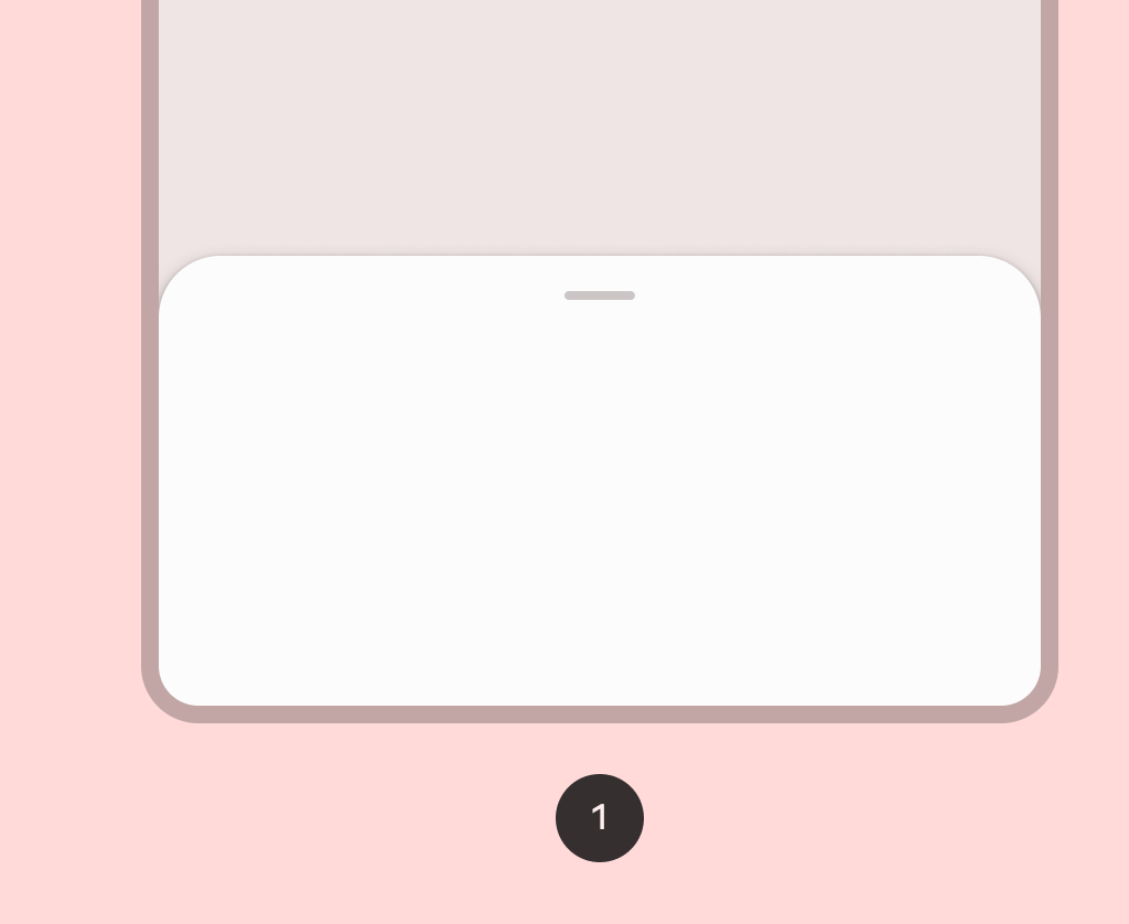
Standard bottom sheets co-exist with the screen’s main UI region and allow for simultaneously viewing and interacting with both regions. They are commonly used to keep a feature or secondary content visible on screen when content in main UI region is frequently scrolled or panned.
Common
@Composable
@ExperimentalMaterial3Api
fun BottomSheetScaffold(
    sheetContent: @Composable ColumnScope.() -> Unit,
    modifier: Modifier = Modifier,
    scaffoldState: BottomSheetScaffoldState = rememberBottomSheetScaffoldState(),
    sheetPeekHeight: Dp = BottomSheetDefaults.SheetPeekHeight,
    sheetMaxWidth: Dp = BottomSheetDefaults.SheetMaxWidth,
    sheetShape: Shape = BottomSheetDefaults.ExpandedShape,
    sheetContainerColor: Color = BottomSheetDefaults.ContainerColor,
    sheetContentColor: Color = contentColorFor(sheetContainerColor),
    sheetTonalElevation: Dp = 0.dp,
    sheetShadowElevation: Dp = BottomSheetDefaults.Elevation,
    sheetDragHandle: @Composable (() -> Unit)? = { BottomSheetDefaults.DragHandle() },
    sheetSwipeEnabled: Boolean = true,
    topBar: @Composable (() -> Unit)? = null,
    snackbarHost: @Composable (SnackbarHostState) -> Unit = { SnackbarHost(it) },
    containerColor: Color = MaterialTheme.colorScheme.surface,
    contentColor: Color = contentColorFor(containerColor),
    content: @Composable (PaddingValues) -> Unit,
)
Parameters
| sheetContent | the content of the bottom sheet |
| modifier | the Modifier to be applied to the root of the scaffold |
| scaffoldState | the state of the bottom sheet scaffold |
| sheetPeekHeight | the height of the bottom sheet when it is collapsed |
| sheetMaxWidth | Dp that defines what the maximum width the sheet will take. Pass in Dp.Unspecified for a sheet that spans the entire screen width. |
| sheetShape | the shape of the bottom sheet |
| sheetContainerColor | the background color of the bottom sheet |
| sheetContentColor | the preferred content color provided by the bottom sheet to its children. Defaults to the matching content color for sheetContainerColor, or if that is not a color from the theme, this will keep the same content color set above the bottom sheet. |
| sheetTonalElevation | when sheetContainerColor is ColorScheme.surface, a translucent primary color overlay is applied on top of the container. A higher tonal elevation value will result in a darker color in light theme and lighter color in dark theme. See also: Surface. |
| sheetShadowElevation | the shadow elevation of the bottom sheet |
| sheetDragHandle | optional visual marker to pull the scaffold's bottom sheet |
| sheetSwipeEnabled | whether the sheet swiping is enabled and should react to the user's input |
| topBar | top app bar of the screen, typically a TopAppBar |
| snackbarHost | component to host Snackbars that are pushed to be shown via SnackbarHostState.showSnackbar, typically a SnackbarHost |
| containerColor | the color used for the background of this scaffold. Use Color.Transparent to have no color. |
| contentColor | the preferred color for content inside this scaffold. Defaults to either the matching content color for containerColor, or to the current LocalContentColor if containerColor is not a color from the theme. |
| content | content of the screen. The lambda receives a PaddingValues that should be applied to the content root via Modifier.padding and Modifier.consumeWindowInsets to properly offset top and bottom bars. If using Modifier.verticalScroll, apply this modifier to the child of the scroll, and not on the scroll itself. |
Code Examples
SimpleBottomSheetScaffoldSample
@Preview
@OptIn(ExperimentalMaterial3Api::class)
@Composable
fun SimpleBottomSheetScaffoldSample() {
    val scope = rememberCoroutineScope()
    val scaffoldState = rememberBottomSheetScaffoldState()
    BottomSheetScaffold(
        scaffoldState = scaffoldState,
        sheetPeekHeight = 128.dp,
        sheetContent = {
            Column(Modifier.fillMaxWidth(), horizontalAlignment = Alignment.CenterHorizontally) {
                Box(Modifier.fillMaxWidth().height(128.dp), contentAlignment = Alignment.Center) {
                    Text("Swipe up to expand sheet")
                }
                Text("Sheet content")
                Button(
                    modifier = Modifier.padding(bottom = 64.dp),
                    onClick = { scope.launch { scaffoldState.bottomSheetState.partialExpand() } },
                ) {
                    Text("Click to collapse sheet")
                }
            }
        },
    ) { innerPadding ->
        Box(
            modifier = Modifier.fillMaxSize().padding(innerPadding),
            contentAlignment = Alignment.Center,
        ) {
            Text("Scaffold Content")
        }
    }
}
Create your own Component Library
Material Components are meant to be used as is and they do not allow customizations. To build your own Jetpack Compose component library use Compose Unstyled

