CircularProgressIndicator
Composable Component
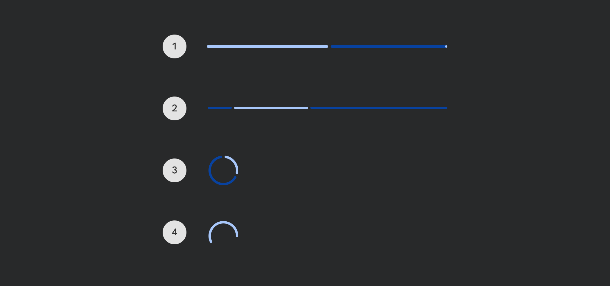
Progress indicators express an unspecified wait time or display the duration of a process.
Common
Deprecated Use the overload that takes
gapSize, seeLegacyCircularProgressIndicatorSampleon how to restore the previous behavior
@Composable
fun CircularProgressIndicator(
    progress: () -> Float,
    modifier: Modifier = Modifier,
    color: Color = ProgressIndicatorDefaults.circularColor,
    strokeWidth: Dp = ProgressIndicatorDefaults.CircularStrokeWidth,
    trackColor: Color = ProgressIndicatorDefaults.circularDeterminateTrackColor,
    strokeCap: StrokeCap = ProgressIndicatorDefaults.CircularDeterminateStrokeCap,
)
Parameters
| progress | the progress of this progress indicator, where 0.0 represents no progress and 1.0 represents full progress. Values outside of this range are coerced into the range. |
| modifier | the Modifier to be applied to this progress indicator |
| color | color of this progress indicator |
| strokeWidth | stroke width of this progress indicator |
| trackColor | color of the track behind the indicator, visible when the progress has not reached the area of the overall indicator yet |
| strokeCap | stroke cap to use for the ends of this progress indicator |
Common
@Composable
fun CircularProgressIndicator(
    progress: () -> Float,
    modifier: Modifier = Modifier,
    color: Color = ProgressIndicatorDefaults.circularColor,
    strokeWidth: Dp = ProgressIndicatorDefaults.CircularStrokeWidth,
    trackColor: Color = ProgressIndicatorDefaults.circularDeterminateTrackColor,
    strokeCap: StrokeCap = ProgressIndicatorDefaults.CircularDeterminateStrokeCap,
    gapSize: Dp = ProgressIndicatorDefaults.CircularIndicatorTrackGapSize,
)
Parameters
| progress | the progress of this progress indicator, where 0.0 represents no progress and 1.0 represents full progress. Values outside of this range are coerced into the range. |
| modifier | the Modifier to be applied to this progress indicator |
| color | color of this progress indicator |
| strokeWidth | stroke width of this progress indicator |
| trackColor | color of the track behind the indicator, visible when the progress has not reached the area of the overall indicator yet |
| strokeCap | stroke cap to use for the ends of this progress indicator |
| gapSize | size of the gap between the progress indicator and the track |
Common
Deprecated Use the overload that takes
gapSize
@Composable
fun CircularProgressIndicator(
    modifier: Modifier = Modifier,
    color: Color = ProgressIndicatorDefaults.circularColor,
    strokeWidth: Dp = ProgressIndicatorDefaults.CircularStrokeWidth,
    trackColor: Color = ProgressIndicatorDefaults.circularIndeterminateTrackColor,
    strokeCap: StrokeCap = ProgressIndicatorDefaults.CircularIndeterminateStrokeCap,
) =
    CircularProgressIndicator(
        modifier = modifier,
        color = color,
        strokeWidth = strokeWidth,
        trackColor = trackColor,
        strokeCap = strokeCap,
        gapSize = ProgressIndicatorDefaults.CircularIndicatorTrackGapSize,
    )
Parameters
| modifier | the Modifier to be applied to this progress indicator |
| color | color of this progress indicator |
| strokeWidth | stroke width of this progress indicator |
| trackColor | color of the track behind the indicator, visible when the progress has not reached the area of the overall indicator yet |
| strokeCap | stroke cap to use for the ends of this progress indicator |
Common
@Composable
fun CircularProgressIndicator(
    modifier: Modifier = Modifier,
    color: Color = ProgressIndicatorDefaults.circularColor,
    strokeWidth: Dp = ProgressIndicatorDefaults.CircularStrokeWidth,
    trackColor: Color = ProgressIndicatorDefaults.circularIndeterminateTrackColor,
    strokeCap: StrokeCap = ProgressIndicatorDefaults.CircularIndeterminateStrokeCap,
    gapSize: Dp = ProgressIndicatorDefaults.CircularIndicatorTrackGapSize,
)
Parameters
| modifier | the Modifier to be applied to this progress indicator |
| color | color of this progress indicator |
| strokeWidth | stroke width of this progress indicator |
| trackColor | color of the track behind the indicator, visible when the progress has not reached the area of the overall indicator yet |
| strokeCap | stroke cap to use for the ends of this progress indicator |
| gapSize | size of the gap between the progress indicator and the track |
Common
Deprecated Use the overload that takes
progressas a lambda
@Composable
fun CircularProgressIndicator(
    progress: Float,
    modifier: Modifier = Modifier,
    color: Color = ProgressIndicatorDefaults.circularColor,
    strokeWidth: Dp = ProgressIndicatorDefaults.CircularStrokeWidth,
    trackColor: Color = ProgressIndicatorDefaults.circularTrackColor,
    strokeCap: StrokeCap = ProgressIndicatorDefaults.CircularDeterminateStrokeCap,
) =
    CircularProgressIndicator(
        progress = { progress },
        modifier = modifier,
        color = color,
        strokeWidth = strokeWidth,
        trackColor = trackColor,
        strokeCap = strokeCap,
    )
Common
Deprecated Maintained for binary compatibility
@Composable
fun CircularProgressIndicator(
    progress: Float,
    modifier: Modifier = Modifier,
    color: Color = ProgressIndicatorDefaults.circularColor,
    strokeWidth: Dp = ProgressIndicatorDefaults.CircularStrokeWidth,
) =
    CircularProgressIndicator(
        progress,
        modifier,
        color,
        strokeWidth,
        trackColor = ProgressIndicatorDefaults.circularTrackColor,
        strokeCap = ProgressIndicatorDefaults.CircularDeterminateStrokeCap,
    )
Common
Deprecated Maintained for binary compatibility
@Composable
fun CircularProgressIndicator(
    modifier: Modifier = Modifier,
    color: Color = ProgressIndicatorDefaults.circularColor,
    strokeWidth: Dp = ProgressIndicatorDefaults.CircularStrokeWidth,
) =
    CircularProgressIndicator(
        modifier,
        color,
        strokeWidth,
        trackColor = ProgressIndicatorDefaults.circularTrackColor,
        strokeCap = ProgressIndicatorDefaults.CircularIndeterminateStrokeCap,
    )
Code Examples
CircularProgressIndicatorSample
@Preview
@Composable
fun CircularProgressIndicatorSample() {
    var progress by remember { mutableFloatStateOf(0.1f) }
    val animatedProgress by
        animateFloatAsState(
            targetValue = progress,
            animationSpec = ProgressIndicatorDefaults.ProgressAnimationSpec,
        )
    Column(horizontalAlignment = Alignment.CenterHorizontally) {
        CircularProgressIndicator(progress = { animatedProgress })
        Spacer(Modifier.requiredHeight(30.dp))
        Text("Set progress:")
        Slider(
            modifier = Modifier.width(300.dp),
            value = progress,
            valueRange = 0f..1f,
            onValueChange = { progress = it },
        )
    }
}
IndeterminateCircularProgressIndicatorSample
@Preview
@Composable
fun IndeterminateCircularProgressIndicatorSample() {
    Column(horizontalAlignment = Alignment.CenterHorizontally) { CircularProgressIndicator() }
}
Create your own Component Library
Material Components are meant to be used as is and they do not allow customizations. To build your own Jetpack Compose component library use Compose Unstyled

